
Tom Geismar is partner and designer at Chermayeff & Geismar & Haviv, New York. Having created iconic logos for Mobil Oil, New York University, Chase Bank, National Geographic, and many more, he is one of the most highly acclaimed designers in the profession. He kindly took time to answer reader-submitted questions on logos, design clients, and his professional background.
Has your approach to design changed over the years, and if so, how, and why?
I know it’s something of a cliché to say this, but we really do view graphic design, and especially logo design, as a problem solving process, a process not dissimilar to that used in other related disciplines such as architecture and engineering. The initial task is to understand and define what the issues are, and what the goals should be. With that background in mind, we strive to come up with the best possible design “solution” to the problem, using imagination and artistic invention to create something memorable and meaningful. In that sense, our approach has not changed at all. The way we went about designing logos for Armani Exchange and the Library of Congress in 2008 is essentially the same as the way we went about designing logos for Chase and Mobil in the 1960’s.
Do you think design has been overcomplicated with marketing analysis? Do we think “too much?” Have we lost sight of simplicity?
The issue isn’t whether “we think too much,” it’s whether we accept marketing analysis as the last word, or simply as one piece of the larger puzzle, and recognize that it only reflects what has been, not what could be. From a logo design viewpoint, an entity with a clear definition of its goals and aspirations makes the job a lot easier.
How large a role does sketching on paper play in your design process?
For me, sketching on paper still plays a key role in my design, mainly because I find at the beginning of the design phase it is a much faster way to try out ideas, and variations on ideas. Sketching also allows me to indicate certain forms, especially curves, that I find difficult and cumbersome with the computer. And sketching allows me to suggest an idea or concept, while drawing with the computer leads very quickly to a sharply defined object. Of course, once an idea is more fully developed, the computer is a great way to study variations in color, form, etc.
When creating a logo, what influences your decision to use a wordmark vs letterform vs emblem vs pictorial vs abstract symbol?
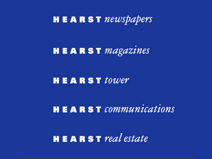
The decision on how to approach a logo design is very much determined by how we define the issues involved, including the name, the type of organization, how the name will be used, etc. For example, if you have a client with a short, distinctive name, perhaps a wordmark would be the best approach. In 2005, we took this approach with Hearst Corporation, which had a number of operating divisions that all used the Hearst name followed by a descriptive word, such as Hearst Magazines. So we developed a distinctive bold wordmark for Hearst, and a contrasting type style for the generic descriptors that followed.

Can you share some advice or stories on how to sell an idea to a client?
Logos are funny things. At first they are just designs on paper. Eventually they come to embody all the qualities of the organization they represent, and most people cannot separate the “design” from their full range of opinions about the organization. The hard task the designer faces is trying to help the client see how the logo might eventually be perceived, how it will work for them, not just whether they “like it.”

We learned this lesson early on when we first presented the Chase symbol to the chief executives of the bank. The man who was then Chairman said he would go along the decision of the others, but personally he hated it and did not want to see it on his letterhead his business card, or anywhere in his office. Six months later we ran into him at the bank. He was wearing a pin with the symbol in his lapel, and a tie-tack with the symbol holding a tie that was itself a pattern of the symbol. To him, the mark was no longer just an abstract design, it had become the representation of his organization.
![]()
You’ve completed work for Mobil and PBS, two companies on opposite sides of the political spectrum. Is it a designer’s responsibility to consider a client’s effect on society? How do you reconcile working with a company that you disagree with philosophically or ethically?
You have to work for people whom you respect. Over the years we have refused to work on various projects because we would feel uncomfortable doing so. But the issue is a complex one. For example, on the surface, perhaps Mobil and PBS might seem to be on opposite sides of the political spectrum, but during the many years we worked for Mobil (before the takeover by EXXON), it was the most progressive of the major oil companies, explicitly stating their positions, championing good design, doing impressive public-interest advertising and being, in fact, one of the major benefactors of PBS, along with numerous cultural and art institutions. In short, we respected Mobil and its people, even if we didn’t always agree with their positions.
![]()
Do you work for non-profit as well as profit-making organizations, and, if so, how do they differ?
Yes, in fact many of our recent clients are non-profit or governmental organizations. It’s easy to agree with their positions, but working with them is not very different from working with a profit-making organization.
Have you designed a particular logo that didn’t make the final cut or that you thought was stronger than what the client ultimately chose?
This has happened to us on various occasions. We do our best to convince our clients to go with the mark we feel is the strongest, but for a variety of reasons that’s not always how the project ends up. On the other hand, while we study a great many alternatives, we try never to present to our clients any designs that we cannot stand behind.
After a lifetime of working in the field, would you choose to be a designer in the present landscape of communication design?
I feel fortunate to have spent my entire working life as a graphic designer, and being part of a small organization where I could interact with talented partners. As an independent designer, whether on your own or part of a firm, one is exposed to many different people involved in a wide range of activities. If curious, you can learn a great deal. Today the field is much broader than it was when we started, and it’s more competitive. Yet the opportunities are great for someone who is curious about the world, interested in defining and solving problems, and passionate about design.
Many thanks to Tom for the intriguing answers. And thanks again to the readers who submitted questions. If you enjoyed the interview, you might also like to read an interview with Sagi Haviv.

Comments
Very insightful. I like Tom’s response about political views on an organization. You don’t necessarily have to agree with your client’s views, but you do have to respect them as a successful organization.
Thanks for all these questions, Tom and thanks David for posting a great interview. Looking forward to more, and looking forward to the release of your new book.
Thank you for sharing such an interesting interview.
After all these years I still find most of his designs striking (the Mobil one is beautiful).
Really great insight. Some very memorable logos in this list. Thanks for the interview David
I love his ideas on how to sell an idea!
You’re very welcome, Kenny, Sean. Thanks for dropping by.
I find the chase (chairman) story quite interesting and a powerful illustration of design, branding, subjectivity and perception.
Good read. Great insights.
David, what a fantastic interview. You came up with interesting and useful questions.
‘The hard task the designer faces is trying to help the client see how the logo might eventually be perceived, how it will work for them, not just whether they “like it”.’
So true, so very true (all across the spectrum of design)…
A great insightful interview here, thanks for the excellently chosen questions! It’s always great to see how professional designers approach their work, and the fact that Tom Geismar still sketches out his ideas on paper says a lot about getting a good basis before jumping onto the computer.
I particularly like the response regarding the choice of clients, and that no matter what they do he only works with client that he respects. Of course this is not a choice that a lot of us can afford to make, but the principle is certainly a good one.
Looking forward to reading similar interview articles in the near future, excellent work!
Hi Cat, most questions were from readers, much credit to them. Glad you enjoyed the interview.
I am keeping this open to read later.
Thank you Dave & Thank you Tom.
“Sketching also allows me to indicate certain forms, especially curves, that I find difficult and cumbersome with the computer.” Glad to know he’s still human after all. :-) Great interview David and Tom. Thanks for sharing.
Dave,
Loved the interview. Have not been able to spend much time reading for pleasure recently, but am glad I stopped by. This site just keeps getting better and better.
Such a great interview. Tom Geismar has really been one of my greatest influences in terms of where I’ve been trying to take my design lately, so this interview couldn’t have been timed any better. I think a lot of *designers* today are getting lost in photoshop filters (of all programs… has “photo” in the name for a reason…) and are blind to what makes a logo design iconic and memorable. Tom Geismar’s work in logo design is truly inspirational and worth studying.
Some legendary work from some very influential designers. Great interview and truly inspirational.
Thanks, David.
Fantastic! Thank you so much for asking the question I submitted.
My pleasure, James. Thanks a lot for asking.
I agree that the decision on how to approach a logo design is very much determined by how we define the issues involved. By properly doing this a logo artist can create a mark that is strong and memorable to the intended audience. A strong mark evokes recall when seen again. This will create trust in the brand and in turn create new and repeat business. A mark is a very powerful entry point into a business. It communicates a lot about who you are and what you do as well as a host of other subconscious triggers.
Its so amazing to hear what the designer behind such famous logos has to say. Thank you for this, it really is inspiring.
I’m a student studying graphic design and I’m writing my thesis on Identity Design, and I would love to see a post about Identity Redesign if possible. Just basic questions like, why is it done? Is it a good idea for the same graphic designer to redesign the logo for a company? Is it always necessary to keep the ‘current trends’ in mind while redesigning?
If its possible, it would really help with my thesis. Thank You.
Thanks for the suggestion, Naina, and all the very best with your thesis.
A fantastic interview on logo development and logo design. Thanks for sharing it.
Fantastic article! Tom is an inspiration for our agency! Thanks for the great read.
Professional. Thank you!