I don’t know why the public has been asked to decide on the new logo for the United Arab Emirates, but I suppose it’s an improvement over the public being asked to create the design (cue efforts for Zambia and Haiti).
The venture was announced a couple of days ago by Sheikh Mohammed.
There are five options to vote on.
1/ Fabric of Society
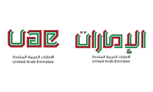
“The repeating lines always appear in groups of seven, representing the seven Emirates. The varied colours are derived from the actual colours present in Emirati art and craft, and not least, the UAE flag.”
—
2/ Brilliant Evolution

“The actual map of the country and the seven Emirates make up the basic shape of the symbol.”
—
3/ ‘You’ can be anything
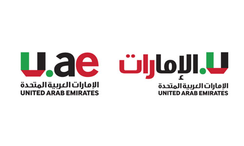
“The ‘U’ element in the mark can be anything you wish it to be – and the people of the UAE are invited to create their own versions of the ‘U’.”
—
4/ Vivid Tapestry

“The rich heritage and balanced Emirati culture of the seven combined Emirates are contained and balanced within a traditional Kufi script — a route where even when written in English, the appearance is unmistakably Emirati.”
—
5/ All-Encompassing
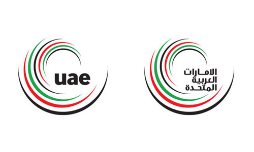
“The UAE is constantly changing, adapting and exploring its potential in the world. A symbol was created to demonstrate this constant state of dynamic evolution — a symbol simple enough to be memorised by the people — to the point where they are able to replicate it with their own hands — no matter the age or ability.”
—
The designers weren’t available for comment (too busy submitting votes). And although I said this event is better than asking the public to design, there’s a clause on the voting page: “In case you would like to share your suggestions or designs as well, you can reach us at nationbrand@uaepm.ae”
—
Update:
My mistake. In 2010 the public was asked to design, but it’s okay, because point #7 in the entry provision clearly states, “There is no fee to enter the contest.” Hurrah!
—
Visit the UAE Nation Brand website to vote and view contextual images.
Reported elsewhere:
Branding a nation: the tricky task of finding the right logo for the UAE, on The National
From the archives:
Branding Peru, one of my favourite country designs.



Comments
2nd one is the one for me, the rest are looking like they were designed by the public.
Mind you looking again, in the arabic language one, aren’t there some letters missing/illegible at the end?
^Yes, the second one is perhaps my favourite though none really stand out as being exceptional. The only problem with the second one (as mentioned above) is the arabic letter version doesn’t work as well. In fact it looks like the ‘shard’ parts were specifically positioned with the Roman character version in mind (the way the ‘U’ and ‘E’ bleed out of the background image is much neater than the arabic version).
The fourth logo is just too complex and it won’t look good in a small scale. These logos are good. But the question is: are they good enough to represent a country? No.
Number 2…. but I’d like to see the black and white version.
It was a contest to the public in October 2010 only for people inside the country…
here it is the link
http://uaepm.ae/nationbrand/en/ContestGuide.aspx
3 & 5 for me, nice digital idea in 3 & 5 reflects the UAE in a traditional/contemporary way.
Thanks for letting me know, Shaima. I updated the post.
None of them are good, they are far from the Arabic spirit, the type is weak. I’m disappointed.
I’d go for number 2.
My vote goes to 5/ All-Encompassing, a good logo should be complete anatomically, being a custom logo designer I suggest ‘all encompassing’ one.
I’d go for the 3rd one. I like how they integrated their flag into it. It’s so simple.
I find the others: (1) hard to read, (2) too difficult to recreate, (4) overdone by others, (5) without connection to the country.
But that’s just me of course.
We have so many talents in the region and this is what they come up with? Such a weak design and not representative of modern Arabic typography or design standards. They should ask for their money back.
Elle
I do agree with you.
Yes, they can do better! UAE is an inspirational place!
I actually really like number 4. It’s the only one I think that works in both versions, though that type is way too small.
The rest are pretty dated and ugly.
So… I tried to vote. Turns out they think Ozzy or Aussie are official names for our people.
Design being put up for vote (or competition) makes the big assumption that everyone is an expert on the subject. The best results come from an knowledgeable panel being put together to work closely with the designers for full understanding and collaboration. This sort of approach to design is shortsighted.
I find them quite ugly. I usually or never use these words, but need to be straight forward and tell it like it is :) Maybe for a middle eastern culture, their taste of design is different than in the west, but you would think with all the modern buildings they build they would go in the same direction for their national logo.
“Maybe For Middle Eastern Culture”
Please Behzad, behave. No need for your assumption!
I love number 5. Yes the crafting could be better which I’m sure will happen on selection but I feel the idea is the strongest – 2030 vision, National pride (Falcon) and 7 emirates.
There is no need to assume the middle-east has a certain standard also, the middle-east are one of very few countries that can actually sustain itself in the current economy, so surely one would assume its not the middle-east that is below standard.
I am sure they have a national emblem already, what are they trying to accomplish with such a logo campaign? Without a clear purpose, these logos are nothing but a beauty contest of geometry.
Go back to the drawing board, they all look like art school, or hire me to design it.
The Vivid Tapestry option is a copy of logo I know. :)