Q&A about aircraft livery and logo design (on johnson banks).
johnson banks’ creative director Michael Johnson was interviewed about the challenges faced when designing aircraft liveries and logos. “You might have the best idea for a fantastically unusual tailfin symbol, but stitched on a badge, or a uniform, or screen-printed in one colour onto a catering pack it falls apart. So infinite flexibility is now the watchword.” A worthwhile read.
On a related note, the above timelapse video filmed over 15 days and showing a Virgin Atlantic respray is intriguing. And here’s a very brief insight into Virgin’s sub-brands.

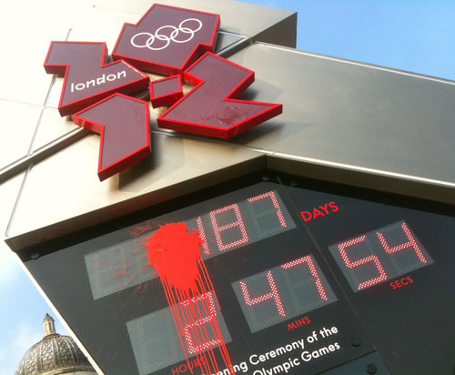
Olympic Clock Remix (on Noisy Decent Graphics).
Although Ben Terrett is one designer who loves the London 2012 logo, for him, it comes down to this: “That’s the problem with this damn logo isn’t it — all the executions are weak. I love that logo I really do, but it’s so hard when all the supporting stuff seems to lack the energy and boldness of the original concept.”

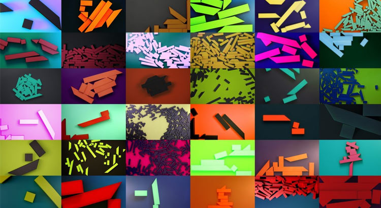
Eurostar Sculpts New Logo (on Brand New).
Sydney-based Clinton Duncan, who kindly guest authored on LDL with Where Gap went wrong, reviewed SomeOne‘s identity for Eurostar (seen in detail on Identity Designed). Quite a mixed response from the ‘Brand New’ readers, but I don’t think that should bother the team at SomeOne. Polarizing design is often that which is remembered the most. Sure, it must be appropriate, too, but who knows the market better than the client? A lot of credit is deserved for enticing the glowing testimonials given by the Eurostar team. No mean feat. Would I have produced something different? Probably. But was I the one who managed to thrill the Eurostar committee and have its members enthusing over the company’s future? No.

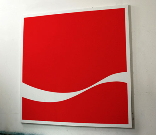
You Took My Name (on Dorothy).
“We’re working on a series of paintings that strip famous logos back to their basic graphic forms. Creating pieces that we think are artworks in their own right.” Dorothy’s art project is part of mini-trend I’ve been seeing elsewhere, along the lines of shortened logos, still readable. It’s a glimpse of the ever-crossing boundaries between art and design. Colors by Mu Chen is another example. Are we artists, or designers? Both? Graphic artists?
That which we call a designer by any other name would smell as sweet.
(Act II, Scene II)


Share a thought