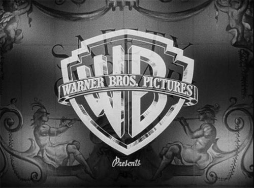
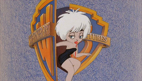
“I couldn’t find a good overview with all logos gathered in one place, so I started to collect them myself, in 2009. Now, five years later, I think I have enough to paint a picture of Warner Bros logo design evolution.”
 From Hitchcock’s Stage Fright, 1950.
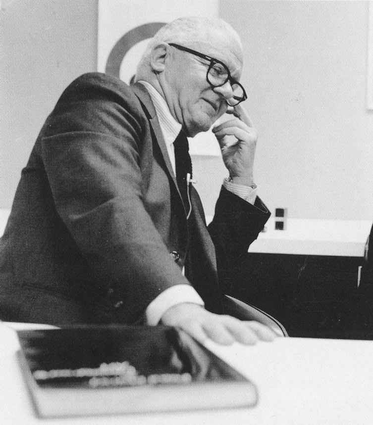
 From Enter the Dragon, 1973, designed by Saul Bass.
 From Who’s That Girl, 1987.
Hundreds more on the Warner Bros logo page, compiled by Christian Annyas.
I’ve always been partial to a bit of Bass.


Comments
Such an iconic logo, it’s great to see how it’s changed over the years.
I’m not a fan of Bass’s logo work. It was very corporate and stern. It was so different to his film titles and posters which were such a delight. I much prefer the old shield WB ones which are far more emotive for me and evoke memories of great movies and cartoons. The latest versions where the logo adapt for the movies are great. It feels less corporate and more about a company that loves entertainment and creativity. In actual fact, the non Saul Bass logo’s feel more like the Saul Bass that did the film titles.
It’s funny, Lee, I’ve probably seen just a handful of shows where the Bass symbol appeared, yet thousands that showed the WB monogram (I loved Looney Tunes when I was a kid). But the Bass design seems strangely just as familiar. I don’t know. Maybe I watched more than I remember with the Bass work.
I think it’s the minimalist designer inside you talking David ;-)
Could be. :)
Such an iconic logo. I heard my colleague Ron say he always wanted to design something similar.
I am in the same boat as lee with seeing the logo and it evoking such emotion. Because the logo has kept the same iconic style and is instantly recognizable.
The Bass logo definitely served it’s purpose in the 1970’s and 1980’s. Warner Communications had book publishing and a host of music labels under it’s umbrella. It needed something simple that would fit on paperback spines as well as cassette and 8-track packaging. The fact that Warner Brothers Records was a stand alone music label (old shield and WB used) made having a “corporate” logo a necessity to avoid confusion.
The only Warner logo I like is the Saul Bass one. All the others are terrible. It’s no wonder it still looks the same as it did 40 years ago.
I prefer the Bass logo; it looks so much more like a MOVIE logo and less like a Bugs Bunny cartoon…