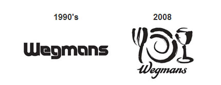
“When we looked back at some of our earliest logos, they conveyed the warmth and personal attention to detail that we hope reflect our brand. The family culture in our company continues to grow. It was time to go back to our roots and to a logo that is welcoming because it is more like a family signature.”
— Colleen Wegman
From the Wegmans press release.


Via Yael Miller. Yael mentioned the recent logo trend of companies looking to their past for logo refinements and redesigns — like the Pentagram rebrand of the Saks logo.


Comments
I think it sure is the strongest one they’ve had so far. The 1930’s is awesome too though.
I think this logo truly blends tradition with modern. The logo is clean, and traditional. I love the way how the original 1930’s font was mimicked. I think that this is the best logo they had so far, followed by the 1930’s one. I think they tried to go back to their roots with the 1990’s one but it comes nowhere near to the new logo. The others are pretty horrendous. May I ask which version are they going to use for the 2008 one ? i hope its the one with the lettering only ! I don’t particularly like the one with the plates cause the font is lost.
DotNetMushroom
We live in a time where branding of businesses THE focus both for starters and established companies.
In the case of Wegmans I think they have caught their original feel to their identity. The 2008 rebrand has lost a lot of weight and for that reason I think it works well as it is simple, clean, classic look.
A lot of rebrands seem to do this to their identities and I am not sure if it is the safe way to do it or if it is just the times we live in.
I suppose one can’t just look at the identity itself, it is important to look at the brand as a whole, everything surrounding the identity.
A good example is the link shown in the article above where pentagram rebranded Saks.
This too is a simple and clean logo that works because of the complete brand, everything that comes with the identity itself.
D
I like this trend. Font treatments before the age of computers was often completely original; when hand lettering was the norm. Like Coka Cola’s font, Wegmans script from the 1930s, and the Saks Fifth Avenue script font they went back to, appear as if they would have stood the test of time if an owner or committee hadn’t been seduced by ‘modern’ type treatments. They would have been stronger for it.
Trish
Jesse, Justin, Daniel, Trish,
Thanks for offering your thoughts.
I also hope the new logo is shown without the extra illustration shown in one of the 2008 versions. Much stronger as a logotype, and less ‘messy’. ‘Modern type seduction’? Interesting phrase, Trish. Sometimes you have to try the lesser of two ideas before realising the best is yet to come.
David,
I agree with you on the Wegmans with the illustration.
It is a lot stronger on its own, lets hope they keep it as a logotype.
D
I go to Wegmans regularly, and I’m pretty sure they only use the fork/plate/wine glass illustration on some of their own products. I’ve never seen it used as part of their actual logo.
The new logo is pretty nice, but right now it seems a little sharp. I wouldn’t mind it being a little softer; but I guess I’ll have to wait and see it in use. It’s definitely a big improvement over their current logo, and it’ll be interesting to see how they use it on the store itself.
It definitely also plays into their image better than the current one. Wegmans is usually referred to in national magazines as an “upscale grocery store,” which is kind of funny for those of us who go to one regularly. Upscale? It’s just Wegmans to us. I guess we’ve been spoiled by a having such a nice store be our main supermarket.
I sure wish they’d add an apostrophe, though.
Does somebody know witch font this is?
It’s definitely a custom job and not an existing font.
I, too regularly shop at Wegmans – and this new, “old” logo rocks. It better reflects the clean, friendly and efficient atmosphere that Wegmans strives to promote.
However, I hope they never use the plate illustration and type together… they look very discordant, as though the two were randomly pasted together.
Finally a GOOD redesign!!
I was getting really tired of all those spherical-glossy-2.0-crap logos :-D
Jonathan,
I see where you’re coming from with the wish for a softer implementation. The new script does have quite a rigid finish when compared to the original.
Thanks to everyone who took time to comment.
I’m glad they’re changing. I agree, the 1930s one was cool. And what were they thinking in the 80s?
I think it was due for change, but I think it fails as a branding device of a leading grocery retailer. The retro logic doesn’t bother me, but the execution does. It’s not particularly good calligraphy, and I don’t feel it distinguishes like it should for a store like Wegmans. When bundled with the fork and plate and goblet from the original Tastings logo, I think you have a classic assembly of different-purposed elements cobbled together in an uncomplimentary way. Borrowing elements because you have them seems like an uninspired approach, and I believe the Tastings logo should be reserved for Tastings, instead of appearing as a store decoration, a signage visual, and other random applications. The scribbly place setting is contemporary and a little wild, yet the Wegmans logo is a very conservative script, and neither flatters the other. It’s what I call casual design. The puffy 60s one is sweet.
Steve,
I agree about the fork, plate and cup. Definitely stronger as a logotype. I disagree about the 60s logo, but it wouldn’t be any fun if we all thought the same.
I love when companies do this. So much warmth, comfort and character in those old designs, and a brand exploiting its own heritage like this always makes its competitors seem a little fly-by-night and johnny-come-lately by comparison.
Great site, by the way!
Wow I’m pretty sure the boss made the 1908’s logo. Artists?!?! Who needs them!
I LOVE the 1930s version. It is so retro and funky. Could be made to look so classy with the right colour scheme and and collateral. They’ve taken a very good step back. :)
The 1930s logo looks like it’s better suited for a baseball team. The ’70s-’90s typeface is where it’s at.
Too corporate faux family-owned in presentation much like Walgreens and Walgreens agrees!
The 1960’s is less pretentious and has a quirky sensibility.