Every decade between 1909 and 1970, Congress called a giant gathering of experts of organizations to the White House to discuss issues pertaining to the nation’s children. the 1970 White House Conference on Children was the largest. (It would also wind up being the last to be held.)
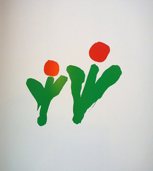
We came up with a simple idea: two flowers — a larger one and a smaller one — suggesting a parent and child, but also suggesting growth, development, and vitality.

But how do you make a mark look as though a child created it? The obvious answer is to go find a child to draw it. So we asked a few children to do the “child-like” drawing.
It was a complete disaster: the actual child-produced drawings were charming but did not look childlike at all.
We needed an adult’s version of a child-like drawing. But how do you achieve that? Another technique we tried was drawing and walking at the same time. We produced dozens of pages of drawings, but ultimately, success came with another old trick: switching to the less dominant hand, which is sure to produce a slightly imperfect and clumsy result.
And it worked.

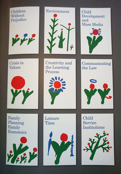
It was a versatile enough concept that we were able to create a series of variations upon it to go along with the different themes and focuses of the conference.

View more inside-spreads from Identify.
Published by Print Publishing, an imprint of F+W Media, Inc.


Comments
That non-dominant drawn clarinet is better than I could manage with my right (dominant)
I like the vibrant shade of red and green, it’s very fresh. They have also managed to create versatility with the final design.
However, I would question whether it associates with a parent and a child, to me it does after seeing the text and explanation, but if I would have seen this outside somewhere I do not think my first thought would be ‘adult’ and ‘child’.
The idea of switching hands to make a child-like sketch was interesting and a quite creative way of achieving what they were looking for.
For me this is great and perfectly shows why I child can not do a “work” destinated to another child or something to look “childish”, just think about cartoons, comics and stuff; all made and ideated by adults.
It’s an interesting mark but I am with Damian and Jr. R, at first view I thought they were a pair of Tulips, it’s not until it’s pointed out that it’s parent and child that I understood. However I like how the mark was produced with the left hand, left handed drawings give great results.
As a 10 year old from Atlanta Georgia, I was invited to attend the 1970 White House Conference on Children. I remember distinctly my name tag had this 2 flower logo on it; in fact I kept it for years, but ultimately lost it. Stumbling across this article and seeing the logo again after all these years brought back the great memories of the conference, touring the Smithsonian, the White House, and even meeting President Nixon. It was a simple but memorable design. Thanks for the memories.