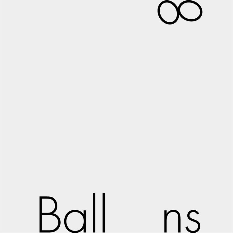
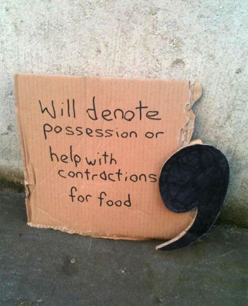
Ji Lee’s short description:
“This project started nearly twenty years ago as an assignment in my typography class at art school. Students were encouraged to see letters beyond their dull, practical functionality.
“The challenge is to visualize the meaning of a word, using only the graphic elements of the letters forming the word, without adding any outside parts. The challenge was hard, but the reward of ‘cracking’ a word felt great. So this became a lifelong project for me.”
The wordplay idea isn’t new (see Tom Geismar and the late Ivan Chermayeff’s Watching Words Move from 1962), but it’s a light-hearted project that might inspire you to merge the appearance of other words with their definitions.
More of Ji Lee’s here, though I think I chose the strongest.


Comments
Nice work. We did the same exercise at college back in the early 90s based on the ‘watching words move’ job by Robert Brownjohn.
Here is a link to Brownjohn’s work: http://robertbrownjohn.com/featured-work/watching-words-move-4/
Interesting. I know Brownjohn was a partner with Chermayeff and Geismar but I didn’t know whether this was his work as the published book’s credited to Ivan and Tom.
Some of the work’s by Daniel Carlmatz.
Love these. Some of these would work incredibly well for logos, while others are just fun to look at.