Leading designers from around the world submitted their strongest work for display in a variety of venues, and a number of designers gave talks about their work and the future of logo and identity design.
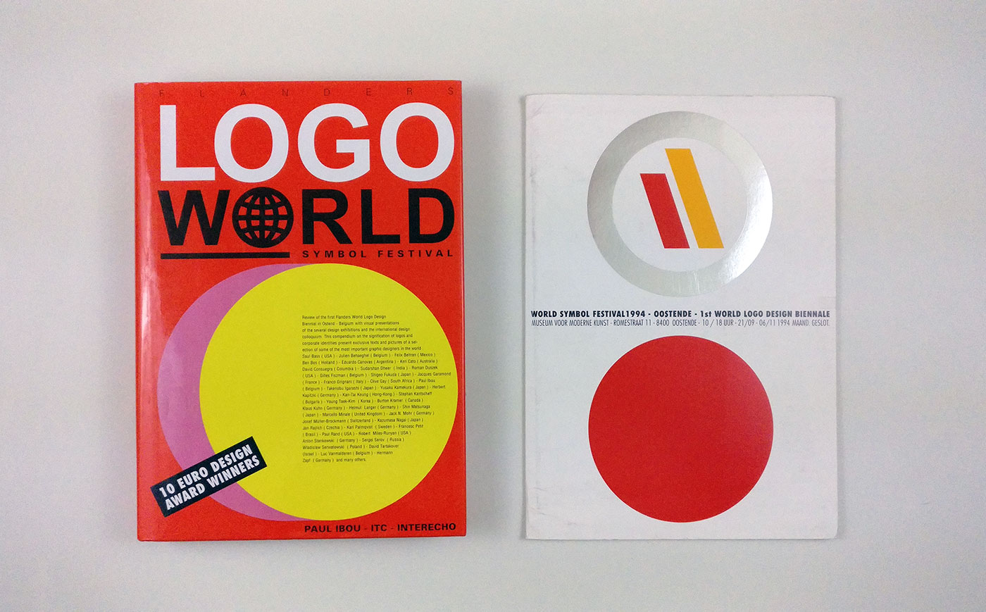
While there’s not much detail of the event online, the Logo World book was published soon after as a form of historical record of what took place.

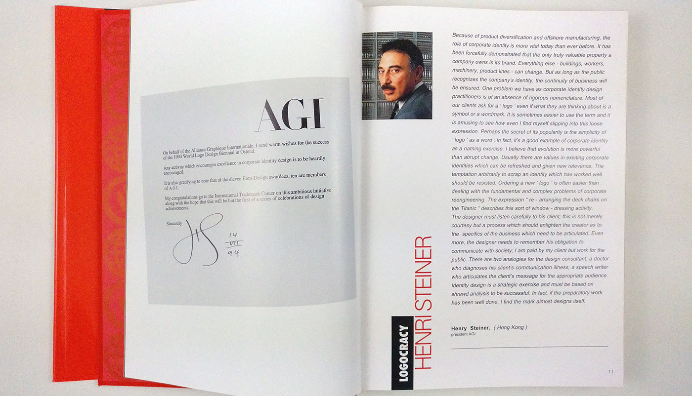

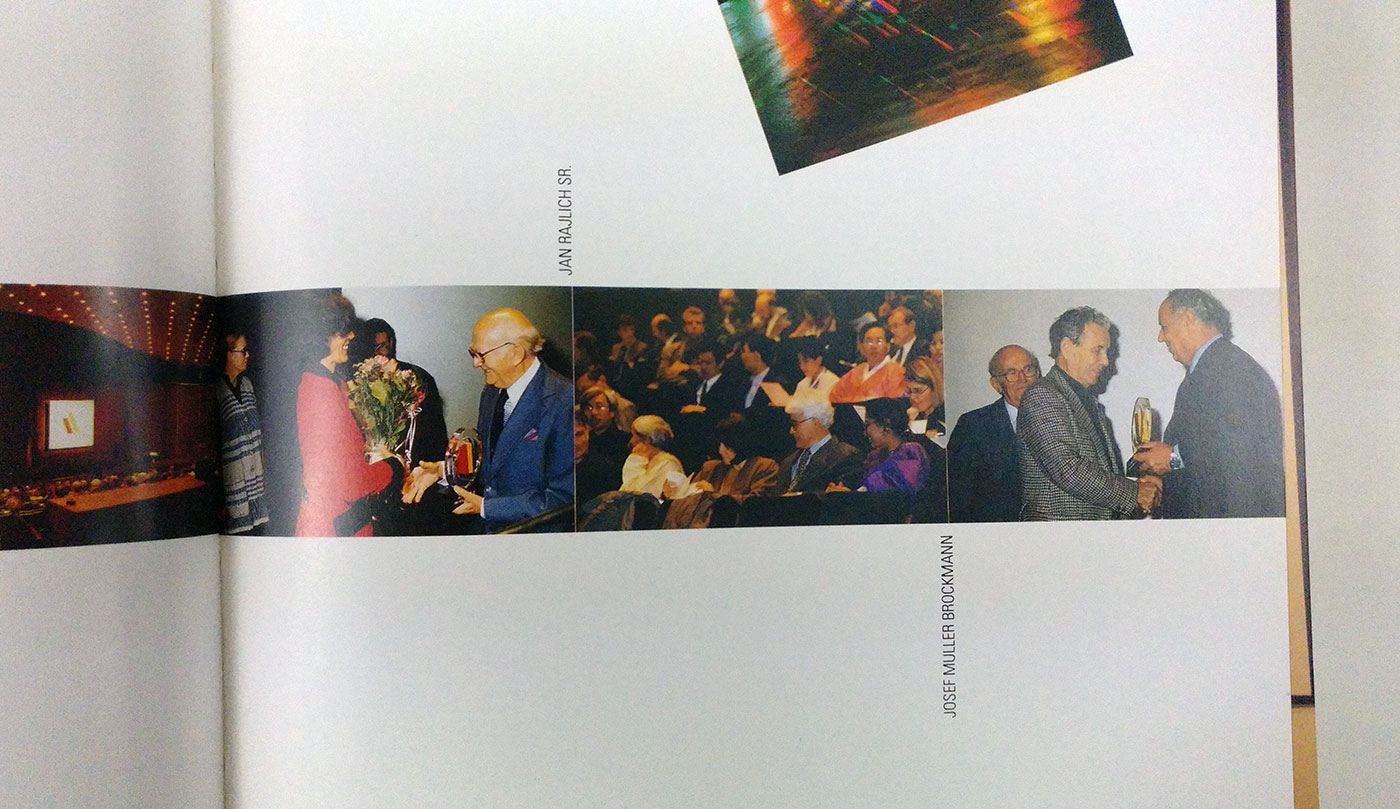
The first Euro-Logo-Design Award was held in the presence of members of the European Commission, members of the Belgian and Flemish Governments, the mayor of Ostend, the Governor of the province of West-Flanders, representatives from international design organisations, members of the press, and others. The award was presented to designers who were considered pioneers in the field of graphic design, particularly logo design and corporate identity. The ten winners in 1994 were Anton Stankowski, Franco Grignani, Jacques N. Garamond, Josef Muller-Brockman, Paul Rand, Yusaku Kamekura, Stephan Kantscheff, Hermann Zapf, Jan Rajlich sr, and Saul Bass.



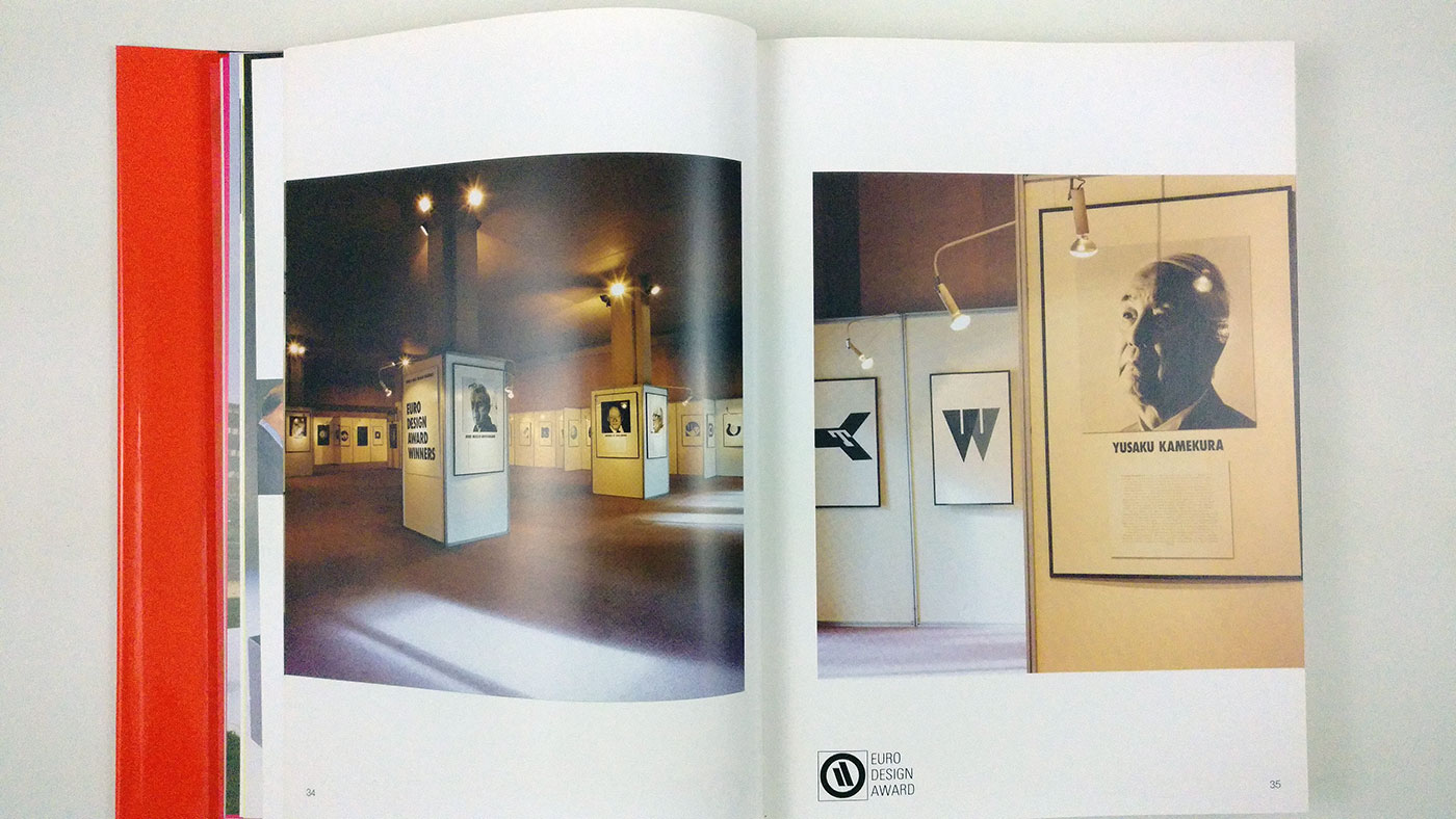
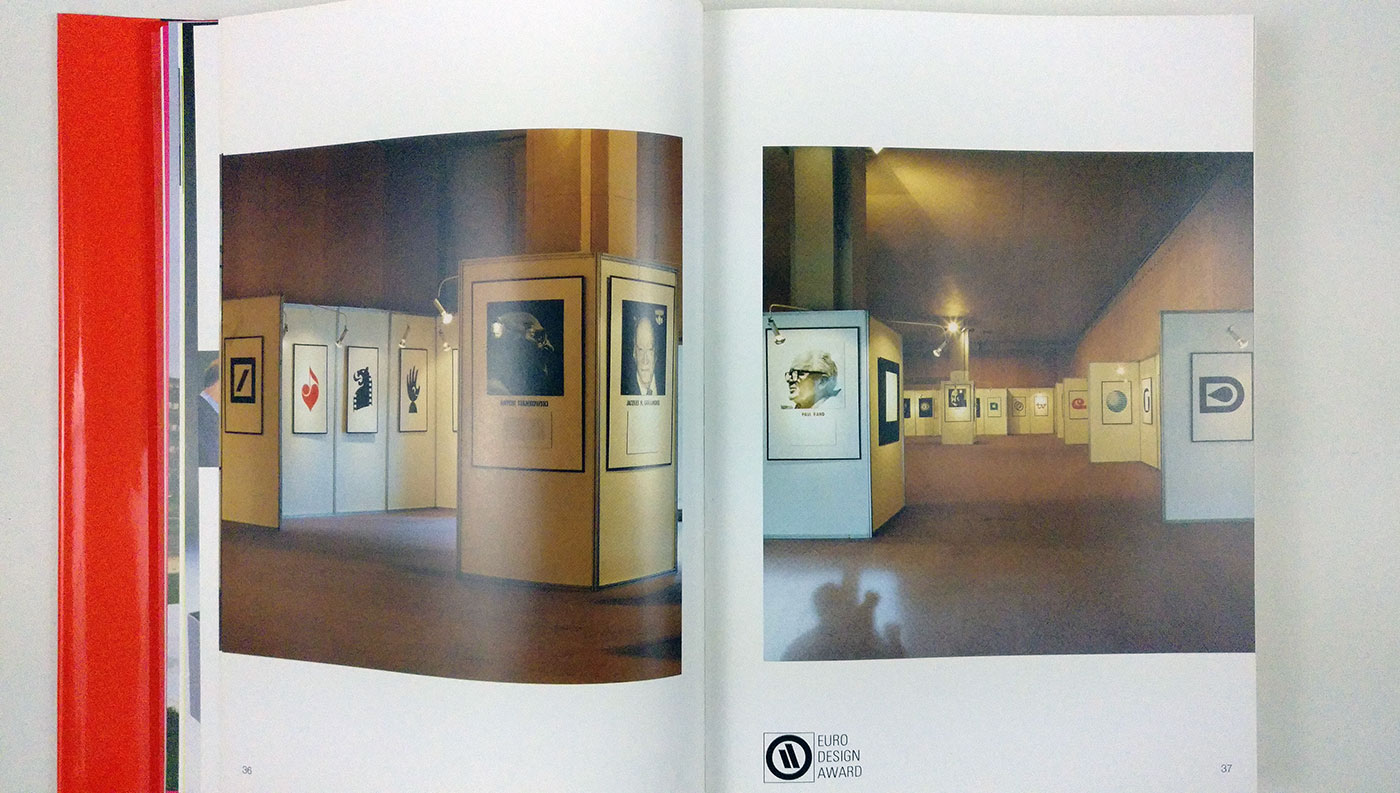
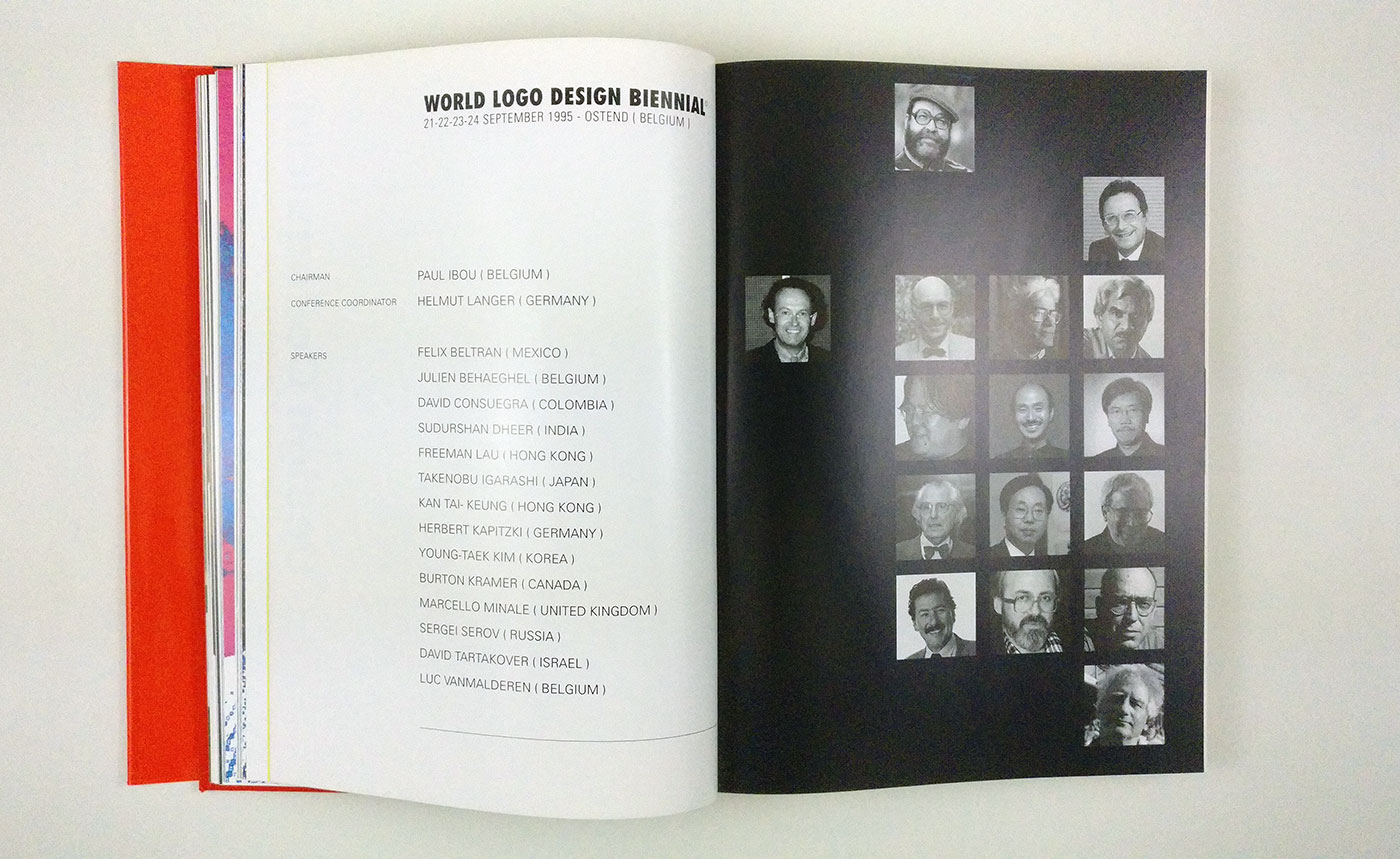
Speakers at the event included the likes of Félix Beltrán, David Consuegra, Burton Kramer, and Marcello Minale, with design contributions from Alan Fletcher, Paul Rand, Saul Bass, Hermann Zapf, and many others.

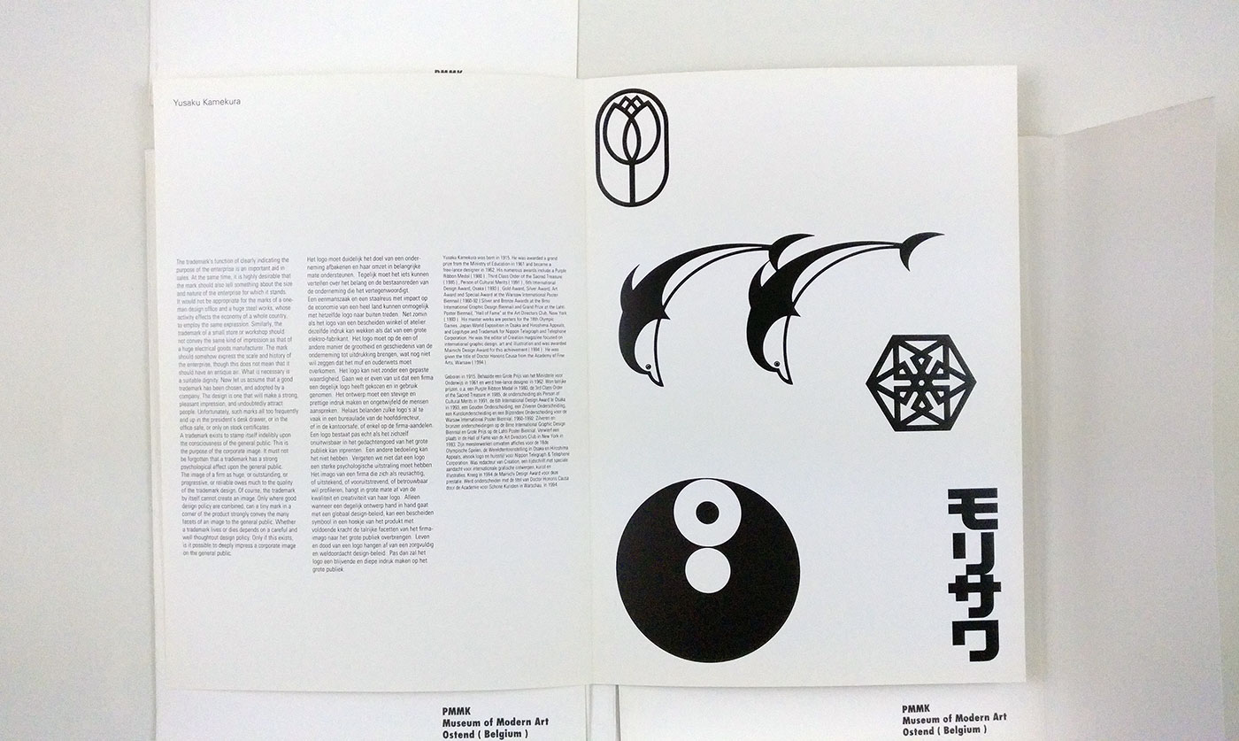
“The trademark’s function of clearly indicating the purpose of the enterprise is an important aid in sales. At the same time, it is highly desirable that the mark should also tell something about the size and nature of the enterprise for which it stands. […] A trademark exists to stamp itself indelibly upon the consciousness of the general public. This is the purpose of the corporate image.”
— Yusaku Kamekura
As Paul Ibou was also the founder and president of the International Trademark Center (ITC), he was able to collect an enormous amount of logo submissions from renowned names in the profession. This helped with a range of logo design books Paul went on to publish (Famous Animal Logos 1 & 2, Banking Symbols 1 & 2, Art Symbols, and others).

One of the festival exhibitions was that of Letters as Symbols, pictured above. It was based on one of Paul’s earlier book ideas from 1991.
Thanks to Paul and fellow Belgian designer Christophe De Pelsemaker, the Letters as Symbols book is now available for backing on Kickstarter.
“When talking about logos, they should neither be linked nor limited to a specific culture, but should be understood by people of different cultural backgrounds, worldwide. A logo should be independent of most standards and be accessible to anyone, irrespective of education or level of intelligence. In fact, a logo that is created for a company or organisation is intended to ease visual perception. The simpler the form of the logo, the more effectively it catches the human eye.”
— Paul Ibou


Comments
These books end up making all identities look the same. The skill of a designer is based in real world context, not how a logo looks in a design book on a white page.
In my opinion the design of symbols is an incredible skill. While you’re right it’s only one tool in the branding toolbox, books like this do exhibit the skill of the designer within that niche. The real world context shows how successful the design is in its implementation; a different skill from creating the symbol itself. All these skills hold hands within the process of creating great identities, and there are many others too, but this book and conference (and website) celebrate the skill of logo design—pure, plain and simple.
I agree, the design of a symbol or logo is a skill. But designers create branding to solve a problem, for a client and their customers in the real world, in context. I’ve had work published in a few of these design books over the years. But when I design a logo or packaging, it’s always designed in context and has in every design company I’ve ever worked at.
Woah, some inspirational work here.