When the World Wildlife Fund (WWF) was being created in 1961, inspiration for the logo came from Chi-Chi — a giant panda that arrived at London Zoo that same year. Aware of the need for a strong, recognisable symbol that would overcome all language barriers, WWF’s founders agreed that the big, furry animal with her appealing, black-patched eyes would make an excellent logo.

British environmentalist and artist Gerald Watterson played a key role in the original panda logo by producing the initial sketches.

Based on these, Sir Peter Scott, one of the organisation’s founders, drew the first logo, and said at the time:
“We wanted an animal that is beautiful, is endangered, and one loved by many people in the world for its appealing qualities. We also wanted an animal that had an impact in black and white to save money on printing costs.”
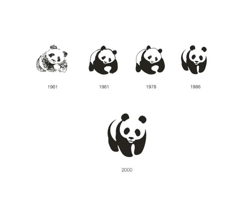
The strongest design improvement came in 1986 when the viewer was left to fill in the gaps in order to complete the symbol.
Jerry Kuyper kindly wrote-in with the following recollection:
“The firm responsible for the 1986 work was the San Francisco office of Landor. Tom Suiter was the creative director, I was the design director, and Jenny Leibundgut was the primary designer.
“Prior to our work, WWF was using two different pandas, one in the USA (a colder, more geometric version of the 1978 version) and one for the rest of the world.
“As I remember, our working attributes were: not too cuddly, not too ferocious, and most certainly, not about to go extinct.
“We looked at a dozen ways to add details to the eyes before realising the obvious — the solid black shapes were the most engaging and open to interpretation.
“It is very gratifying to see that the mark has lasted 25 years without the addition of any swooshes, glows or reflections.”
The black-and-white panda has since come to stand as a symbol for the conservation movement as a whole.
Watch Pentagram partner Angus Hyland talking about the WWF logo (and the classic Penguin logo) in the video below, from a recent talk in London’s Design Museum.
References:
WWF in the 60s
Panda conservation


Comments
Thanks for sharing that, very interesting article. That logo-mark has truly been resolved to an almost perfect form, probably won’t need revising unless the species unfortunately becomes extinct.
This is one of my favorite logos of all time! Thanks for posting the story and sketches behind it, David.
thanks for sharing… I love seeing the sketches & process. I try to save as many sketches as I can too. Nice to see logos that start off with a pencil instead of a mouse :)
This must be one of the most recognizable logos of all times.. I’d never come across an article which discussed the evolution of the Panda.. Thanks for sharing this!
The ’78 version really stands out to me because it looks like the panda is hugging the world. I know this goes against the one thing in a logo principle, but a combination of the ’78s use of hugging the world and the ’86s use of negative space jiggery pokery would be an interesting concept.
Love the original sketch though and nice to see the progression of the logo from it’s conception through to present day.
Still one of my favorite logos of all time!
Such a great logo, it’s minimalistic qualities make it timeless so it continues to work just as well today as it did in 1986. The logo is friendly and makes the company approachable to people of all ages. The way the panda looks at you without even having eyeballs, creates empathy with the viewer. This logo is one of the greats and should be talked up more.
One of the finer examples of a logo utilizing a perfect balance of positive and negative space.
The firm responsible for the 1986 work was the San Francisco office of Landor. Tom Suiter was the creative director, I was the design director and Jenny Leibundgut was the primary designer.
Prior to our work WWF was using two different pandas, one in the USA (a colder, more geometric version of the 1978 version) and one for the rest of the world.
As I remember, our working attributes were:
– not too cuddly
– not too ferocious
– and most certainly, not about to go extinct
We looked at a dozen ways to add details to the eyes before realizing the obvious – the solid black shapes were the most engaging and open to interpretation.
It is very gratifying to see that the mark has lasted 25 years without the addition of any swooshes, glows or reflections.
One of my favourites, too. Thanks all for reading/commentating.
Jerry, great addition. I’ve updated the post with your comment and a link to your site.
Now THAT is a brand image that has evolved beautifully.
The 1986 update was amazing, look how well it’s stood the test of time, it still looks ‘modern’ today!
Love it.
Love this logo… though I’ve always thought it looked like Panda Express (the U.S. fast food/chinese chain)… or vice versa.
I disagree on suggesting that the Panda has come to stand for the conservation movement as a whole.
That would imply that it wasn’t effective in being the brand identity for the WWF. Having worked with other conservation groups I do believe it is regarded as one of the most effective and endearing identities within the conservation movement.
Outstanding!!
Amazing and so often I’m told by designers and non-designers alike that this is their favourite logo Just received my copy of ‘Symbol’ by Angus Hyland!
Having worked for local WWF projects in Switzerland, that logo is burnt into my head that I can not understand how the Chinese fast food chain “Panda Express” gets away with almost a copy of the WWF logo… It hurts to see a fast food chain “mis”-using the Panda bear in their logo.
As part of the Landor team that created the WWF logo, I also cringe at Panda Express.
But this makes my blood boil:
http://www.logodesignlove.com/wwf-panda-logo-just-69
While the panda symbol is a truly iconic design that has proved the test of time and trends – the logotype below seemed inferior. It was based on the Times font and felt as if it didn’t share the same graphic language and quality of the symbol.
In 2000 I had the opportunity and privilege to be part of this story by design ‘matchmaking’ between the symbol and letters (and subsequently creating new brand guidelines). I was working at the time for Enterprise IG (now Brand Union) in London.
In order to create a more balanced and homogenous composition, it was important to understand and transfer the visual character of the illustration onto the letterforms. This would not only homogenise the pairing but give more personality to the initials. While the contrast of strokes was kept, they were made bolder, the serifs were taken off and replaced with rounded corners ‘borrowed’ from the symbol. As a result, the new found harmony made the overall logo more modern and friendly – just in time for the new century.
In 1976 I worked at Corporate Design Systems in Boston. My boss and I each designed a version of the WWF logo. Mine was preferred by WWF and it was accepted. My boss was not happy and I was fired shortly after. We also designed their annual report and other media that used that logo. Landor did a wonderful job of updating it later on.
And the Landor 1986 version added the key advancement: the “W” in the panda, which turned a drawing into a logo. Beautiful work.
My father designed the 86 version, Lansford Bouthillier, Boston Ma. Get this corrected. Thank you. Graham Bouthillier.
While doing research for my book on visual communication I came across a Panda symbol designed by a German designer in 1951 – a full ten years before Sir Peter Scott refined the WWF symbol from sketches. I was astounded to see the closeness in design style of the WWF 1986 (Landor) version compared to the 1951 version. What caught my attention in particular was that the German designer was based in England at the time and created his Panda version for a company in the USA.