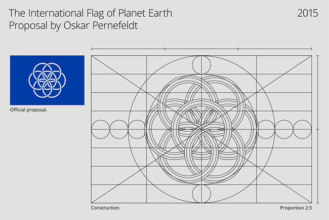
A nicely crafted insight into the construction of Oskar Pernefeldt’s International Flag of Planet Earth.
Animated by Johan Fredriksson, a designer at Forsman & Bodenfors, the flag design was part of Oskar’s graduation project while studying at Beckmans College of Design in Stockholm, Sweden.
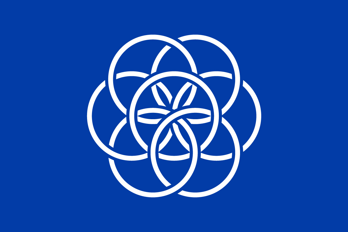
“Centred in the flag, seven rings form a flower — a symbol of life on Earth. The rings are linked to represent how everything on our planet, directly or indirectly, is linked. The blue field represents water, essential for life, and as the oceans cover most of our planet’s surface.”
Quoted from the project website.
The photo mockups were honed by a few folk from bsmart.


More of Oskar’s work at www.oskarpernefeldt.com.
Via Khoi.
Comments
Hats off to the designer. He’s got himself lots of publicly from all over the world, which is a fantastic achievement. From what I can gather, It’s not a serious proposal for a world flag, just an idea.
I don’t believe any symbol could unite or please a whole planet, especially one as divided in ideology, intent on destroying the one and only planet we have, as this one.
The problem isn’t the flag or symbol, the problem here is that we don’t know who it’s for, it’s purpose or it’s story.
Flags and logo’s work best when they symbolise the truth behind them, a cause, a purpose, something people want or love. They are infused with the brand they are there to represent.
I’m not sure who would want or love a world flag, no matter what it looks like.
Logo. Design. Love. ?
It’s a start. I believe his proposal is better than anything else we’ve previously seen. Furthermore, humans need symbols to conceptualize different concepts and put them into reality in time.
The flag definitely should not represent our planet because between those circles which only want to trick you, making you think that it is The Flower of Life (Flower turned 10 grads to right or left to fit the first dark thought) is hidden the sign of devil formed from two triangles, which together form the sign of Evil.
I’m pretty sure that wasn’t the designers thought.
Well, I’d want it for one, and I love it. Because it does have a cause that it represents. Unity. Who can’t get behind that?
I love this. A 🌎 world flag is amazing. Please let’s fly this flag everywhere. It’s beautiful ❤️
Hello there, I think its better to use a global flag than having different flags as different species because this divided us in to pieces and makes us weak and small, so as Human Race and as we are the ruler of this planet we shouldn’t let this divide each other as a continent or maybe as a citizen of a powerful country or maybe poor and unlucky people.
I think we must live and think as one or we should find something to gather or collect us as people who belong to the One And Only Creator Of Everything.
So that was my thought. I might not be right and I am not good at English but try to understand my words.
An interesting idea, but, according to me, not a very creative design.
Maybe we should spend our efforts uniting the world before we put the cart in front of the horse and design a flag.
I hate to break it but, I think we should include some green, as this flag looks like it is for NATO astronauts. I can see what you are aiming for, but that specific shade of blue just so happens to strongly associated with the west, and it feels a bit ignorant to exclude the rest of the world. I think it would be better to include a lighter green, symbolising the great forests of our planet, the white showing our icy north and south, And the blue representing our great oceans.
Interesting point. I disagree and pose that the world would unite easier with the ability to rally under one flag for humankind on earth. Think of the flag as a tool or platform to stand on.
I find it odd how there’s no mention about ‘The Flower of life’ (part of it anyway) or what this symbol actually represents since ancient times, or about Sacred Geometry. He talks about the Golden Ratio but does not mention how this ratio, that you can find everywhere in nature, is actually derived from the geometry of the Flower of Life.
I don’t mean to overthink this but if we’re using symbolism to find a symbol that represents THE WORLD, isn’t overthinking it necessary? It’s like ignoring the pink elephant in the room.
Imagine the symbol was a swastika, or something closely related, and the author would just say it’s just 2 intersected lines that represent whatever…
Do we just respect the subjective view of the designer or do we go into details with the symbolism?
I’m glad someone picked up on it. It’s literally a plagiarism of sacred geometry but at least it’s for a good cause like uniting earth.
Very reminiscent of the original Epcot Center logo from 1982, which still looks good today. The Epcot logo had 5 rings not 7 and the circles were a little heavier but it is the same concept with the circles creating a flower.
Great idea. If it gets just a few people starting to think outside the box it will have accomplished its goal. If a few tell a few others, well, that’s how movements are born. Don’t over think it, just do it!
It looks like the Flower of Life, the root of all things. I like it very much!
It’s the presentation I liked most, from the video and commentary to the website and imagery. Student projects are so much more professional than what I created. A world symbol would never please everyone, but as Lee says, fair play to Oskar for catching attention.
I dont think it can ever work as a flag, a flag should be something super easy to recreate, I remember drawing flags at kindergarten and I dont see this as something children or a lot of adults can retrace quickly and simply, even it being white over color is a problem for this.
The US literally has a flag with 50 little stars. Millions of kids draw this flag, yet almost none of them include 50 perfectly drawn 5 pointer stars. Too simple could dull such representation. Overcomplication (think Saudi Arabia’s) could be prohibitive. This seems like the ideal middle ground. It would also educate young students on the meaning behind such an object, which would benefit all of us.
The concept of a world government and flag really doesn’t make sense without the context of other civilizations outside of earth. I can imagine 2-3 competing superpowers on earth, but total unity like the pictures in this post suggest will probably only be achieved when the entire planet is referenced as a unit to another one.
I also think this logo shows us how logo design can also be art.
I love this – I have a personal philosophy that I drew up as a seven petalled flower a few years ago, so this resonates.
Mine is: cleverness – me (I am – ego) – patience – love – obsession – guilt-free – future
Cleverness: is knowing you still need to learn, stupidly is knowing you are clever. Arrogance keeps us stupid!
Me: the most important part of any life, for you cannot live for anyone but yourself.
Patience: in all things is a virtue for virtuous things are possible if done with patience.
Love: in all things is essential, as nothing that is not essential can come from love. Love is necessary because it binds us together.
Obsession: is needed in everything we do, if we don’t get completely involved in what we are doing, then we do it halfheartedly.
Guilt-free: is to not do bad, but do things with love and care.
Future: future is where you always need to be heading, what has happened is not of consequence, only events to come. Time is not important, only the events in time (the moments).
It’s amazing what you can accomplish with a little creativity… and a professional advertising firm. I’m confused, though, why NASA withdrew their support for the flag.
Same idea here.
And been using for a while, not really the newest idea, but clearly a good execution.
Everyone is using the “seed of life” symbol… I don’t think this is a particular unique idea that stands out from the crowd. It just looks like cliche of the very common symmetrical symbol. Adding perspective and links is still taking the essence from “seed of life”.
I would like to see a picture of the globe in the centre just like it appears from space. It could replace any country’s flag on the moon.
I love this design and hope it achieves its final goal. It is the perfect middle ground from oversimplification (draw Earth on flag) to overcomplication (invent a completely new symbol with no common precedence on Earth). Let’s move forward.
It seems to me that a picture of the earth from outer space would make more sense.
If the flag is to suit a purpose, it would be to greet visitors from outer space. What they think about us could be represented by the physical reality of the place we live.
I’d like to see all the critics designs.