

Here’s the accompanying promotional video. The design’s still fresh, and although my editing skills aren’t anywhere near as good, the video’s a bit jumpy for my taste.
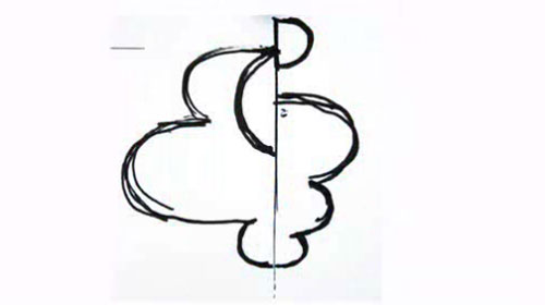
There’s something about logo sketches I find much more interesting than the polished, digitised outcome. These are from Moving Brands‘ 2008 project for Swisscom.


Here’s the accompanying promotional video. The design’s still fresh, and although my editing skills aren’t anywhere near as good, the video’s a bit jumpy for my taste.
Comments
I am with you – Sketches always seem to carry more energy than the polished designs. Kinda wish a rough sketch logo worked just as well for branding, with those stray lines, spills etc. By the way, I really like using watercolours in the design process. I will make sure to put it to use.
Thanks for sharing.
I am absolutely in awe of the extensive process Moving Brands goes into. Sometimes the visual result doesn’t always reflect the time and energy spent but I feel that this particular project does.