In 1964, the Design Research Unit — Britain’s first multi-disciplinary design agency founded in 1943 by Misha Black, Milner Gray, and Herbert Read — was commissioned to breathe new life into the nation’s neglected railway industry. The corporate image of the railway had remained largely unchanged after its nationalisation in 1948, a reflection of a largely disjointed and out-of-date transport system.

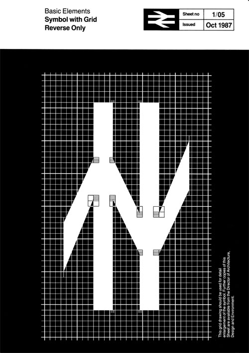
“The company name was shortened to British Rail and Gerry Barney of the Design Research Unit conceived the famous ‘double-arrow,’ a remarkably robust and memorable icon that has far outlasted British Rail itself and continues to be used on traffic signs throughout the United Kingdom as the symbol for the national rail network and more specifically railway stations on that network.”
Quoted from Nick Job’s fascinating website devoted to the double-arrow. Just look at the amount of detail in the manual section. Brilliant. Right down to the uniforms to be worn by the British Rail Catering Refreshment Room Staff.
Related:
D&AD 50: 1966, British Rail, on CR Blog
Another British classic, British Steel, on LDL
Via Iancu Barbărasă.

Comments
Such an iconic, instantly recognisable logo.
L.O.V.E. it!
Always loved this logo – generally – but what always bugged me about it was that the lines forming the middle diagonal are parallel, but the ones for the outer diagonals aren’t, and are more fluted – which for me means each arrow (ie the full form pointing right, and the one pointing left) isn’t symmetrical.
Or is it just me?
Ah no – it’s me – i just noticed, they’re not parallel in the middle after all.
As you were…
Thanks Andy, you just ruined this logo for me. All these years, I thought I liked it.
A lovely strong identity. The fluted diagonals work beautifully to compensate for the visual weight and unbalance that would otherwise be caused.
“British Rail” in the blue-grey box looks elevated. Is that to suggest it’s riding on tracks? If so, I think it’s clever.
This logo reminds me a lot of the Dutch NS railways logo :)
I think it was the 1970s when the logo was referred to as the “arrows of indecision” by critics of British Rail.
Chauvinistic as I am, I’d like to point you all to the Dutch Railways logo.
http://commons.wikimedia.org/wiki/File:Logo_NS.svg
Truth be told, it was introduced three years after the BR-logo.
Once while waiting for a train at Kings Cross,I spotted a BR railroad worker sporting a Brit Rail logo pin on his lapel. After I admired it, he gave it to me; I still have after 30 years!
Such a classic!
Cant help noticing the similarity with the swiss rail (SBB) logo…. http://www.robin-hoffmann.com/wp-content/uploads/2009/07/sbb.gif
They had to use Helvetica? Ugh, next.
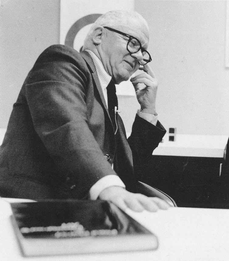
Gerry Barney is my granddad. He might be a great designer but he sure is a dick-head. I haven’t seen him since I was seven.
It’s Rail Alphabet, not quite the same as Helvetica, but similar. Developed from the Transport typeface by Jock Kinneir and Margaret Calvert.
Yeah gosh, what was a transport system thinking using a clear, legible and instantly recognizable typeface?
I hate to throw a spanner in the rails, but Gerry Barney did not design this logo. He has been credited with it for years when actually it was originally thought up by a Mr Thomas William Edgar Roche who worked for UK immigration and was a devout railways enthusiast and author of numerous books – many about the railways of the United Kingdom. He was asked by the then head of the soon to be formed British Railways if he had any ideas for a new logo as they would need one for the new company. Mr Barney may have possibly refined the detail, but the original concept of two rails with arrows pointing in opposite directions was that of Mr Roche.
Why did the new logo for BRITISH Rail use the American spelling of “recognisable”?
Good spot Simon.
I actually prefer the dutch railways logo, feels more elegant, and with nicer white space.
Both great though.
This iconic logo reminds me of the double N arrow logo used by all National Bus Company subsidiary’s including National Expess.
Me too, Martin.
… classic logo and now super-nostalgic. I never noticed that the upper and lower ‘arms’ are fluted, as mentioned above. That seems like quite a quaint affectation now but was presumably groovy in ‘65. The central diagonal seems to have parallel sides, of course … thanks