
![]()
Sketches by Sunny Zheng.
![]()
Image via QBN.
![]()
Designed by Timur Yevtuhov.
![]()
Designed by Daniel Evans.
![]()
For Hospice of the Valley. Via Bill Heyman.
![]()
Designed by Austin & Company.
![]()
Designed by Jesse Bennett-Chamberlain.
![]()
Designed by Robin Kosnas.
![]()
Designed by ZeeBrands.
![]()
Designed by Pentagram for The Waterways Trust (more likely a duck).
![]()
Designed by Randall Museum.
![]()
Designed by Tom Balchin for Housing Justice.
![]()
Designed by Predrag Stakić.
It’s a popular statue/monument, too.


Above images via Peace Monuments.
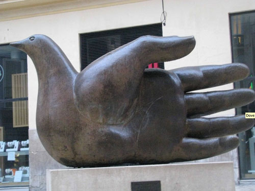
Photo by Andra Folks.
No doubt there are hundreds, maybe thousands more. Not that it’s a bad idea, but when the idea comes, be extra careful the design isn’t exactly like another.

Comments
Another one: http://img.artlebedev.ru/everything/rtcomm/identity/rtcomm.gif (designed by Art. Lebedev Studio)
Thanks for the post David. The diversity of the solutions illustrated show that it is possible to create a distinct design from an unoriginal idea.
I particularily like ‘Freedove’ and ‘Coalition for Kids’.
A good reference for next time a design brief asks for a logo based on a cliched idea.
To paraphrase Hegarty on Advertising, John Hegarty: “A brief is either a friend or a foe. . . Is it a box or a platform? Too often we see it as a box”.
I really enjoy The Waterways Trust dove logo. It has a warm and comforting feel to it and it stands out from the other dove/hand designs.
Something I did a couple of years ago for Sixpack Fr, a France based clothing company. http://www.harveynichols.com:8080/media/catalog/product/cache/1/image/700x/9df78eab33525d08d6e5fb8d27136e95/3/8/383153_3.jpg?isAjax=true
I’ve heard it said that all logos based on the hand fail. I prefer not to use them.
I’ve heard a variation of your advice somewhere else but I can’t remember where. It was pretty much along the lines of: if you’re working on a design and immediately come up with a great concept, you should think about it for a while, it could be that you’re recalling a design that you’ve actually seen somewhere else.
That being said, I think the first monument with the shadow is pretty cool. I wonder how the dove looks as the shadow moves throughout the day.
Dove Financial is my favorite.
Never realized how ubiquitous that design combination is. I wonder why… on another note, @miles do you know why logos with hands tend to fail?
Love the examples, but the Waterways Trust bird is clearly a duck.
In some cases, the brief demands the exact use of some symbols. For instance, St. Francis’ attributes are the bird, and because he also had stigmatas like Jesus, the hands as well. Sometimes you simply cannot go around overused “ideas”. But you can really stand out from the flood of designs with a distinctive one, as Brian stated.
These are all quite well thought-out!
I think all these designers deserve a big “hand”!
Pun intended!
I’m with Natasha…I had the same reaction instantly (wondering how it would appear throughout the day. ) Then I wondered if a logo design could be effective using that shadow puppet concept. (I think not but then…….)
To be avoided if at all possible. An unimaginative cliché.
Dove Financial is my favourite as it is very unique to the other designs and uses a more minimalist approach so it doesn’t actually look specifically like a hand or a dove. The bronze sculpture is my least favourite as the hands coming from the dove looks quite creepy with part of the forearm in view too.
It’s overused for sure, but dove-hands nearly always look great don’t they? :D You can understand why designers keep doing it.
Thanks for the compilation of samples, useful to see all in one place, and enough to make most designers avoid this combo like the plague now, no matter how alluring it may be :)
Predrag Stakić pulled it off the best in my opinion.