
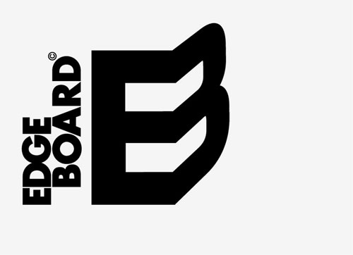
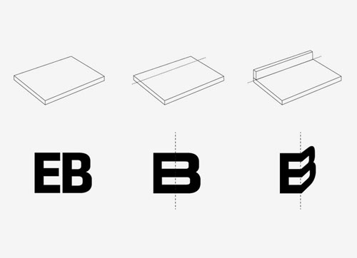
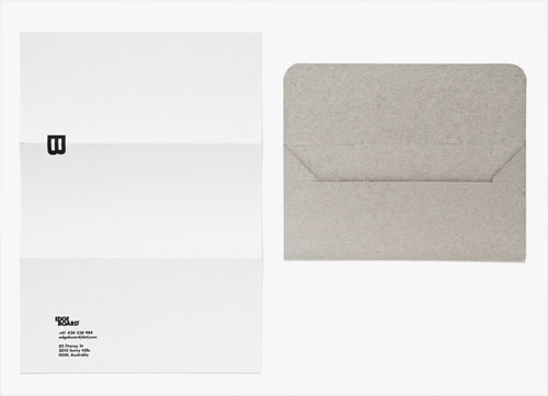
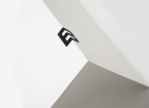
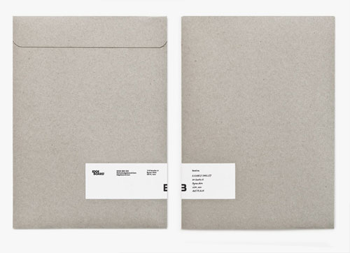
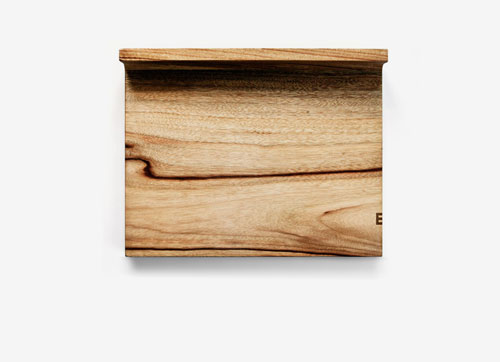
The identity is based on the board’s special feature, the edge, and the brand comes to life using the edge in any any application. A simple, structured logo is used in combination with textured and environmentally friendly stocks.


Designed by Hampus Jageland when at Maud.

Comments
Perfect identity for such a simple, functional product. The application of the logo on the product is spot on.
This is INGENIOUS. Probably one of the most creative logos ever!
It’s perfect and a thing of beauty.
This really is a perfect logo if you ask me.
This makes me happy.
Very nice and well done to the client for seeing the beauty in something so simple. If only all clients were like this…
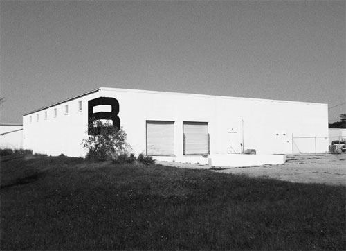
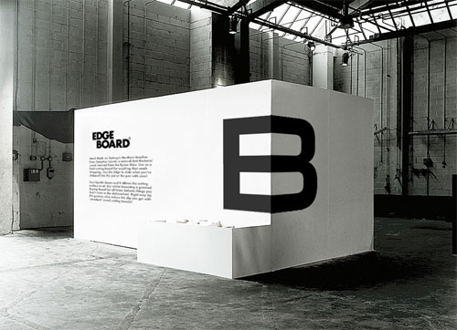
Brilliant. Love it! Love the display wall.
I love this! Beautiful design.
Wonderful work.
Simple and to the point! Love it … G.
Minimalism at its finest! Beautiful execution, and a fantastic concept overall.
Cheers to a job well done!
Simply brilliant…especially the way the logo is incorporated on the letterhead.
Such a simple concept that works incredibly well, love it!
This is just awesome; I’m sure, Jageland cried some tears of joy after crossing this concept, it’s timeless and just smart
Wow. Amazing execution! This is truly intelligence made visible.
Or EB = Elvis Benício (hehe)
Incorporating the name of the company literally into the logo, such a smart idea! It is simple yet so memorable. Brilliant!
I just saw all the comments on this post.
Thank you very much all! Appreciate your kindness.
H
we appreciate that you’re sharing your work with the rest of us :-)
This is such a great logo design when you see it in context.
Truly amazing, when I first saw it I got pissed of, because it’s just so awesome. :)
Reminds me too much of this. Should have used different type imo.
http://www.dailyrosetta.com/wp-content/uploads/2010/10/New-Balance-Logo-2008-300×300.jpg
I absolutely love this design.
It’s stunning in it’s beauty, elegant even.
I love how it is based on the “Edge” :)
Good work guys!
Thought that last image looked familiar, check out http://www.madethought.com/, recent projects; established and sons; 2005/6; image 2.
Nice project Hampus. I am all for using imagery to help show ones work off but make sure its as anonymous as you can. Made Thought are one of the most influential design agencies of our time ;)
Can you please tell me where i can find such envelopes? Are they recycled?