The design was chosen in a competition won by a teacher at one of the country’s Indian Institutes of Technology. Uday Kumar’s design was chosen from a shortlist of five and he was awarded around £3,500 in prize money. Interestingly, the short-list of five that was in circulation didn’t include the chosen option.

The symbol won’t be printed or embossed on currency notes or coins, but will be included in the Unicode Standard and major scripts of the world to ensure that it’s easily displayed and printed in the media.
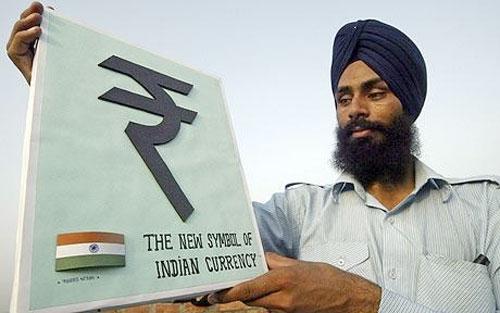
The symbol will also distinguish the Indian currency from some other currencies in the region, like those of Pakistan and Nepal — also called rupee.
Among currencies with distinctive identities, only the pound sterling has its symbol printed on the notes.
Reported elsewhere:

Comments
Some Euro notes have the Euro symbol printed/included:
http://www.fuertenews.com/images/20071003/euro_notes.jpg
Take a look at 5,10 and 20.
I really liked the design. there are 3 things to it. Secondly, It shows the front portion of ‘R’. It’s also had the “R” equivalent of hindi script. Third, it also has the stripes of indian flag. Well done!!
‘the short-list of five that was in circulation didn’t include the chosen option’… it does make you wonder what was going on behind the scenes, yes? Hopefully someone will enlighten us.
I’m surprised it looks similar to the one I preferred which was the third to last option from your last post on this. I say that because it doesn’t look like any of the ‘short list’. I like it. Hope it is successful for them.
If this symbol doesn’t included in the earlier top 5, how come it can be a winning design?
Very shady. But the winning design does look better than the short list there.
I am proud that our currency has joined the elite currency club. though it wont be printed or embossed on the currency notes. keyboard will be soon modified. I can’t wait to see that all. India has done really great to project its economical strength
With Regards
~Sanskar Shrivastava
I bet Gurpreet Singh is happy as Larry. But 1-5 are all pretty similar as is the chosen route.There isn’t a huge amount you can do with something like this. Out of interest, what do the other Rupee symbols look like?
I wonder why the chosen version wasn’t in the list? I would have picked that one also…
Every indian felt proud when govt launched rupee logo. some said it shows simplicity and some said logo is the combination of hindi varnmala and english letter and its true also. personally i felt logo is not the best but good. dont wana any more about logo because those who selected the logo are very intelligent. Am feeling proud now..
and is there a symbol esp for baksheesh?
I love the new Indian rupee logo… AWESOME.
Update : RTI (Right To Information) had already exposed that he is Non-eligible candidate for Indian Rupee Symbol Design Competition as he had violated the Indian Rupee Symbol Design competition guidelines .
According to guidelines one candidate could send maximum two design entries but he had submitted a total of four designs.
Second violation of guideline is the symbol itself, as it’s not applicable to standard keyboard or Unicode enable.
Violations are not stopping here according to information and broadcasting minister Ambika Soni “The new rupee symbol partially resembles the Devanagri ‘Ra’ and Roman capital ‘R’ without the stem coupled with two parallel lines – in line with Finance Minister Pranab Mukherjee’s vision for a symbol which reflects and captures Indian ethos and culture.”
But using roman script/English alphabet in designing the New Indian rupee symbol is also a violation of guideline according to the guideline “The symbol had to be in the Indian National Language Script”.
But according to National language Script English is not included in that list till this date.
All the above facts clearly show that his candidacy for the Indian rupee symbol competition has violated the guidelines which can be found http://www.saveindianrupeesymbol.org
I think case has also been field against this decision in India court.
Will need to remove the upper dash on the official logo…. it is tough to write the symbol otherwise and also looks ugly when hand written….
Wow what a nice symbol it is awesome symbol..i am proud that we have got such a nice symbol…and hats off to the founder of the symbol.
How can we type the symbol of Rupee from Microsoft Word or Pagemaker?
The new Indian rupee logo is really very awesome. When it comes to the keyboard, the dollar symbol is modified to India rupee to key word, so very easy use to directly Indian rupee not by any shortcuts.
Historical improvement……….
Delhi HC Allows RTI Activist To File PIL Against “Rupee Symbol Selection Process”
source- http://www.saveindianrupeesymbol.org/2011/06/delhi-high-court-allows-rti-activist-to.html