![]()
Association of Zurich Stationery Stores (from Graphis Annual 1955/56)
![]()
Electrolux AG Zurich (from Graphis Annual 1962/63)
![]()
Russell & Hinrichs Associates, a two-man design studio (from Graphis Annual 1967/68)
![]()
Dorey Design (from Graphis Annual 1967/68)
![]()
Polator Oy, a Finnish import/export firm, designed by Martti A. Mykkänen (from Graphis Annual 1965/66)
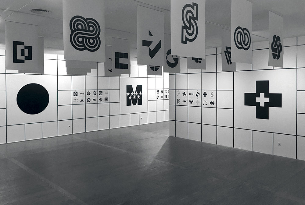
More in this Flickr set compiled by Sandi Vincent.


Comments
I love how bold these are. There is something so utilitarian about these that brings to mind a day when each object did only one thing…
Simple. Clean. Forceful.
Well said, EricMichaelSay… I agree.
Such timeless, simple and powerful designs for our generations to review and learn from.
Thanks David.
Looking at the Electrolux AG Zurich logo, is almost the same as the one on your logo design love book on page 26 ???
Great collection. I love the classic simplicity in these.
A great fan of these logos! I am the proprietress of a small stationery store in the Middle East and would like to use the first logo as mine (albeit with different colours).
Where can I buy the rights/get permission to use it? Any insight is highly appreciated. :)
Nodded off there, sorry. A very similar idea, Alejandro. I prefer this one.