
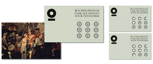
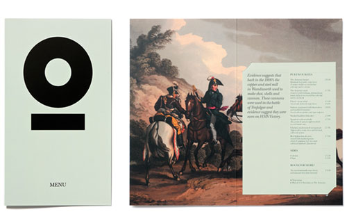
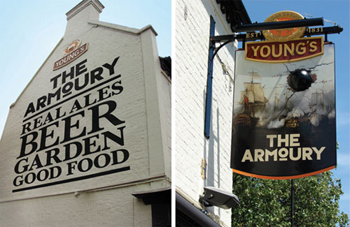
“Steeped in history, the new Armoury identity references cannons produced by the old local mill, whilst 19th century paintings set the scene for famous battles during that time. The new identity has been brought to life across loyalty cards, stationery, menus, signage as well as an iconic swing sign complete with a 3-dimensional cannon ball!”
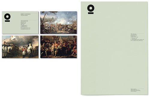


Designed by London-based Purpose for The Armoury pub.
It’s a good example of how a wordmark needn’t eliminate the potential for a stand-alone symbol, although the design idea is stronger when the brand name is shown.

Comments
Not sure which came first, but that logo is identical to Conservation International’s recent logo. http://www.conservation.org/Pages/default.aspx
Lovely. I think it could be in conflict with C&G’s Conservation Intl though.
http://www.cgstudionyc.com/newwork/conservation-international
^ Minutes apart. Hah.
It works nicely.
The icon has the sense that you’re looking into a canon. That’s powerfully memorable.
This identity is al about context. The canon in the sign is witty and fun, the targets on the loyalty card are great and I loved ‘open fire’ next to the er…open fire. I’m not mad on the circle taken out of context, it looks like lots of other things and feels a corporate. This is for a historic local pub after all, not a bag of cement. It’s the cleverness and personality that communicates that brings it alive. It would have been nice to make more of the type on the side of the building so it’s more like the old Ghost Signs. There are some really nice ideas in here that made me smile, something the elements surrounding an identity haven’t done for a while and are seemingly rarer these days as people climb on the CGI bandwagon.
As soon as I saw the logo in my Facebook feed, I immediately thought of a cannon barrel and sure enough, my thoughts were confirmed when I got to the full article. Identity accomplished, Purpose!
I too like it :)
I prefer the wordmark to the “O” used as an icon. I love the “M” it reminds me of the stripes on military uniforms. The canon in the sign is very clever, walking by I’m sure people would probably stop to see what its all about. I wonder what the ball is made of and how it stays in place?
The design of all the materials as a unit is awesome!
Yeah I like it. Very similar to http://www.cgstudionyc.com/newwork/conservation-international
though :(
I like it a lot too! I love that cannonball in the sign. So cheeky! It’s too bad about the similarity to the Conservation International logo, but I still think it’s a slick identity.
What a fab, simple yet striking logo! Love the rest of the marketing materials too, so fitting!
I love it. I don’t think it is really that similar to the Conservation Int. that people are mentioning. Sure, it has the o with underline, but that is a really simple part of the branding as a whole. The rest of it is what makes it stand out as great. Like Natasha mentioned, I like the M as it resembles military forms and the outside signage is phenomenal.
I love it too! I think the icon used on it’s own looks fantastic. I also enjoy the use of the old photographs in the identity- especially for a pub.
I love this! This may be one of the most effective and symbols I have seen all year. Truly inspiring. However, I do agree that the emblem out of context is not as effective. Either way this is amazing.
I think The Armoury identity came before the CI identity anyway to be honest…
The Armoury was around June 2010 http://www.purpose.co.uk/news/details/the-armoury-opens-with-a-bang/
whereas the CI one, I think, was launched around September 2010
http://identitydesigned.com/conservation-international/
I like the wordmark in general, but I am not as intrigued by the underlined circle on its own. It feels a bit too modern and disconnected to the look and feel of the establishment when it is by itself. The hint of the cannon could also be played up a bit more with a slightly different font choice.
Really like it, but for those wondering about the genesis of that ‘icon’, it’s simply the lowercase ‘o’ of that particular font (Typeface Six by Neville Brody)
http://www.fontshop.com/fonts/downloads/fontfont/ff_typeface_six_seven_ot/
Now THAT is what I call a coherent, clever and well implemented brand. Love the cannon ball in the sign, the nicely sign-written end wall and the hole-punched loyalty card. Wit and intelligence in equal measure. Nice one Purpose.
Excellent work particularly the way its been used on supporting material.
Love the fun of the sign outside the pub too.
I love this logo and the art that supplements it. It’s hard because a lot of people now expect our old pubs to sport ‘grab a pint’ lad language because that’s how so many have been marketed. Personally I hate pubs like that and can appreciate the modern mixed with old to tick a few boxes.
This underlined o seems to be an all new trend, check out the Luxembourg-based professional cycling team Leopard-Trek: http://www.leopardtrek.lu
By the way, the latter would deserve an article here on this excellent blog!
I pass this pub often, and I always admire the logotype.
This is just great. I wish all my brewery clients were as open to this type of approach as this one. The pictorial image in particular is very well realised and executed :)