

John Langdon designed this logo for Aerosmith.
“Created to be a gift from Dan Brown to Stephen Tyler. I was able to retain the look of Aerosmith’s long-standing logo, while turning it into a rotational ambigram.”
John has written some great tips for those wanting to create their own ambigrams, referenced in the resources below.
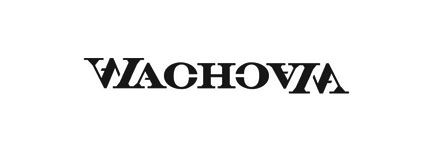
More info about Brian Risk’s take on the Wachovia logo.

Balance: a personal design from Agency26.

Edge logo, designed by Raja Sandhu.

The Ann logo was designed by Kevin Burr of Ocularink.

Designed by Phil Gibbon, this one’s a mirror-image ambigram, for the car made famous in Back to the Future.

For the band Nine Inch Nails.

Logo for the iconic group, ABBA.

Logo for the French clothes manufacturer, NEW MAN, designed in 1969 (source) by Raymond Loewy. This was one of your favourite logos, featured here previously.

Blacksmith website. Thanks, Steve.

The Society 27 ambigram is a personal project of Pavel Pavlov.

Not quite an ambigram, but this one for Truce Vodka is interesting nonetheless, by Turner Duckworth.
For those travel-loving logo designers out there, how about this ambigram mug?

Available from Flipscript.

I found this beautiful labyrinth design in the ambigram Flickr pool.

Wishing you all a very happy Christmas with this ambigram from npgraphicdesign.
Ambigram resources
- John Langdon’s ambigram gallery
- Advice on learning to create ambigrams, from John Langdon.
- Inversions, by Scott Kim
- Ambigram Flickr group, currently over 1,700 images.
- 10 great ambigram logos, from Alec Rios.
- Flipscript ambigram products, and the PRWeb news story behind how Flipscript started.
- Love / amor optical illusion.
- Ambigram’s by nagfa — Naguib and Fadilah have clearly done this before.
Posted . Updated .
Learn how enduring logos are made in Logo Design Love, third edition.


Alec Rios,
Thanks for the link, David.
I hadn’t seen the “Truce” one before, but I love the style. A while back, I made a similar ambigram using the negative space to create a new word when rotated 180 degrees. Really cool effect.
Kristen,
One of my faves is the 20th anniversary logo for The Princess Bride.
George Ryan,
They’re all very cool, although the only one that I like as a logo is the New Man logo. Quite a few of the others seem to be more “art” than something that should be used in a commercial application, simply because I was getting a headache looking at them, especially the Aerosmith one. Nice list!
Jaime Guadagni,
great post!
here are a couple ambigrams I did a about a year ago.
found on http://blogcooler.blogspot.com/2008/12/ambigrams.html
penflare,
one word: breathtaking.
absolutely brilliant logos, all amazing – thanks so much for sharing david.. i think my favorite is either ann or aerosmith
thanks!
Alex Charchar,
Nice post :)
I once spent a week or so working on an ambigram (that i ended up using on a business card for some fun and to run a press, not for a legit use really) and it was one of the most challenging but rewarding pieces of work I’ve ever spent my time on.. it’s not too hard to get a grasp of the concept and the kind of shapes that’ll work, it’s in the fine tuning, over and over, that things get interesting.. especially as it wasn’t the same word both ways (it was create/beauty)..
I agree with George that you wouldn’t really use any of these in a commercial application, but I think in designing one you learn a lot about letterforms and how to compress an idea to its elegant core — something that comes in handy when working with logos?
Nice post David :)
Roy Smith,
Another quality post, David. My favourites are edge, ann, blacksmith and truce.
Pablo,
Nice compilation. :-)
My two cents: http://dengueanguap.com/
Eric Roberts,
An ambigram I created of my nickname “Aken”: http://www.flickr.com/photos/akeninc/2547614982
David Airey,
Great addition, Kristen. I wasn’t familiar with it.
Alec,
Have you tested Flipscript? It’s superb how it combines two words into one, with rotation showing the difference.
George,
Raymond Loewy was a fantastic designer, and his New Man logo is certainly iconic. I agree that the Aerosmith option wouldn’t be ideal for brand identity. It does take a close look to decifer the letters.
Jaime,
Thanks for the kind mention, and for sharing a couple of your own ambigrams. I hope to experiment with my own designs quite soon.
Sean,
You’re more than welcome, my friend.
Alex,
From my short experience, I think you sum it up well with the ‘fine tuning’ term. Thanks.
I’m pretty sure George doesn’t think all these ambigrams are unsuitable for commercial use. I find the following ones particularly effective: Nine Inch Nails, ABBA, Edge, Ann, Delorean, New Man.
Roy,
Glad you think so.
Pablo, Eric,
Superb additions. Thanks for commenting.
Rambal,
Nice Collections. I love Aerosmith, Blacksmith and Raja’s Edge Ocular Ink’s ANN.
Specially, now only I came to know that ‘ANN’ is an ambigram.
Thanks a lot.
Rob,
Paul McCartney had one for his 2006 album.
Michel Thomé,
Hello
My personal logo is an ambigram too : you can see it at the top of my professional website (www.michelthome.com) or here http://photos-d.ak.fbcdn.net/photos-ak-snc1/v790/164/79/633538228/n633538228_500611_6668.jpg
Greetings from Belgium,
Michel Thomé
Al Woods,
Brilliant!! Never even knew that about the Aerosmith logo.
I love stuff like this, shows the extra mile taken in the logotype design rather than just picking a suitable font and running with it.
Kinda shows that sometimes the simplest of designs can have a deeper twist to it.
Definitely one to try out in the near future.
David,
hi, i can also remember the brand oysho, the division of Zara for underwear:
http://www.oysho.com/es/
great ones
best regards
inspirationbit,
I love clever logos, and the ones with ambigrams are definitely at the top that list.
My favourite one is Chanel logo with two inverted “C”s—simple, elegant, iconic—just like Chanel brand itself.
Leon Poole,
Beautiful collection here for inspiration. My favourite is the Wachovia – he did a great job on it. A recent simple ambigram logo I did was for the Brisbane Web Design group (http://www.brisbanewebdesign.org)
Kevin Burr,
John Langdon is such an inspiration. I especially enjoy his Kelly Ripa ambigram. Thanks for the mention, David!
James Kurtz III,
Ambigram’s are really fun to view and to make. Check out my portfolio section of my website there is an example of an ambigram for the band Catwalkblue.
Scott Kim,
Nice collection, David. I’ve seen some of them, but some are new. I’m nuts about the Labyrinth ambigram – clever, appropriate, interesting style that arises naturally out of the problem. I design both logos and ambigrams (see http://scottkim.com/graphicdesign), and agree that ambigrams rarely make good logos, mostly cuz they’re usually too hard to read. The few successful ambigram logos have been for clients for whom ambigrams were appropriate: artists, magicians and puzzle makers. My last name, however, works well as an ambigram. Like Michel, my personal logo is an ambigram…see my site http://scottkim.com.
Alec Rios,
David, I hadn’t seen Flipscript before but it produces some quality designs and quickly. Of course, it’s not perfect. It told me no design was possible for a design I’ve already accomplished. :)
Zúñiga,
hey danone have this one.
DANUP LOGO
Mark Hunter,
This is a great list, David, and thanks for mentioning FlipScript. We’re honored to be among such good company. That Aerosmith design has always been one of my favorites.
Alec,
You tried an ambigram that you know is possible, but it didn’t work on FlipScript.com…
…and you didn’t WRITE to us?
Hey! How are we supposed to improve this thing without a little nudge here and there! :-p
Seriously, though, it’s always improving, even though we already have thousands and thousands of characters. Let us know which one we’re missing, and I’ll do my best to make it available for you.
Thanks,
Mark Hunter
Founder
FlipScript.com
nagfa,
Hi, nice compilation, David.
And thanks for the link to our blog. The superbly conceptualized Labyrinth ambigram was done by Krzystof Sliwa of Poland. It was his entry for our Nagfa Ambigram Challenge (NAC), which saw other ambigram entries from artists from all over.
The link is:
http://nagfa.blogspot.com/2008/11/nac-september-2008-danial-dostals-greek.html
Thanks
nagfa
Nikita Prokhorov,
Hello David,
Thank you for including the holiday card there. There is some great work here that I have not seen before. Keep up the great work & posts!
Nikita
http://ambigramblog.blogspot.com/
Andrew Kelsall,
The Truce Vodka “Ambigram” is quite inspiring. I wonder how the whole concept/thinking behind it came about.
Words don’t usually mix like that — the designers at Agency26 were either lucky discovering the concept for this final outcome…or extremely talented designers!
Patareco,
You forgot the beautiful oysho logo!
David Airey,
Thanks very much for everyone’s kind comments. A web server issue has meant my last reply to you all was lost during a necessary backup restoration. Please accept my apologies if you have received comment updates twice, and I’m very glad you enjoyed the ambigram feature.
rinkon,
Hi! I loved this ambigram collection. I like the idea of being able to read the same word in different directions. I designed this logo for a music band using an ambigram:
I would love to hear your comments!
http://www.rinkon.com.mx/blog/archivos/fotos/20.jpg
Thanks in advance!
Jim MacLeod,
That variation on the Aerosmith logo is great. Maybe it’s because I’m familiar with their classic logo, but I find this ambigram to be one of the most legible. A lot of these are obviously ambigrams.
I think the most successful ambigrams are the ones that don’t scream that they work both ways. If the logo works on its own, and THEN you find out that it also works upside down, I find that to be a much more successful logo.
Simon,
Nice I love these, not only do they require a lot of creativity, but also the name has to work with it. I think you may have missed swissmiss’ redesigned blog logo.
http://swissmiss.typepad.com
Neha,
awesome post. loved them all, especially ‘aerosmith’.
erin,
I recently made this one as a wedding present for my cousin –
http://thereluctantcreative.files.wordpress.com/2008/12/karencorey6.png?w=396&h=612
-e
brian,
The Truce logo is not from Agency26, but it is indeed awesome, and was featured at LetterCult, which might explain why it’s on my server. :)
cheers!
Daniel Eckler,
Great list, here’s another…
http://formatmag.com/wp-content/uploads/2008/05/format-intern.jpg
Steve L,
These are pretty breathtaking. I’ve always loved ambigrams, and I actually created one somewhat similar to Raja’s “edge” design for an ill-fated student magazine. Here’s a link: http://www.reaktdesign.com/Portfolio/edge/edgecover7.jpg
Kosal Sen,
FYI, the Blacksmith logo is also designed by John Langdon.
myows,
WOW ! ambigram logos are so intriguing… some are very famous, such as the NIN or ABBa logo -I’ve known the NEW MAN for a while, and now i wonder if there’s anything i could do with MYOWS
Roy leban,
The TRUCE ambigram is a rotated figure/ground ambigram. Most figure/ground ambigrams have two different words (e.g., true/false), so this one is pretty unusual.
Here’s a plug for something that people might find interesting — a game based on ambigrammatic ideas. http://www.puzzazz.com/wim
Amanda Vlahakis,
I think ‘Edge’ is really good, amazing that it’s so easy to read still as well.
I think Aerosmith have the benefit of global familiarity with the word to allow them to get away with something that otherwise would be pretty difficult to read.
Not keen on Labyrinth at all, I think it’s pretty scruffy and hard to read and whilst the ‘concept’ is good the execution just hasn’t worked very well in practice. I think it’s dreadfully impractical also.
Anna,
Wow, what a cool list!!
You can also check similar logos, not all as cool anagram textlogos as here, but similar at http://www.goodlogo.com/tags/pointsymmetric/
Kevin,
The xpedx logo is my favorite in this category:
http://www.xpedx.com/
What’s great about this logo is that it reads upside down or right side up … and for a company that sells reams of paper, this makes sense because the stacks aren’t always right side up.
Form + Function = Good
David Airey,
rinkon,
Love the clip logo. Very adaptable.
Jim,
You make a good point about Aerosmith. Those unfamiliar with the band will undoubtedly find the ambigram less legible.
Simon,
I mentioned Tina’s swissmiss logo here (at the foot of the post), and agree that it’s a great redesign.
brian,
Thanks for the clarification. I enjoyed browsing your Agency26 website, and appreciate you dropping by.
Daniel,
Indeed, the ‘format’ design is an interesting mirror-image.
Steve,
If the magazine’s survival was in tune with the strength of the logo, I’m sure they’d be selling a lot of copies. Nice job.
Kosal,
I’ll update the post, cheers.
Roy,
Your game piqued my curiosity. Good on you ‘Puzzlemaster’.
Amanda,
I agree how the labyrinth logo isn’t practical. I see it being more effective as a promotional piece, such as a poster or flyer. Too enjoyable to pass up on though (very fond of the idea).
Kevin,
xpedx is a great example. It’s one of those where the letters are perfectly ordered for ambigram use. Thanks for linking to it.
mattus,
Great post! If I may add one: SUN Microsystems
http://www.comp.nus.edu.sg/~dasfaa06/images/SUN-logo.jpg
David P Crawford,
Very sweet post. Maybe one day I’ll get the chance to do one :)
Jared,
For me, “edge” is the real winner in this group. The struggle with ambigram logos is maintaining readability and of the group I think raja succeeded far more than the rest. I’d give a close second place to ann.
Nikita Prokhorov,
http://www.blacklist.tv
I recently did a case study & interview with the designers of the Blacklist logo. Take a look at it. Considering the nature of the company, I think an ambigram logo is a perfect fit for them.
Nikita Prokhorov,
Another example of an ambigram logo, from clothing/accessories companies.
1. http://www.686.com/2009/
2. http://www.boatechnologies.com/
David,
Turner Duckworth did the Truce logo. The Blacksmith logo is nice too.
jiznakefoo,
Super cool! We used to use an ambigram for our logo http://www.studiodemiurge.com/sdi_old_logo.png. Our company name is Studio Demiurge, but we go by Demiurge which explains the logo.
Paul,
I guess I’m the lone dissenting voice… ambigrams are cute, but I think in many cases the artifice is like sugar – pleasing at first, but tiresome after a little while…
Neil Martin,
These are stunning. Nice collection.
Ico,
I design the logo for Perevorot, a webdesign studio in Kyiv. Perevorot means revolution or rotation, so form follows function in this one :)
ペルチャス 先生 (Peruchasu Sensei),
The Abba logo isn’t an ambigram, it can be readed if you “mirror” the image, but if you rotate the image 180º, you obtain something like V8BV
David Airey,
Thanks for the additional examples. Great to see.
David,
I appreciate you crediting the Truce logo.
To the last commenter, the ABBA logo is what’s known as a mirror-image ambigram. You’ll notice the Nine Inch Nails and Delorean designs are the same.
Fabrizio Paci,
Another one here:
http://www.fabriziopaci.com
archenemy,
what about SUN’s classic logo? does it qualify as an ambigram??
Spoolly,
Another:
http://www.oysho.com
Deb,
Nice Ambigram logos from two really cool design studios
http://www.blacklist.tv
http://www.smog.tv
Tracii,
I miss the New X MEN logo created for the comic book by Grant Morrison
Chiqui,
And one more: oysho, the lingerie company of Inditex (same owners as Zara)
http://www.oysho.com
Roy Leban,
ABBA and NIN are not ambigrams because they are not readable as they are. Each has a backwards letter. I would call them ambigram-like. A bit of irony is that NIN is a natural rotational ambigram if you don’t do anything to it.
There are many forms of ambigrams and the SUN logo is certainly one. See http://en.wikipedia.org/wiki/Ambigram for a list of types of ambigrams.
charlesambigram,
hey, nice compilations, no doubt, some of them are my favorite ambigrams too.
Julien DAVID,
I do some ambigrams too (in french), you can see them here :
http://www.virtualmagie.com/ubbthreads/ubbthreads.php/galleries/141543/Ambigrammes_de_Julien_DAVID_La
Jeff Lazerus,
Love your blog. Here’s a great ambigram logo for you to consider: http://www.xpedx.com/images/xpedxLogo.gif
Emilio,
One of my all time favourite logo designs works perfectly upsidedown or right-side up for VIA rail – the print works on a box car whether its upside down or right side up.
David Airey,
Thanks very much for the additional suggestions.
Roy,
The ABBA and NIN logos are mirror-image ambigrams, meaning each side (left and right) is a reflection of the other.
Roy Leban,
David,
I don’t agree that the ABBA and NIN logos are ambigrams. They are not properly readable either way because they each have a backwards letter. Would you consider ЯUR an ambigram of RUR? I wouldn’t — that first R is a Russian YA, not an R!
If that counts, here’s another one: the mirror image ambigram ARI/IЯA. One way, the R is forwards and the other way it’s backwards, but, hey, we’re allowing backwards letters! Certainly, some ambigrams have hard to read letters, but, to be a real ambigram, you can’t have letters that nobody would say is a valid instance of the letter.
These logos are certainly ambigram-like or ambigram-inspired. I created a new section in the Wikipedia Ambigram page to showcase logos like this.
-Roy.
David Airey,
Thanks for the reply, Roy. I’ve added a small update to the blog post, referencing the ‘ambigram-like’ qualities of both the NIN and ABBA logos.
jennanderson,
My logo is an ambigram: http://www.3across.com
(designed by Wayne Wright)
nagfa,
Hi again,
we just realised another brand ambigram (reflection). It’s also a natural palindrome. Nora Haron’s (shoe designer) website at:
http://www.noraharon.com/home.html
(we understand that perhaps backwards letters provide vague intepretation.)
nagfa
Colin,
Great list but one excelent ambigram your missing can be found here http://www.18bikes.co.uk/
Gargamel,
Broken link report!
*John Langdon’s ambigram gallery* link points to ‘http://www.johnlangdon.net/gallery.html’ instead of ‘http://www.johnlangdon.net/gallery.php’
David Airey,
Thanks a lot for picking up on the broken link.
Andrew,
The New Man logo is my favourite. As a kid I was fascinated by it – I think it was one of those iconic pieces of design that inspired my career
Owen Jones,
I know I’m a bit late but was browsing this today and thought I’d mention the Truce design is by the mighty Turner Duckworth.
Good on them! Excellent stuff.
David Airey,
Thanks, Owen!
mark kelly,
A bit late to jump in, but just stumbled onto this site….there’s also the xpedx delivery service logo…..
jemma,
I love all of these logos, especially the labyrinth one very clever this has also given me some ideas to work with so thanx
Michael Beckett,
I am really loving how much exposure ambigrams are getting. Now, if only it can become a real word.
Thanks for the post.
I create ambigrams, also. I hope you enjoy them and please post comments. I really want constructive feedback.
Cheers!
Michael
mike erickson,
Bar non the Aerosmith is the best here, done by the King of Ambigrams himself. Big kudos to Kevin Burr’s Ann.
Suzanne,
“Not quite an ambigram, and I’m not sure what you’d call it, but I found it interesting nonetheless — for Truce Vodka”
I think you can call it a tessellation; think M.C. Escher. :)
Fiona Burt,
Very nice selection of ambigrams! Thank you for sharing them. My favourite is the ‘new man’ one.
I am relatively new to the ambigram scene but think I’m hooked! I’ve been attempting to design some of my own They’re amateur compared to these but hey ho, I’m just a beginner.
Please take a look at mine at: http://engaginggraphics.com/index.php/the-art-of-ambigrams/ Your comments will be most welcome. :)
Karen,
I agree with Kristen. Probably the first such logo I’ve ever really noticed, The Princess Bride title is clever and works well with the rotatable cover design depicting the two lives of the characters.
Dan Higgins,
27 & Ann are brilliant in their simplicity but for the Aerosmith ambigram, it’s brilliant in it’s complexity.
Check out an ambigram I did for a drinks promotions company, inspired by the Justice music video for D.A.N.C.E…
http://www.graphicstillandmoving.com/bartab.php
Laura,
I didn’t read through all the posts to see if it was mentioned, but xpedx is one I’ve always thought was fun. When they first designed it, our then Nationwide Paper Rep said that way if the truck is ever flipped over in a ditch it was still recognizable. Maybe that was only funny if you knew the rep…
Mark Hunter,
Hi David,
Thanks for the wonderful comments. I love your blog.
I wanted to reach out to let you know that we just created a new font called FyreWater. John Langdon and Daniel Dostal were the font architects behind this wonderful new ambigram font, and I’m sure you will like it.
Keep up the good work!
Mark
FlipScript ambigrams
Guz,
I created this personal ambigram: http://guzforster.com/2010/06/vida-morte-ambigram/
“Vida” means “life” and “Morte” means “death.”
I’m a huge fan of Langdon’s work. I highly recommend his awesome book Wordplay.
Nikita Prokhorov,
Just wanted to mention that last year, Peachpit Press published an international collection of ambigrams, which included 200+ original ambigrams, case studies, interviews, and tips/tricks on how to design ambigrams. Although my name is on the book jacket, 95% of the work is from amazing artists such as Scott Kim, John Langdon, and many others from around the world. The book was an absolute joy to work on, and it’s one of a kind, at least for now! If you’re an ambigram fan, check out http://www.ambigramsrevealed.com, where there are various ambigram challenges and news related to the world of ambigrams. And a big thanks to David for putting together this post and these great ambigram examples.
David Leclercq,
My logo DAZE is an ambigram.
The process can be seen here:
http://www.behance.net/gallery/14337423/VISUAL-IDENTITY
Thanks David for the ♥
dtw42,
It’s a shame so many of the links in the comments above have broken in the intervening years. I have both John Langdon’s and Nikita Prokhorov’s books and can thoroughly recommend them to those interested in the form. (A second-hand copy of Scott Kim’s book is on it’s way to me as I type – hey Scott, how about a revised edition?)
Timothy Chow,
Many of the broken links can be repaired using the Wayback Machine, e.g., https://web.archive.org/web/20081216015051/https://swissmiss.typepad.com/ and https://web.archive.org/web/20100328103756/http://www.xpedx.com/
Roy Leban’s point about the “unreadability” of the ABBA ambigram is an interesting one. Should we instead call it a necgram (“neithergram”)? But I’m not entirely convinced. I wonder if Leban has ever shopped at a “Toys Ya Us” store?
Raphael,
Thank you for this quality post, the logo of Voice of America is also an ambigram, i don’t know the author tho.