
According to Pavel Zelenka, partner at Studio Marvil, the official name is nearly impossible to remember, even for native Czech speakers, so the designers aimed for a simple symbol that was easy to recall. It’s based on the letter Ž for Železniční (“railway” in English), and symbolises railway lines linked by a track switch.


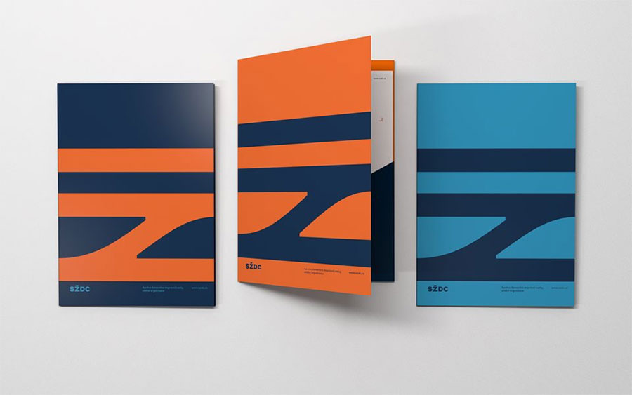

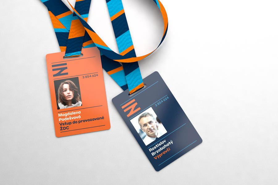
“We wanted to use a high contrast colour scheme. Deep blue is traditionally associated with railways in Czechia, and orange was a rational choice because it is not used by companies operating on Czech railroads. Cyan was added to expand the palette for web, animation and corporate clothing.”
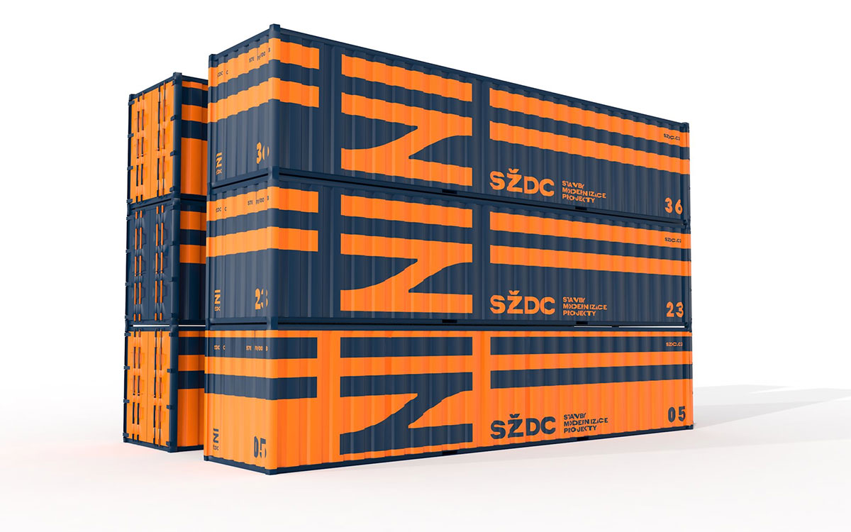
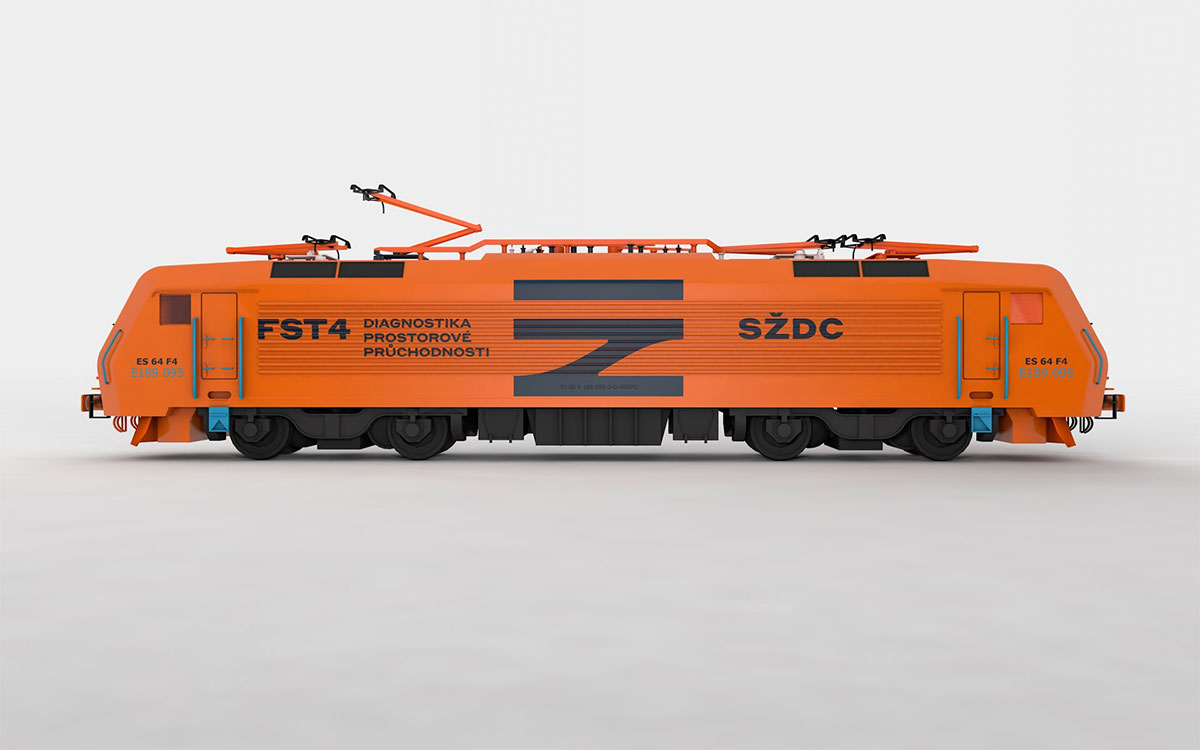 Typography from the Styrene Collection by Commercial Type.
 The SŽDC train livery that’s being replaced.

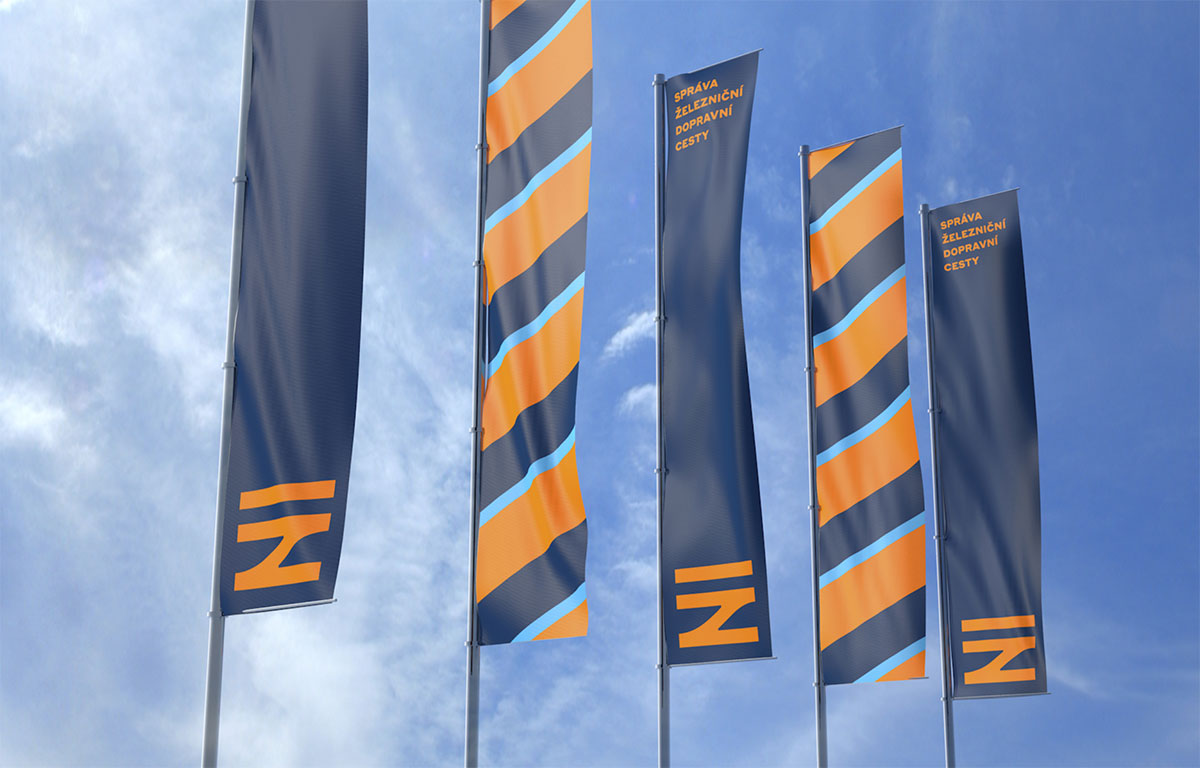
The new identity is currently being rolled out on print collateral and train livery, but is yet to appear on the SŽDC website.
Fantastic work, and a mark to last a lifetime.
See more from Prague-based Studio Marvil, established 1995. Via Brand New.


Share a thought