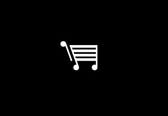
“…the identity basically had to represent ‘music’ and an ‘online shop’. It was here that the simple connection was made. Online checkouts use a shopping trolley symbol which also looks similar to musical notation.”
— Mark Richardson, Superfried

The web design doesn’t live up to Mark’s proposal, which is a shame, but I do like that symbol.
See more from Manchester-based Superfried.


Comments
Very similar to the logo design for Beatcart which I created in 2010.
https://www.logorado.com/beatcart/
Great minds think alike? Come on.
I’ll take yours over what’s on the Beatcart website any day, Nadir.
Much cleaner!
Lovely work Nadir. One of those designs you see that you kick yourself that someone else thought of it!