Rapha, the cycling clothing and accessories brand, hired Dalton Maag to refine the Team Wiggins wordmark (named after Sir Bradley Wiggins). Alongside the Roundel — already associated with the Wiggins brand — the wordmark forms a key part of the team’s identity.
“It was crucial to find a balance between performance and elegance, and to hint at Sir Bradley’s 60s-style mod image.”
Rapha set the initial design direction by supplying artwork of the letters (below) in Illustrator format.
![]()
Original outlines
“Our first step was to assess the basic typographic parameters of weight, contrast, and proportion. During this process some characters were redrawn completely, and adjustments were made to modulation and stroke tension, creating a harmonious feel across all of the letters in the wordmark.”
![]()
Design exploration
“Next the treatment of key characters was explored to enhance the feeling of performance and elegance.”
![]()
Design exploration
![]()
Design exploration
“Numerous routes were explored, and after several rounds, we homed in on the ‘G’.”
![]()
Design exploration
![]()
Design exploration
![]()
Final wordmark
![]()
Final logo
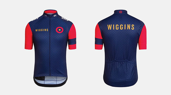

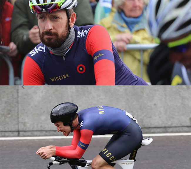
The original type outlines weren’t very distinctive, and the spacing was too wide for the name to be easily read. Dalton Maag’s customisations make it more memorable, legible, and with a colour scheme that hints at the most well known RAF roundel (or as noted on the Rapha website the “British national kit of the 1980s” — whatever that is).
Good improvements.

Comments
Great work process and result. Love the small touch to add distinction and “speed” to the very characteristic double G.
Nice, but could be less ‘shy’.
Target.
I like the typeface choice and treatment, but the logo and color don’t work for me personally. Looks like a cheap casino in Las Vegas with the roulette and Trumpy colours. Doesn’t say “sport” to me. But its a refresh, so I guess they couldn’t stray too far. It def looks better than before, so still success :)