
![]()
Davidoff
Designer: Zino Davidoff, in 1968–1969.
Zino Davidoff was born on March 11, 1906, in Kiev, and died in 1994 at the age of 87.

Davidoff made it his business to upgrade cigar smoking, and every cigar from the company carries a label with Zino’s signature.

Oddly, the Davidoff website is unavailable to UK viewers, and I was greeted with the above screenshot with this text:
“We are sorry but due to UK legislation we are not allowed anymore to show you our Website www.davidoff.com. Thank you for your understanding.”
The cynical among us might think this is due to prices placed upon Davidoff products, combined with the strength of the British Pound. If you know the real reason, do let me know.
![]()
Ford
Designer: Childe Harold Wills, in 1909.
Ford‘s first chief engineer and designer, Childe Harold Wills, is thought to have developed the stylized Ford script in 1909. The oval was added in 1912, and the design has remained virtually intact since 1928. The Partners are responsible for the most recent update to the Ford identity.

![]()
Harrods
Designer: Minale Tattersfield, in 1967, modified in 1984.
The 1984 re-design for this UK department store incorporated ‘Knightsbridge’ into the mark, which is Harrods‘ London address.

![]()
Cartier
Designer: unknown, designed before 1888.
Cartier was founded in Paris in 1847 by Louis-François Cartier when he took over the workshop of his master. Today, Cartier lends its name to a long line of prestigious products, from watches and jewellery to leather goods and fragrances.

Cartier’s largest stores can be found in New York, Milan, Beverly Hills, Rome, Boston, San Francisco, Tokyo, Paris, São Paulo, Shanghai, London and Vancouver.
![]()
Paul Smith
Designer: Zena (a friend of Paul Smith), date unknown.
The Paul Smith logo design was actually written by Zena, a friend of Paul, so handwritten trademarks need not be authentic signatures. Paul Smith is an integral part of his company; he is both designer and chairman, and is continually involved in every aspect of the business.

![]()
Olive
Designer: Liquid Agency, sometime after 2005.
Olive is a digital audio equipment manufacturer based in the United States.

![]()
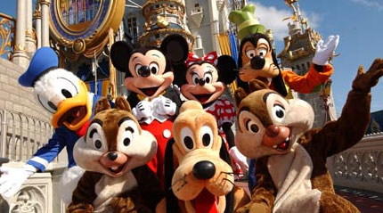
Disney
Designer: Walt Disney, in the 1940s.
Today’s representation is an evolved, stylized version of the founder’s signature that now identifies a media empire worth over US$25 billion in annual sales.
![]()
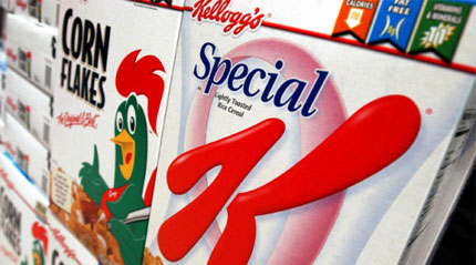
Kellogg’s
Designer: Will Keith Kellogg, in 1906.
One of the world’s most recognizable wordmarks, the Kellogg’s logo is a classic case of using the founder’s signature as a guarantee of authenticity.
![]()
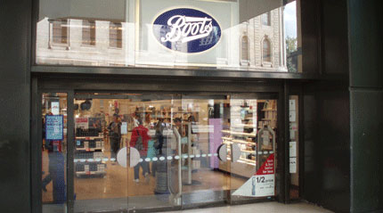
Boots
Designer: Jesse Boot, in 1883.
The Boots Company PLC known as Boots and financially branded Boots The Chemists, is the dominant pharmacy chain in the United Kingdom, with outlets in most high streets throughout the country. In recent years they have diversified their business from a traditional pharmacy to one offering one-hour photo-processing, opticians, and even home appliances in certain stores.
![]()
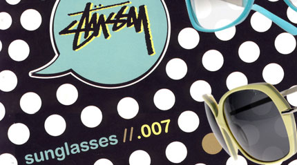
Stussy
Designer: Shawn Stussy, in 1980.
Stussy is a streetwear label in the USA. Shawn Stussy was already shaping and signing surfboards on Laguna Beach, California, when he started to apply his marker pen to T-shirts.
Some of these logos have lasted more than a century, with few (if any) alterations. Others have been going strong for around 50 years. What is it that helps them last? Are there any other handwritten designs that have caught your eye?

Comments
Another one I like is Ogilvy’s logo, so informal: http://www.ogilvy.com/
Also the old Virgin logo.
Good post as usual. I think handwritten logos provide that personal touch to the products the endorse. Carefully selected typefaces can also render the same.
Enjoy’d the post.
jeff
Hi David, I was going to say exactly what Jeff already said:
“I think handwritten logos provide that personal touch.” although rather than in regard to specific products, handwritten logos can give that personal touch to a huge corporation like Disney.
Coke was another one….
If the right typeface is selected and used well to reflect the company it is branding, then yes it is very effective. Great examples.
Nice selection. I’m not too crazy about the Stussy logo, but it does fit its streetware image.
There’s also Cadbury that uses a handwritten logo. I think the biggest appeal is that those logos are so simple yet elegant.
Another thing is that most of those logos use a custom-made typeface, rather than going with an available one.
Falta Coca-Cola, que creo q es más antiguo que todos esos
Brian, great addition. The Coca Cola logo is much more recognisable than any of the above.
Vivien, I’m not too keen on the Stussy logo either. It’s a more stylized version of Shawn’s signature, as it progressed a little over the years.
I suspect you can’t see the Davidoff site in the UK because there is some law regarding selling tobacco products online there.
They all seem to have a sense of elegance to them (hard for kellogs to be elegant though).
I was going to comment “What? No Coca Cola?” but I see we’re in agreement there :)
I’m a big fan of the hand drawn style, but it’s not right for every company. I think it’s interesting that the Ford logo is still a handwritten style. Why do you think that is? I wonder if they want to remind people that their company dates back to before all this impersonal, modern time.
You know, every time I saw the Disney logo when I was little (I’ve always lived within 20 minutes of Disneyland and grew up memorizing lines and singing the songs from The Little Mermaid, Lion King and all those 80s-90s Disney movies) I always thought the D was a backward G. I could never figure out why Disney had a G for the logo. I know better now, but that’s still initially what I see every time I look at it.
Hi Lauren, definitely in agreement on Coca Cola. The Ford logo, even though I’m not a great fan, is so recognisable that I think any change would be detrimental to the brand.
Thanks for the Disney story. I’m looking forward to your podcast singing those old movie songs.
Another one that holds a special place in my heart is the logo for Fender guitars.
Nice addition, Eric. Thanks. A skilled guitarist then?
I was hoping to see Fender there.
Yeah, you have to include Fender, man. That one has inspired so much of history and culture. Rock on!
I love handwritten logos, nothing sexier than a real nice flowing script (even some old school clumsy ones make me feel warm).
Not sure why but whenever a hand drawn brand name that is actually a person’s name, Paul Smith in particular, I think it should really be that person’s signature or at least of that person’s hand. It adds a nice level of personality and comfort in the name. I kinda feel a bit cheated that it isn’t actually by Mr. Smith’s own hand, or even a stylised version at least.
Am I being a little picky there?
Al,
I had a similar thought about the Paul Smith logo. Why isn’t it at least written using his own hand? Even if it needed modification afterwards, it would’ve added a great personal touch.
Some nice examples.
I think Harrods is a beautiful script – I love it’s soft buttery flow across the letters. It oozes quality, but that might just be the brand that makes me think that!
Boots is in dire need of a revamp …come on Boots, it’s ‘time’ – they only need to look at what M&S did and try not to fear change.
Always loved the Stussy Logo and the Special K/Kellogs logo are spot-on!
Hi Amanda,
Interesting thought on the Boots revamp. Their mark has become so recognised on the UK high street that it’d be great to see what variations were proposed.
Look at the work of Doyald Young at delphipress.com
Cool!
In late 2007 Harrods reviewed the way they use their brand and decided to drop the “Knightsbridge” again, among other minor changes.
May I also add Maserati’s?
Cheers!
Oh!
And must not forget one of the most recognized in the world – OPRAH.
Daniel, I’m not sure which Maserati logo is the most up-to-date, the one with the scripted face, the serif, or san serif. There seems to be quite a few in circulation.
my recent discovery of logodesignlove site was like a dream come true,i really love the site,believe it or not some of these simple and cosy handwritten signatures or logos have made the products/services great and a successful brands that consumers really want to identify with…to beat some of these logo,competitors will need the whole money in the bank to do that.
Here’s a question. How about the Virgin logo for this section? I remember reading Richard Branson’s biography and there is a story behind the logo. Its says about someone drawing it on a serviette in a restaurant and then passing it over to Richard. He then said that he should use it as his, at the time, record company logo and it has become his brand on everything Virgin nowadays!
Pretty cool I think!
Hi, I live in Brazil and I am starting to create websites, and this site interested me much, because talk about a subject that at the moment is that I am learning about logos.
Congratulations on LogoDesignLOVE site!
After working for Shaun Stussy from 1988-94, 10 years down the line, (the handwriting of Shaun we as shippers in the warehouse would emulate on each box of clothing going out) would pop up, while working for Quiksilver as a tee shirt designer. Late one night in the building I began to handwrite with my natural hand style QUIKSILVER. Unfortunately the script I liked most, the letters “ver” were horrible. So, quickly went to the go-to font that never let’s down (Helvetica Neue) connected them all together, slapped it at the end of my hand script, creating a syllable tempo logo. Quik,Sil, Ver with the ver in type, and the rest hand.
It was the best selling font for the company for 3 years, on all product, and was fun to watch be accepted by the masses.
A once in a lifetime accidental design, flawed to success.
You can view it by Googling: “Quiksilver Anti Social”
….still fooling companies that I know how to design
God Bless.
Jason, Virgin is another good example. Nice addition.
Dean, good of you to comment. I’ll respond to your separate email shortly.
I have long loved the handwritten logos of House Industries and Paul Frank. Very expressive: classy with a sense of fun.
Nice article. And very nice logos… I want one like this…
Kenny,
Paul Frank logos certainly have a sense of fun to them (just searched for them following your recommendation, thanks).
Love the Stussy logo! big fan of the brand and love that they have never touched it, it is pre-illustrator and photoshop, and as a young graphic designer who is a slave to these programs :) it’s always amazing to see work that has a hand feel to it.
I am a new fan of your website. I would like to mention however that while the Disney logo is instead a handwriting type logo. It was not Walt’s handwriting. In fact the story goes he had problems if he signed receipts and such when he went to the store because it did not match the iconic Disney D. Keep up the great work. You are inspiring with your own work.
Thanks for the extra info, Amber, and for the kind words about my site.
What a fantastic post ! And I suggest Salvator Ferragamo, like an authentic signature.
Your LogoDesignLove Rocks !!!
I am amazed Boots was designed in 1883. I saw it afresh today. It looks old, quaint, familiar, but not THAT old. Very similar to Ford, with the oval too. I love how old designs can still look current.
Great post. I’m a big fan of handwritten logos, because they are instantly unique. I think they add a personal touch to any company that has one.
Calvin
Great post, David. Thanks for getting all these together in one spot. I appreciate the fact that you have given the original designers credit.
I always enjoyed that Stussy logo.
As designer, I made some logos, and I love this work (www.sambarella.com.br), is not a famous brand, but, the logo was created using my own handwritten text. Mixing S, B font and handwritten.
the URL to see the logo is here:
http://logopond.com/members/profile/showcase/18211
best
Nice work, fabio. I found the ‘m’ difficult to make out at first, but it’s great that you’ve experimented with your own hand-writing.
I like hand drawn logos. I’m about to register my name signature. People recognize me from my all caps, architectural style hand writing.
When I was a kid I always thought the Disney D looked like a backwards G, it took me a long time to realize that it was a D, and even though I know it is, I still see a backwards G when I look at it. I really like the Stussy logo too.
The Fender logo would be in my top 10. Another one that comes to mind is the “Sean Jean” handwritten logo. I’m not a fan of his music or clothes, but that signature sure looks cool.
Eddie Bauer’s hand written logo
Hao Li, that’s a great addition, and one I wasn’t familiar with. Thanks very much for the suggestion.
The great thing about hand-written logos is that they stand out. Generally, you can tell if a logo is typed up simply by seeing if the letters are the exact same, etc. It not only makes the logo unique, but it gives a little character in terms of who wrote it and that directly reflects what the company appears to be. That is what I think anyways.
Hey, Mr. Airey!
Discovered your site last year and then, fortuitously, whilst visiting The Logo Factory, saw this link and gotta say: “Lovin’ it!”
Thanks for doing this. It’s refreshing, educational, entertaining and I really do appreciate how you take the time to answer each comment.
The most interesting thing about handwritten logos is that they aren’t used more often! IMO, they convey certain intangibles that speak to us at a gut level where those that aren’t hand-written can’t.
I think that a case in point, for me at least is the one for Mossimo.(I think that’s the name!) I got a bag from the company as a gift over 6 years ago: the pin came off in washing it once but I kept it. It’s still in front of me on the monitor base!
Again, great work, keep it up and God bless u!
Don’t mention it, Gerard. Good of you to join the chat, and I appreciate you letting me know how you found my site. Steve is doing a stellar job with his Logo Factor blog.
I love handwritten logos. I have to add two signature logo’s that carry a lot of meaning especially in the southern US. Dale Earnhardt and Richard Petty. Dale Earnhardt Inc. based in NC uses the signature logo on various products including hats t-shirts and die cast cars.
You missed this, one of my faves.
OGILVY
http://www.ogilvyindia.com/home/index.asp
I adore handwritten logos myself as I believe they imbue the personality of the brand -like a silent messenger- long before the experience takes place.
I’m hoping one day my handwritten logo will find its place among the giants!
Great site!
@ecstewart
what typeface is used for the “olive” logo. great looking and very clean.
Love the authenticity of of handwritten logos! I especially like the ‘Disney’ logo – a classic! Love the ‘Stussy’ logo too – it looks really contemporary! Great post! Thanks for sharing!
With the exception of Paul Smith and Stussy – I’m not sure that these logos are strictly related to handwriting. Hand drawn type != handwriting. Handwriting relates to the hand / character of a specific person.
Most logo designs involve either custom alteration to typography or hand-kerning. Very few aren’t designed by hand – the points are moot.
N.B. it’s ‘cynical’, not ‘synical’
(.. cynically, I’d think posts like this one are published purely to increase the search engine rank of all participants.)
Thanks for catching that typo, Luke. It’s been there for a year and a half, but fixed now, better late than never. Much appreciated.
Titleist would be another nice handwritten logo:
http://www.titleist.com/
Yup. The D in Disney has always looked (and still does look) like a G to me. Another logo I confused when I was little was the Chick-fil-A logo. I never saw the full chicken in the C…it looked more like a partial smiley face to me.
Even though i’m late to the party, I guess that the Hallmark logo also should be mentioned in this list of “handwritten logos”.
http://www.hallmark.com
I think the Davidoff site is inaccessible for UK users since Tobacco advertising and promotion are banned in the UK
I always feel like existing fonts limit me as a designer. Especially when a client need a custom logo, it’s not quite custom when using preexisting fonts.
Currently I’m looking for ways to expand my skills as a logo designer and looking to start a calligraphy class. Do you think it’s a good idea, and will it help me to create, real custom logos?
Thank you
I think it’s a great idea, Ana. I’ve thought about learning calligraphy in the past, too.
Hey David,
just noticed, but do you have any thoughts on the similarities of Boots and Ford? hmm.
Lou socfx.com
Hi Lou, I think there’s a greater similarity between Ford and Carrier.
The following could make this list:
1. Johnson and Johnson (consumer and pharmaceuticals)
2. Eli Lilly (pharmaceuticals)
3. Moulinex (French kitchen and household appliance manufacturer)
I have an old Boots item, from the 60’s or 70’s i think and the script is different, the version you have is a revamped agency logo and not the original as far as I have found.
Good article. It’s not a classic, but I love the Wynn logo used on the Wynn Las Vegas Hotel. I think it’s just Steve Wynn’s signature, but it looks fantastic.
Who hand wrote the Titleist golf ball logo?
When I see the Boots logo, I see the Los Angeles Dodgers’. I think it’s a combination of the script type on an axis, the blue, and the swashes. For some reason, I keep reading “Bats,” which must be subliminal.
If you were to do an updated list, I would definitely add the newish version of the MyFonts logo. Very clever.
Dave
The only best Handwritten logo is Coca-Cola, I guess……! Anyways nice post
One of my favourite handwritten logos has to be cycle brand Rapha.
http://www.rapha.cc/
What about the Salvatore Ferragamo logo? Love it!
Lillywhites, a sports retailer based at Piccadilly Circus in London
Harrods – It always looks like it’s ready for an update.
Obviously Michael Jackson statues are more important than brand facelifts ; )
i think a hand-written logo generally implies some degree of integrity – in the case of the Ford logo – of history, heritage and strangely – strength??
When designing my own logo – i struggled for a long time – trying to reconcile what personality it should project – meanwhile, i kept signing my work – illustrations and presentation drawings with a stylised signature (as a building designer) – eventually i gave up trying to design a logo for myself, and further developed my signature as a logo. Now i feel it was the best solution all along – it is personal and expresses creative flair – what more could i want my logo as a designer to say??
Interesting website – i particularly enjoy reading experts analysis of logo design (great logo refinements story) – seems graphic designers have a lot more sharing of all aspects of their industry than any other design discipline.
And you aren’t going to show us your logo?! :O lol
sure – http://www.behance.net/blewis :) lol
The Disney Logo is the best one in my humble opinion… I also suggest Salvatore Ferragamo’s logo
A brand is a persons gut feeling about something – It’s a reputation. The signature – the idea of putting your name or mark to something – is the essence of that. And – due to past exposure we all have to handwriting – the way it’s written can communicate visual shorthand very quickly. If it’s smooth clean and perfect it can feel sophisticated and upmarket. If it’s childlike it can feel playful. We can then push it further by contrasting a sophisticated product with a casual handwritten font like Olive have; it gives a surprising twist.
I’m actually a fan of “olive”. Sometimes this type of handwritten style can tend towards a more “elementary” feel, but I think they pulled it off without being too kiddish.
Would have loved to see it a tad smaller on their website–that’s if I was being real nit-picky though!
Thanks for the post David!