
We’re surrounded by the same influences, the same shapes, forms, patterns. With hundreds of thousands of designers working on similar projects around the world, it’s obvious that ideas will, from time to time, look almost identical.
Here’s a tiny selection of what designers are up against.
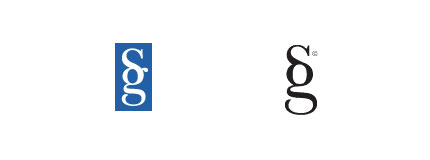 Sumpter & Gonzalez and Stylegala.
 National Film Board (recently updated) and Virtual Global Taskforce.
 Scottish Arts Council and Artworkers.
 NBC and Nebraska ETV Network.

![]() One Spa, Manulife One and Penzeys One Magazine.
One Spa, Manulife One and Penzeys One Magazine.
 SimpleBits and LogoMaid (LogoMaid link directs to a Flickr thread with a fascinating commentary).
 pseudoroom design and Cyberathlete Professional League.
 Ubuntu and Human Rights First.
 Graphic Design Blog and Peter GI.
 Star Sports and maltastar.com.
 Sun Microsystems and Columbia Sportswear.
 Applied Materials and Planned Parenthood.
 searchmash and smashLAB.
 Wayback Machine and Google Blogoscoped.
 Beats by Dre and Anton Stankowski’s 1971 Stadt Bruhl logo.
![]() Not to mention the BigFix and Priority Parking logos.
Not to mention the BigFix and Priority Parking logos.
 British Paints and Pagan Osbourne.
 LA Lakers and LA Clippers.
 Belfast City and South Hams Food and Drink.
 Blackburn Market and Barrow.

In the words of Mike Davidson, “tell yourself at every step in the design process that someone has undoubtedly already thought of this and what can you do to really set it apart. In design, and particularly logo design, the pessimistic axiom that ‘everything has already been done’ is becoming more and more true, and it is only the virtuous designer who can continue to stand out in a sea of sameness.”
Update:
Some companies take things too far: Logo Garden ripoffs.
Comments
I was quick once to accuse another designer of copying a logo I had done, only to realize that the element in question was really something very common. I hadn’t realized that I had basically used the arches from an RSS Icon as part of a logo I had created, as the logo was for a company that had nothing to do with blogging. I wrote a long post about it at my blog here.
I think we also need to realize when designing that we need to be designing for the market our clients are in, not necessarily the world wide market. Not every business will have exposure to every country on the planet, so building a brand that is strong in their market is probably more important than ensuring 100% originality throughout the entire world (by this I mean honest similarities. Stealing a logo from one market to use in another is still not right. I just mean we shouldn’t burden ourselves with researching every logo ever made just so that the ma and pa store logo doesn’t look the same like the shoe company in China… I hope that makes sense).
Hi Pat, good point about localities and small businesses. The expense of research isn’t something everyone wants. Having faith in your designer plays a part — where logo “contests” are a terrible idea. I wonder how much emphasis other graphic designers put on trademarking.
I’ve found that most of the time my first ideas for a logo are a little cliche and have been done before. It’s a designer’s job to dig a little deeper and try to find the essence of the company. It’s difficult at times but the result is usually worth the effort!
Interesting collection, I think the fact that there are so many concepts which are similar it really makes those truly original ones shine just that little bit more.
Rudy, I go through a similar process, with most of the obvious ideas surfacing at the start. It’s why I find sketching to be essential.
Liam, so true. It takes a design you either haven’t seen before, or have very rarely seen in order to shine.
Great post! I’ll link this in my blog.
Regards
Daniel
Wow, some of those are really close, especially the first one. I guess a good question would be, which one came first?
About two years back I designed the logo of a simulation company during my studies, ten months later I saw a very similar design within the logo of a product I used much. Never my intention to copy it though; I suppose the shape was just in my subconsciousness.
Funny to see more famous examples.
Hello,
I just ran into a similar issue, and I was wondering what you did to solve the issue, if you did anything at all?
Daniel, I’d appreciate if you don’t copy the entire thing, and that you upload images to your own server rather than hotlinking. Cheers.
Kyle, it’s close, although that’s a particular issue where monograms are concerned. There are only so many ways to arrange two letters.
How about Overstock.com and Opera.com Both the same red O
I’ve always been concerned about companies I’ve designed logos for trademarking their logos. To a certain extent this is a lawyers job though.
I typically only research their main competitors. There is no guarantee that the original logo I’ve designed will by trademarkable.
I’ve always thought that the more illustrative you make a logo, and the less reductionist, the more likely it will be unique. Though often the simpler a logo is the bolder it stands.
I tend to design more icon style logos for this reason. They have some illustrative flair, but are still bold and simple.
I’m curious, have you ever had an issue with a client not being able to trademark a logo you’ve designed? Thanks.
This is a tricky part of logo design. Another challenge for designers is when the client wants to incorporate a visual element because it’s in fashion right now (despite their logo needing to be, essentially, timeless), or wanting a local icon which many other businesses have already used e.g. mountains if there’s a mountain range in the region. Creating something which stands out becomes very challenging.
Thanks, David.
The main reason it took me a bit to realize the RSS Icon thing was because my head wasn’t in “blog” mode at the time I designed it. I honestly did not even think about the RSS Icon when I designed the logo, as the logo was for an audio company, not a blog. It wasn’t until Maarten (the designer I complained about) pointed out the RSS Icon thing that I realized my complaints were totally unfounded.
Wilde said it best:
“Talent borrows, genius steals”
Sean brings up a great question. I wonder if trademarks passed for both logos in the examples above? I know markets are taken into account. I’m currently awaiting my trademark acceptance for my company’s logo and it makes me wonder…
Great article.
I’m currently working on a logo for a SMS company that I felt was rather unique and original only to find out it looks exactly like the blackberry logo. (Doh!)
I think having so much information available makes us lazy in coming up with fresh new idea. I’ll be the first to admit searching through google images for logo ideas. (and monkey see, monkey do)
However, I think by repeating the same style of logo it helps in identifying the industry as a whole. (i.e. RSS swoosh for anything related to SMS, internet, broadcasting, telecommunication) Not necessarily a bad thing.
*shrug*
Here’s another one:
archive.org (the wayback machine logo)
blogoscoped.com (the blogoscoped logo)
I like the applied materials and planned parenthood examples.. lol –
I have a third item for the “ONE” logo: Penzey’s Spices magazine called “One”:
http://www.penzeysone.com/
It even has your own website’s heart logo incorporated into it! Freaky.
Three in One .. truly a holy trinity of logos.
Coming from Phoenix, AZ, where every logo has a sun in it, I probably saw more similar designs there than anywhere I have lived and designed. While still in Houston, TX, I designed the Polaris Construction logo. A year later we relocated to Phoenix, AZ, and I was researching trademarks in the area. Low and behold an extremely similar design was being used by a spa product. Polaris also turned out to be a popular name for construction companies as a whole; although, all those we found were out of business or in the process of and did not have registered logos. So they could register the logo if they want. I believe money is the factor there.
When designing the Mosaic Homes logo, I came up with several versions as I worked my way to the final. One of those versions I saw on a billboard in my community a year later for a bank. No copying from either of us, just a very similar idea. Luckily I did take it to the next level and it is currently the best logo I’ve ever designed.
Others bring up a good point about the client wanting a particular look or even lusting after someone else’s design. It happens to me all the time and it is a constant fight to keep clients from outright plagiarizing everything they see.
Trish
My dad has worked for applied materials my whole life and I never noticed that it looks like planned parenthood.
Hi – frequent visitor at davidairey.com – you guys bring up a great point. But how can you do research to see if the logo is in fact trademarked. Ya you can look up trademarks in uspto.gov (U.S.) but how can you see if your design is similiar to someone elses.
Scottish Arts Council and Artworkers looks similar to this logo: http://www.davidairey.com/ just flipped…
Intention?
Cory, good catch. I suppose at least one (Opera) uses a shadow, even if I’d recommend against it.
Sean, I’ve had an issue with one client where the idea I arrived at had been trademarked by London Council. Back to the drawing board it was.
Tracey, there have been many times I’ve needed to educate about trends, and how following them can leave a design looking dated.
Peter C., at least you caught the Blackberry similarity before you finished (or had you?).
Bob, good examples. I’ll add a few more to the post.
Nice find, Nick. Thanks for letting us know about it.
Trish, you mention your Mosaic Homes logo as your best. I’m curious why you don’t place it at the top of your portfolio page, so it’s the first one seen?
Joe, thanks for the trademarking resource.
Milo, one of the links in my post (from davidairey.com) features similarities between my own logo and the old Dosh Dosh design (much closer I think you’ll agree).
David, I have to agree with you and say that designers do sometimes come up with similar ideas. At other times, however, some designers blatantly copy other designs– which is something that I really hate. I’m not saying that that’s what these guys did, but I’m just saying that sometimes it happens.
I scrolled all the comments looking for an answer to your first question –What resources do you use to ensure you don’t infringe on copyright?– and didn’t found it. I guess no one knows how to do it, and neither do I…
I just hope this doesn’t create some kind of paranoia that will lead us to avoid simple forms and increasingly create more and more complex logos… ’cause I still believe less is more.
I’m really kinda surprised that so many of these examples are rather famous ones.
I think a good way to avoid this problem is to, as a good designer should, dig deeper into the company to find the essence that could be turned into their logo, as Rudy Vaughn said. If you look at ones, like the first example, and the Overstock/Opera logos, they are just typographic, without a unique graphical element. I think when a logo consists of more that just a typeface, even a custom one, though less so in those cases, its easier to be unique.
I do consider myself to be a good print designer, but I suck at designing my own website. Shoot it took me fifteen years to finalize my Contemporary Native logo.
You are right the Mosaic Homes logo should go at the top and I should take out those that are partnership logos or those that are all client and certainly not me. Unfortunately, I’m obsessive compulsive so everything in my website is chronological. My other issue is that I am afraid to leave anything out. Yeah, such and such logo is not that great, but there is one genius detail in it I want people to see. There are also logos I’ve designed that I hate, but the clients loves them and I get other positive feedback, so again, I’m afraid to leave them out just because I hate them. There are also logos I love that do get bad feedback, but I love them so I stick by them.
As for print design samples, they suck, too, I know. It is hard to get that gorgeous design piece when your client is working on a shoe string budget. Seems conservative clients go hand-in-hand with small budgets as well. The cool stuff is often rejected for the same old stuff because it is what the client is comfortable with.
Yeah, my website portfolio sucks, I know. Being an old print designer I never fully embraced website development. Someday I’ll have enough money to pay someone to develop the portfolio site of my dreams.
Someday.
Trish
Nice post David.
I hadn’t seen the Sumpter & Gonzalez LLP and Stylegala logos…That’s just nuts!
It’s just like music today…..it’s all been done….songs today will always be inspired by something in the past….samples are on everything these days…it’s all about how you put your spin on the concept that’s already been done a thousands times and make it your own design.
As a designer I can’t believe it has all been done. I believe in order to be a good musician you can’t believe everything has been done musically as well.
I’m so tired of hearing people moan and complain about this, “It’s all been done.” Why even be a designer then? Why listen to music ever again? Why live?
Every generation believes they’ve hit the end of creativity. But if you look back over the last 150 years and compare what we have today with its counterpart 150 years ago, what we have today looks unique in every way. Sure, it took 150 years of gradual change to get there, but it is here!
Creativity is a bit like evolution, you can’t get the perfect organism without years of experiment, failure and luck. As time and thought progresses, perfection seems farther and farther away, but that doesn’t mean you stop striving for it.
Sure for every creative genius who gets recognized, 100 end up like Van Gogh where their creative contribution is not recognized until after death. You know what? I’ll settle for that.
What will art, advertising and music be like 150 years from now? Don’t you want to be a part of the evolution? I do.
Trish
Here’s one…the illustration on the new McDonald’s coffee cups and the new MillerCoors logo. I’m not sure the McDonald’s version is supposed to be an overheard view of a coffee cup, but it looks similar to me, nonetheless.
Great post and I really enjoy following your blogs.
Great, and uncanny, finds.
I’m not a graphic designer, though I’m interested in it and actually attempted to host a contest to redesign Sherwin-Williams “Cover the Earth” logo over at http://newbreedofadvertisers.blogspot.com/2008/07/cover-earth-logo-contest.html.
No takers, though.
Two thoughts on this post. First, I’m guessing you (artists) visually consume even on a subconscious level. While some folks certainly make blatant attempts at mimicry, I wonder how often you sit down to draw and your brain produces a thing that seems original but is really only remembered. Can you imagine having a search engine (inter-cranial?) to verify this when this is happening?
Second, books and magazine articles and TV episodes often have remarkably similar features, but aren’t considered plagiarism. Is it okay to resemble another’s work simply because it’s good art, or is that taboo for graphic designers?
Love it Dave… love it! The funny part is that I am constantly doing this when I see logos. Some really are strangely alike, regardless of being on purpose or accident. Its always a fun scavenger hunt.
The funny part is that you could probably take this further and play sort of a “logo telephone” game. I am sure you would find all sorts of variants that skew and may be inspired from other ones… the first thing I thought of was that Bank of America looks somewhat like the Sun and Columbia marks. I think we could do this for days.
Sports teams are also notorious for doing this. The LA Clippers logo is a blatant knockoff of the LA Lakers, and the NJ Nets Previous logo knocked off the NY Knicks.
Keep up the good work.
David,
A bit late to the party. Looks like you rocked the house with this one!
Scary similarities here. As already pointed out in the comments these are particularly astonishing ripoffs because most are very well-known companies. It really makes me want to run and do research on their trademarks, to see how these passed muster.
Regards,
Kelly
Sam, you are right about that whole “seems original but is really only remembered” thing. I’ve done that a couple of times. Luckily, I caught it before I sent the design to the client.
There are a lot of logos out there that are the result of mergers, splits, partnerships, acquisitions, etc. where a logo is a deliberate ‘knock-off’ or an update of an original, new logos are generated from a parent logo, or a combination of two or more logos are creatively put together. Similarly, say an investment company owns several companies. Logos may be done in such a way that they relate to each other and back to the parent company as well.
Sometimes you can trace a company’s evolution through growth, merger and takeover by the way the name and logo change. PriceWaterhouse Coopers comes to mind. Or how at&t has added orange to their color palette because of their takeover of Cingular. Fonts, icons, colors, etc. get passed from one company to another because of the ever changing corporate landscape.
I have noticed a trend lately where completely new logos are created to represent new mergers and partnerships, whereas back in the 80s and 90s what I described in the first paragraph was the way to go.
It will be interesting to see how logos continue to evolve with every new merger, split or acquisition.
Trish
David,
I think this post could expand to similar slogans and taglines as well. Funny how many companies attempt to define themselves in three word bursts:
ABC Company – Tall. Fuzzy. Sushi.
Cheers,
Rudy
Trish, I think it would be fascinating to follow a logo’s genealogy via the artist. This is similar to what you’re saying but instead of following off-shoots back to a parent company, you’d follow the way a logo has been influenced through mentor/apprentice relationships.
Maybe you’d end up realizing you’re related to Kandinsky or Van Gogh, and have the genealogy to prove it.
Sam, that would be cool!
Trish
I was surprised to see the National Film Board logo there.
I have another logo to add to the Scottish Arts Council/Artworkers one – the Quark Xpress logo, which you can see here: http://img.photobucket.com/albums/v64/hollypop/QuarkLogo.gif
It’s green but it’s exactly the same.
Thanks very much for the continued comments!
I’ve taken your suggestions on board and added three new comparisons to the original post:
Wayback Machine and Google Blogoscoped.
Beats by Dr. Dre and Anton Stankoswki’s 1971 Stadt Bruhl logo.
LA Lakers and LA Clippers.
My appreciation to all those who linked to this post, and passed it around others.
Great post, I smell a book…
How about Mitsubishi and 3 Diamond Tuna?
http://www.mitsubishi.com/e/images/top_logo.gif
http://i4.peapod.com/c/ZQ/ZQSFC.jpg
Great article.
It seems more than obvious that most of these were not coincidental, but flat out copies. Who needs talent and skill when copy/paste will put food on the table?
However, plagiarism can be expensive, in more ways than one.
Oh, you’ll definitely have to add the Quark logo.
This blog is pretty well known and respected. Do you think any of these companies will change their logos because of what is shown here? I don’t think I’ve ever seen such a list all in one place, in such a popular venue, or done so well. I’m with Dave, smells like a book. You should jump on it David.
Trish
The Beats by Dr. Dre and Anton Stankoswki’s 1971 Stadt Bruhl logos look remarkably similar to the British Paints logo http://www.britishpaints.com.au/.
Lee
Some of these are really rather stretching it…I used to work in the Marketing department of Applied Materials (where I worked with the logo daily) and lived near a Planned Parenthood clinic that I had to pass each day on my commute. Didn’t see any particular resemblance in the logos then and don’t see it now.
The fact that someone has done something similar before (like creating a letterform with two parallel lines) doesn’t mean that the second item necessarily resembles the first. When something looks like a blatant copy (NBC and Nebraska ETV), that’s one thing, but many of these logos simply employ a similar design element or device but do not really look alike.
You need to step out of the forest so you can see it.
Not sure why, but comments and trackbacks had been disabled for the past months. It seems to have repaired itself now though, so thanks, belatedly, for those final few comments I never replied to.
I added a few of your suggested similar logos to the end of the post. Thanks again.
In addition to BigFix and Priority Parking logos
http://www.1c-bitrix.ru/bitrix/templates/1c-bitrix/images/1c-bitrix-logo.gif
1C-Bitrix logo
Graphic Design Blog and Peter GI and http://www.senatorpen.com
Funny to see how for most of them, there is one with a much better execution than the other(s).
(Also, LA Lakers and LA Clippers look similar? Come on…)
The same logo (star) has an ukrainian GSM operator
Kyivstar: http://www.kyivstar.ua :)
You forgot about Xbox 360 and Xerox, they are quite similar
More notable suggestions. Thanks for taking the time.
Don’t forget about the biggest (most overlooked) copycat of the year!
http://www.wellmont.org/
http://www.barackobama.com/index.php
Got me thinking for sure, having seen the Big Fix logo above it reminded me of a similar thing i did for an internet phone company called Butlers but remember Boss (who make guitar effects pedals) have a similar one again like this.
My point to add, that i haven’t seen on some of the posts i’ve read here is – If the industries are very different and the general public doesn’t see these shapes on a day to day basis and as long as it works for the business then originality has no upper hand over it. Can be perfect for the business if it’s original or not.
..the buyer wont care. Remember these images are made to sell products and services not be original.
If the concepts are similar but in different industries and markets, then I agree. But if the execution is exact, I believe that is a problem.
You also have to be careful of companies who are sue happy. Budweiser sued a small town, mom & pop flower shop because they had named their store “This Buds for You”. Obviously the industries are completely different, absolutely no competition problems and there was no issue with logos, but Budweiser won anyway. They were able to prove that use of their slogan at the time to name a flower shop diluted the effectiveness of their slogan in their own industry. I personally think they were being sue happy and assholes, but that is just me. But such an argument can be made for similar marks as well.
Similar concepts are going to happen and, on occasion, similar execution. Despite the example of Budweiser above, I think most of the time designer and client should be fine. But, as a designer, part of your job is to research your logo concept as much as possible. If you find your logo looks remarkably like others out there, it is up to you to inform your client and let them know the risks, if any, of using it.
Nice post.. Found an Ubuntu impostor :)… http://www.matthodder.com/2009/03/31/ubuntu-lookalike/
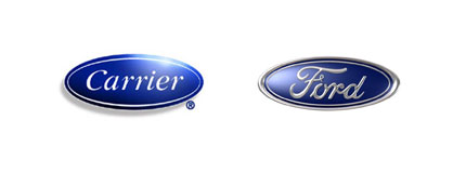
I am amazed with the Carrier and Ford logos. Im guessing the Carrier designer would go with “What is Ford? Never heard of them.” ha!
That seems like a reasonable retort to me, Lorenzo. It was only yesterday when I discovered… a big mac? I washed it down with something called coca cola.
Very impressive collection. I remember about a year ago I started a collection of similar looking logos and the reason why I gave up on that idea was that around 5 logos collected were featuring same style and similar drawings (kind of like the man on Adobe Acrobat splash screen) so I just got lost in “who got there first” thoughts. It looked like it was the same logo redrawn a few times, each time for a different client. The point of the exercise was to put logos side by side, like you did, but in my collection it got to be the circle – each logo is a lookalike, but still different.
The Blackburn Market logo and Barrow logo also closely resemble the logo for Burlington Coat Factory.
I just came across this one… last night! I guess it makes sense since they are both in the same city and when Hornets moved from Charlotte to New Orleans, they realized that they needed to adapt their logo to the culture of the city. Which was already established by the other sports franchise, the New Orleans Saints. Obviously changing the name from Charlotte to New Orleans was good enough to capture the hearts of the spirited southern fans! Take a look…
http://www.droppin.com/wordpress/wp-content/uploads/2007/09/nohornets092707_fleurdebee_story.jpg
http://www.2ktours.com/cgi-bin/logos/nfl%20logos/Saints_logo.gif
Thanks Vlad, Micah, Anthony,
I’m sure the Fleur de lis can be seen in hundreds, if not thousands of logos across the globe. Could make for another similar collection.
Then there’s…
Florida Hospital Waterman
http://www.fhwat.org/Portals/42/SkinRelated/images/logo.gif
and
Gridiron Flow
http://www.gridironsoftware.com/images/flow_logo.png
i stumbled across this web page recently http://abduzeedo.com/creating-crazy-cool-logo/ containing a tutorial on “creating a crazy cool logo”.
Now i don’t seem to be able to escape the thing. i must have seen 7-8 totally unrelated sites with a logo made like this, right down to nearly identical circle weights.
Here’s one to make you wonder…
http://www.chase.com
http://www.niagarafallschamber.com/
Nice Post David! I just found it on twitter, very interesting indeed. The Pseudoroom comparison set are almost identical, albeit flipped.
Well, what more can I say except that good designs can be highly contagious. But frankly folks, I don’t think that some of the examples were entirely accurate. I mean, in spite of their apparent similarity, some pairs actually consisted of very distinct logos. For example, the Sun Microsystems and the Columbia Sportswear logos, or the Graphic Design Blog logo and the Peter GI logo. For that matter, the Ubuntu and the Human Rights First logos too. I think they are actually more dissimilar than similar.
Some nice additions there. Cheers for those.
In Blackburn Market and Barrow you missed Mr. Bricolage!
http://www.mr-bricolage.fr/
Good eye! One thing I want to point out is the Human Rights First vs Ubuntu logo- they might be intentionally similar.
Ubuntu’s focus is making easy to use software that’s free and accessible to everyone and putting usability first. (Ubuntu: Linux for Human Beings).
When I saw the Ubuntu and Human Rights First logos, I immediately thought of the Scripps logo which, I’m not sure but, may be only here in San Diego?
See it here:
http://nms-management.com/images/scripps1.jpg
Damn David, you still putting my logo on blast, huh? Haha. For the record I DID NOT try and rip off anyone’s logo, and the owner of Graphic Design Blog says the same about her logo as well. We both reiterated that here in your previous blog post about this same topic (Tara and PG in the comments section) :
http://www.davidairey.com/just-how-original-is-your-logo-design/
I may be biased, but I don’t think my logo and GD Blog’s are really that much alike. I can see where you’re getting at with the subtle similarities in shape, but anything else it’s a stretch. Some of your other examples are more legit.
I know you mentioned your own logo before in that blog post of yours I linked to above, but why didn’t you include it as well in this post? I know you didn’t rip off your idea for your logo so I think it’s only fair that you include it to reiterate the fact that logos/design ideas are sometimes unfortunately similar, but NOT ALL are rip offs. A short paragraph noting that notion wouldn’t hurt either because I know like all designers out there, we HATE being accused of plagiarism especially when we are INNOCENT!
BTW… that’s not my web address anymore. I obviously do not sell furniture?? ;)
Hi Peter,
It’s been a while. How are you? I hope you don’t think that by this post I’m accusing anyone of plagiarism. That’s not the point I’m making. I’m saying the more we’re exposed to logos (increasingly possible via the internet) the more we see similar designs, because almost everything has been done before we even pick up a pencil.
If you’d prefer I drop your logo just let me know. No problem at all. Have you stopped your design work now?
David,
I’m doing good, thanks. Yeah, I understand the purpose of your post, but I guess in my opinion it would’ve been better if you had made it more clear that you’re not accusing anyone of plagiarism. Because quite frankly some of your other examples were probably plagiarized and I just didn’t want other people to think I was in that category.
I know this blog post is almost a year old, but my friend actually came across it recently and told me how she saw my logo, so I guess I’m getting some kind of free advertisement, righ? Haha.
That said, I’m not gonna hassle you to take down my logo, it’s not that big a deal. But when I decide to get a new web address I will hassle you to update that current link ;) And yes, I’m still doing design work. Just not freelancing as much anymore.
Do let me know, Peter. I’ll happily update the link with your new site. Ciao for now.
theres also oxford and loblaws
You know the thing I love about Logo Design Love is that it is filled with so many resources. I never imagined that I would get to see so many logos in one place, and I certainly never expected to see so articles analyzing them. The trend for logos is a tough one to depict and, like fashion, it is always changing.
I am only 16 years old, almost 17 years old, and I plan on doing a minor somewhat related to Digital Media. It’s blogs like these that really help open my mind and prepare me for what is about to come. I know I am not ready yet and I realize that sometimes I do get a little mad when someone is critical about my work, but I hope to get a good grasp of the whole “logo” industry and everything that comes along with it. As a final note, I would just like to say how much I appreciate this blog and this article, along with many of the other articles on this blog, that have really opened up my mind of what to expect and how to tackle these situations head on.
Nice list! Very well done!
I agree, as a graphic design student, it is more and more difficult to produce original designs. When I was born (1988) everything was pretty much visually established, and it’s really difficult not to execute what I have been looking at during my whole life.
Also, I’d like to contribute with the Suzano Group logo, which looks A LOT like the Airbus one. It is one of the largest pulp and paper industries in Brazil, and you can check them out on http://www.suzano.com.br
Google has another service that seems to have borrowed from an earlier design. Compare Google Desktop with SFX logo from Ex Libris.
Augustus,
All the very best with your studies, and should you choose to become a graphic designer, let me know if you think I can help.
Interestingly I think that apart from:
(A) NBC and Nebraska ETV Network
(B) Scottish Arts Council and Artworkers
None of the other examples would breach a Trademark as they appear to be from different business sectors? But I could be wrong being a designer rather than Trademark lawyer.
Very nice collection. I too have asked Clients to give me a logo that looks a lot like an existing brand. I tell them that the logo/Identity is only part of building their brand process.
this is just a timeless post! I’d repost some of the contents sometime in my blog. :)
Is there a preferred way to search and cover your butt for originality before trademark? We designers are ‘logo aware’ of the big guys but how do you search for smaller company duplicates?
shawnawho, other than hiring a trademark lawyer, I don’t think there’s any surefire way to know. You could always go through the trademarking process yourself, but it’s a difficult and time-consuming process, so I’d leave it to those who know what they’re doing.
Murder or Manslaughter?
Is it all about intent? In the same way some legal systems work, it is surely about whether a designer intends to rip off someone else. Mind you, it’s going to be a hard task if anyone tries to prove blatant copying. I guess it could always be explained as a ‘crime of passion’!
Intent is key, Andy. I agree.
I just received another email suggesting this one for Carbonfund.org, to be compared with the Obama logo.
David,
It’s inevitable really, that good design is imitated. After all, it’s the job of the designer to soak up as many visual ideas as possible, in order to draw on those ideas at a later stage. ‘Adapt, adopt, improve’ seems a fair rule by which designers can operate fairly.
It’s been said that ‘imitation is the sincerest form of flattery’, so maybe we should be proud of our influence in the world.
As an aside; I have to work on college and university logos on a daily basis, and you wouldn’t believe the amount of logos which are ill suited to reproduction at a small size. Many of them being ambitiously designed for full colour reproduction, but without consideration for today’s various electronic media.
Andy
Imitation can be a form of flattery, Andy, absolutely. But it can also be a source of unwanted aggravation. :)
That is funny. It’s amazing with all the unique designs that could come out of a designers head that there are logos that are this similar.
Imagine my surprise at finding one of my own logos in this collection!
I designed the Ubuntu logo 5-6 years ago (I have no idea if it came before or after the Human Rights logo, as I have never laid eyes on it before)
I guess that this sort of thing can happen even to the most original and creative designers. Ubuntu is a philosophy of life, it was the name chosen for an open source operating system.
Here follows Archbishop Desmond Tutu’s explanation of what Ubuntu means:
“One of the sayings in our country (South Africa) is Ubuntu – the essence of being human. Ubuntu speaks particularly about the fact that you can’t exist as a human being in isolation. It speaks about our interconnectedness. You can’t be human all by yourself, and when you have this quality – Ubuntu – you are known for your generosity.”
I think you can now see where the idea for the icon originated from – and why it so easily represents the Human Rights logo as well.
I believe it also explains why so many of us are able to design logos that look so similar.
Pierre
Scottish Arts Council and Artworkers
Add Australia Network to the list
http://australianetwork.com/
Also i am not sure if this was discussed ever (I saw the post on Melbourne city Logo) and the similarity to something designed by Raja Sandhu for a logistics company.
Melbourne City Logo : Landor Associates
http://www.brandsoftheworld.com/categories/government/226271.html
Merchant Logix: Raja sandhu
http://logopond.com/gallery/detail/857
Thanks for the extra insight, Pierre. I like the thought behind the Ubuntu saying, and wasn’t aware of it before you said. I hope all’s well where you are.
Karthik, two worthy additions. Cheers. I’ll get around to an update one of these days.
Fairtrade and Pepsie are also very similar.
Haha, I guess its understandable with Clippers and Lakers since they are just both in LA. :D
Great post..
These are awesome, I got looking at them after finding out about the Apple vs. Woolsworth logo fiasco. Read more about it at http://wordsoftheweb.com/2009/10/when-logos-are-too-similar/
Cheers
Hello again David.
Another very interesting post and thank you once again for your endeavours to keep us informed.
To be honest I don’t know how you all do it. We have just updated our baldchemist brand. Nothing to special as the name is the logo and brand but just a new look was murder.
I’m just grateful that we have such an unusual but now well known name.
How’s the book coming along by the way? I think we are all looking forward to seeing it (buying iy).
Take good care my friend.
The book’s coming along well, thanks Ray. It’s available for pre-order on Amazon.
Take care, too.
I think that many of the similarities are there because some ideas are universal, and if one takes a path on finding the best solution for a logo design, it’s not impossible that another person will come to the same solution, if the project is similar.
But, yeah, maybe some of them are just copies of previous logos.
I saw this logo the other day on a local San Diego hotel (Woodfin) and thought, wow that flame looks a lot like a logo design I was involved in during the 80’s.
Woodfin Hotel: http://picasaweb.google.com/lh/photo/LT8zviHaIcrzd4VUkakvZw?feat=directlink
Ektelon (racquetball): http://picasaweb.google.com/lh/photo/u0BYagwV567ixhLp9-Aqyw?feat=directlink
So I started looking around:
Epilepsy Foundation: http://picasaweb.google.com/lh/photo/V0-o8rwfEIwZg3LWRu96-Q?feat=directlink
Camp Fire Girls: http://picasaweb.google.com/lh/photo/6X2JbXJ3fcLQA_xlJQktJA?feat=directlink
Seagrave Fire Apparatus: http://picasaweb.google.com/lh/photo/QMfep7gomuwYZcYyt2T2AQ?feat=directlink
I wonder how many other three-part flame images there are?
Recently I was accused of stealing someone’s logo.
Mine was Similar to theirs, but theirs was a picture from istock (not copyrightable to start with) and mine was like theirs but a shadow image and it was different and not copied from their image. I contracted with someone to make it. It was very upsetting because of the nasty nature of the person accusing me.
I’ve taken it down and am doing a complete redesign of my site, as I want to be original. But I hope others read this and think twice about making accusations before talking to the person in question.
Nice finds, Tom. Cheers.
Good luck with the redesign, Stephanie.
Interesting post, so many similar designs out there.
Thanks for sharing all of these examples.
hi, i’ve got a logo which looks like the dr dre beats and the Stadt Bruhl logo, the british music experience http://www.britishmusicexperience.com/
Thanks for that, Martin. Good call.
I think one thing we have to remember is that. As designers we have all be taught the same “systems” when it comes to tackling design problems. Creativity will most certainly come into play as well as inspiration but at it’s foundation we are all attacking the problem with the same vision.
exactly, we will be working in similar ways, doing research and trying to communicate what the company wants to communicate, so you will be coming up with similar ideas of other companies that have the same ‘values’, and if it’s trying to use a letter, you will be coming up with ideas that exist already even if you are unaware of there existance. we’ll all come up with the more ‘obvious’ ideas for exactly that reason.
ps i noticed that bbc 6 music looks like the dr dre beats logo too
Flick between http://www.britishmusicexperience.com/ and http://www.dateline.co.uk then visit http://designedindevon.co.uk/ then check out the others in this post and say to yourself “I will never play with the negative space inside a lower case d or b ever again”. We’ll all be better off for it.
http://bodytonicmusic.com/
this logo is just like the Dr Dre and big fix also……
popular!
I’ve run into this problem as well… and it inspired this resource site which I put together to help myself and others during the planning and early design stages. Check it out…:
http://www.identityarchives.com
Search by keywords; visual, conceptual, color, alignment, layout… whatever it is that you want to see (and avoid) in other existing logo designs.
A personal favorite look alike pair: Sony Music and Cialis. Two dreadful logos made for each other!
http://www.seeklogo.com/images/C/Cialis-logo-C10F65AD90-seeklogo.com.gif
http://photos.friendster.com/photos/21/47/80477412/1_499186690l.jpg
Wow I never realised how difficult to come up with an original logo designs.
So if a logo is copyrighted or trademarked (not sure which is the right term) is it actually possiable to sue?
Hi Angel, I believe a logo must be a registered trademark (i.e., showing the R inside a circle) before there’s grounds to sue. I think simply being ‘trademarked’ (i.e., showing ™) means the application is in process. Correct me if I’m wrong.
I find the similarities of the very first logo and the ford logo to be the most interesting. They both seem to be blatant copies of one another.
It can be hard to create a good logo especially when you look at other companies in order to come up with new and creative ideas.
Thanks for the post.
Another example of great similitude to the logos of BigFix, Priority Parking, British Paints and Pagan Osbourne:
Bodytronic
http://bodytonicmusic.com/
I’m not sure what, exactly, there is to worship in those “b”-pictograms but, they must obviously contain a visual formula that has to have something fundamentally ‘right’ about it, right?
If you start your process outside of Adobe Illustrator, and to work with more organic shapes, it’s not difficult to make a unique logo.
I have some logos in my own work, they may not be perfect, but I know they are unique in shape at least :)
Nice find, Henrik. I’m thinking about a similar-styled symbol for myself, only with the ascender on the opposite side, to form a “d.”
Interesting article, the Wayback Machine and Google Blogoscoped surprised me quite a bit – they must surely be aware of the similarities.
Also look at Manoli cigarettes logo (1910) by Lucien Bernhard and the new Muzak logo. Muzak just slenderized the original.
Could you please tell me some helpful hints when designing a logo in terms of researching to the best of my abilities, if there is an existing logo that I am unawaringly copying. Should a designer always submit the logo to be trademarked/copyrighted. Help! I don’t wanna land on CNN being accused of “ripping off” anyone. Just tryin to have some good clean fun.
The Studebaker logo and the former Pepsi logo also look EXTREMELY similar.
Hi Shelly, trademarking can be a long, detailed process, so if your client wants to go for it, be sure to consult a trademark lawyer. Here’s a blog post you might find useful:
Logo trademarking tips: a legal perspective
Great post, amazing how similar some of them are!
Check out similarity between these two logos:
marketresearch dot com and sauder school of business
I think everyone just needs to calm down. There is only one reason a logo needs to be unique and that is to differentiate the brand from it’s competitors. Most of the examples shown here will never compete for the same business. This post reminds me of trash mag showing celebrities wearing the same dress. It’s purely trivial and has no relevance beyond this post.
Dan,
If I design a logo which takes a lot of my experience and skill, I’m going to be pretty p***ed off when I see the exact (or almost exact) logo somewhere else, even if it’s not in direct competition.
Andy
Here are two more:
http://www.deltafaucet.com
http://www.pnc.com
Don’t forget Screen Gems and Sportcraft.
oh man, i’ve just wrote about 2 look-alike logos on http://ninjagory.blogspot.com/2010/07/unidos-nuevo-leon-se-copiaron-el.html
2 logos separeted by 3 months, one from western europe and the other from Mexico
by the way, the post is in spanish but you could get the translation here: http://babelfish.yahoo.com/translate_url?doit=done&tt=url&intl=1&fr=bf-home&trurl=http%3A%2F%2Fninjagory.blogspot.com%2F2010%2F07%2Funidos-nuevo-leon-se-copiaron-el.html+&lp=es_en&btnTrUrl=Translate
the Dr Dre beats and Anton Stankowski’s logos are pretty much the same like the British Music Experience (or vice versa) – check it out http://cms.whathifi.com/Images/136710032bli.jpg
the fourth example is a very common one: look at the hungarian national television’s former logo: http://www.dunaart.hu/images/tamogatok/dunatv.jpg
Just noticed I recognized the Graphic Design Blog logo as the logotype of Swiss chocolatier Gilles Desplanches. The logotype is almost identic. Wonder who spotted who’s logo. http://www.gillesdesplanches.com/
Burlington Coat Factory is another heart shaped B.
http://www.burlingtoncoatfactory.com/
many designer wants to make simplest design. I think the amount of simplest shape or design is very limited, so sometimes one design partly will have similarities with other design. Different process can make almost look alike design.
Here’s another heart shaped ‘a’, this one is even in the exactly same line of business as Heart Radio. http://www.radioaura.dk/aura.aspx
Another one is GSK (GlaxoSmithKline) and The Pork Council (the other white meat).
(Belfast City and South Hams Food and Drink) Burlington Coat Factory rebranded and uses that same/very similar stylized “B”.
As it happens I’ve also designed a logo looking similar to the one’s posted http://www.bdaily.co.uk
Another scary similarity is the norwegian post’s logo (www.posten.no) and London Clearing House (www.lchclearnet.com)… Too identical for my taste…
Don’t forget “The Price is Right” and Grand Theft Auto: San Andreas.
The chemistry company Phenomenex’s logo is even more similar to the (Anton Stankowski) Stadt Bruhl logo!!
Another example : Isringhausen imports and Nissan
http://www.sj-r.com/firstinprint/x1110820071/Isringhausen-challenges-Nissans-trademark-design
which apparently Nissan Motors changed again and can be seen on their home page : http://www.infinitiusa.com/?dcp=nml.mtl.HMP.infiniticom_landingpage
I came across this Jet Wholesale logo that looks very similar to the 78-97 NY Jets logo:
http://web.mac.com/printpros/wholesalecellular/welcome.html
1978-97 Jets Logo:
http://www.sportslogos.net/logo.php?id=5gtfjeljv9kf52bdv9otg3fhf
Personally, I wish the Jets would go back to this logo as I think their current one is awful.
Also very similar: Caparol and Mywalit http://www.sproud.nl/blog/2011/6/13/gestreepte-olifantjes.html
Check out http://www.postnl.nl/voorthuis/ and http://www.zalando.nl/ . Same shapes.
Hi David,
I’m a french canadian graphic designer and I just read your book.
Very inspiring !
I’ve found a logo in Quebec quite similar to Beats by Dr. Dre and Anton Stankowski‘s 1971 Stadt Bruhl logo
http://www.groupebeaucage.com/
Thanks very much, Nicolas. Glad you liked it.
I’m impressed GameStop and SmashBurger aren’t on here. They *are* the same logo, just with different text. Both red/white, Impact font with no embellishment.
I think some of those are by accident by some of them look like a direct copy. There are just too close to be an accident. And to the comment above me, I checked both smashburger and gamestop and the logos on their sites look totally different. Not sure if it’s the one’s you’re referring to.
Hi David, always appreciate your blog posts! You must have seen this then on the same subject?
http://www.rockpaperink.com/content/column.php?id=88
A great new site by the way!
Cheers,
Brian
the duo “sinarmas and airbus” are not that similar compared to the duo “airbus and hotspring”
http://www.hotspring.fr/htm_fra/getpage.asp?i=1
Back in 2002 I created a HIV Positive logo t-shirt. That same year I ran into a women from South Africa who happened to be wearing an HIV POSITIVE shirt. I learned that back in 1999 a HIV POSITIVE campaign was started in Africa.
Then of course Annie Lennox wore her version of the t-shirt and that definitely made the design infamous.
I guess in this case these logos are about awareness from organizations not necessarily companies competing.
Hey David… check this out, talk about doing a “double-take”: http://www.mutualmobile.com/ and http://www.squarespace.com/
Which one do you like better?
Wow, it can happen and is bound to happen with the amount of brands and the saturation of design. Interesting… I do wonder how many of the above where directly taken from the above source and how many were genuine ‘wow we did the same thing’ moments?!
The Los Angeles Clippers were once the San Diego Clippers, and had a royal blue and orange graphic that would have been great for a nautical museum, but that had nothing to do with basketball. When the team switched to the current symbol, I was shocked that the NBA let it do such a blatant knockoff of the Lakers iconic logo, with its identical italicized font and enlarged first letter. The only significant difference (besides the team colors) was the word “San Diego” instead of “Los Angeles.”
I figured that after they moved from S.D. to L.A., the Lakers would say “enough’s enough.” But I guess the legendary franchise with its full roster of Basketball Hall of Famers figured nobody would ever confuse the hapless Clippers with them.
So far, they’ve been right.
I don’t know if someone has brought this up before. Please excuse me if someone has.
You said that logo designers are influenced by similar shapes,similar ideas etc.
Yet in the comparisons that you’ve posted, the two companies/organizations have absolutely NOTHING to do with each other.For example:Applied Materials & Planned Parenthood.
How would you explain this?
How wonderful that I was just able to forward this article to a client, due to recent similarities between a recent identity I developed for them and another brand (as with entries above – admittedly reflecting a completely different sector)
On that note – Edinburgh’s Scottish Gallery identity is a very close bedfellow of the Sumpter & Gonzalez LLP and Stylegala logos!
The chemistry company Phenomenex’s logo is even more similar to the (Anton Stankowski) Stadt Bruhl logo!
I was going to post about the dr dre beats logo and also the issue with the quark (we all remember that program right?) logo having to be tweaked. When your basing your logo/identity on a single letter you’re limited already by the uniqueness of the letter itself.
The list of logo similarity goes on and on. Here is another case: Take a look at Grant Thorton http://www.gti.org designed by Pentagram and Option Collections http://www.optosystem.com. So close they are like twins.
And let’s not forget the logo of Google’s Currents http://www.google.com/producer/currents
Never realized how close the Lakers and Clippers logos matched!
You can add DROPLR to the Scottish Arts Council and Artworkers Logos
Hi David, there are a couple of others you can add alongside the Scottish Arts Council and Artworkers logos, mainly Quark Express and Alcone.
And sometimes it’s done intentionally.
The Hartford Whalers: http://www.hitch50.com/uploaded_images/whalers-701605.jpg
and their farm team, the Binghamton Whalers: http://images.wikia.com/ahl/images/9/99/7vepky59p91ew432gsp2xqyyf.gif
And the greatest sports logo in history (truly on par with Glaser’s I♥NY):
http://content.sportslogos.net/logos/1/32/full/ogouihgcfcycg1mhymfjhnzwf.gif
It’s the same in advertising. I’m always running to google praying my idea hasn’t been done.
This is why it’s really important to focus on the unique aspects of your client.
Two dutch companies who have similar logos.
Score
http://score.nl
and
Vanleest
http://www.wugly.nl/images/uploads/winkels/69633/vanleest-in-donner-5245.jpg
What a great post! I think sometimes as designers we can be quick off the mark to think someone has copied us when in fact we are a product of the same creative energy. TRULY LOVE the point made in your wise words section:
“Tell yourself at every step in the design process that someone has undoubtedly already thought of this and what can you do to really set it apart. In design, and particularly logo design, the pessimistic axiom that “everything has already been done” is becoming more and more true, and it is only the virtuous designer who can continue to stand out in a sea of sameness.”
— MIKE DAVIDSON
This is the key to expressing our uniqueness as designers. Thanks for talking about this important subject.
What about GameStop and smashburger
Recent logo doubletake I had:
Rocco Forte Hotels vs. Roger Federer (the tennis star)
The logos are strikingly similar.
I can name a few lookalike logos:
1. Professional Ski Instructors of America and Union Pacific Railroads (of course, the ski instructors’ association is not likely to be confused with a railroad).
2. The early 1960s logo for United Airlines and the late 1960s logo for Frontier Airlines; both of which had a blue stripe along the windows and the names of the carriers in italics and all-capitals. Considering that it took awhile for United to replace its logo, I’m sure that I wasn’t the only one who was confused by the look-alike logos for both airlines.
3. The former logos for Pittsburgh Paints and NBC television-both of which involved peacocks. Pittsburgh Paints has retired its peacock.
Everyone is aware of the Major League infidel logo which is very similar in nature to NBA, MLB, National Lacrosse League.
Is this not a trademark infringement? or are those logos not infringing each other?
Can someone modify for example, the NBA logo, by using a different white silhouette, and use different background colours, for a logo, which is non basketball related?
Super interesting! @elg why would you modify them?
Similar logos or concepts that are repeated over and over can be logos where abstract figures of people are found in a circle, sometimes colorful, sometimes they have swooshy hands holding on to each other, the designer may call it united people.
It could be the most trendy logos in the past few years as many designers keep creating (producing) these kind of logos. :D
I’m not gonna give samples, no. There are tons of them if you can imagine.
Is this a good thing?
to be honest, I don’t really sure.
I mean, how far is a design concept protectable?
In my mind, a monkey is an animal, an object that can be visualized as a character design into great numbers of variations.
What about a group of human figures in a circle, like the ‘Ubuntu’ logo? Can we use the ‘monkey’ analogy here?
Curious about a logo I have which is similar to the air jordan logo but instead of holding a basketball the man is holding a surfboard. Any ideas or advice would be helpful as I would like to move forward with the idea and produce some clothing with the logo. Thanks.
I ran into this problem today. My friend showed me a band in which our logos look EXTREMELY similar. They are even spelled almost the same!
What do I do? Just go ahead with my design or reconfigure my logo?
I’ve already gotten T-shirts and hats made.
Korean Air and Pepsi Cola!
I’ve always thought GNC (General Nutrition Centres) and GMC (the auto manufacturer) have very similar fonts for their respective logos.
For logos that use downloadable fonts I’m not really sure if it can be called a copy. Unless the original ones tweak the fonts for themselves. If the font has only been downloaded free or even purchased, it can’t be said to be the same. Colors and fonts (as long as companies don’t own the font) are open to everyone. But similarities in the image is something to complain about.
Question:
I have a client with a cannabis edible product and they asked my company to copy the logo of a well known brand. When I brought up trademark infringement, the client told me they researched this issue, “We did make sure that [name] trademark is only for alcohol products.”
I still think they will get sued, since the client wants their customers to recognize the brand, and they are using that to help push their sales.
What is your take on this? Any info is greatly appreciated.
To the question about registered logos. Yes. copying a logo exactly, even for a different industry, would count as theft and infringement. There is such a thing as identity confusion. For example, when a tiny mom and pop flower shop opened with the name, “This Bud’s for You”, they were sued by Budweiser and lost. Personally, they should have won, but what lost it for them is marketing confusion. The company with the original logo doesn’t want their product or service confused with your client’s product or service. And your client should not want that either.
Thanks for the question, Bubs. I’ve given a short answer here.
And thanks for that example, Trish. Very appropriate. I hope you’ve been keeping well.
I was surprised at the similarities of these logo pairings. Designers need to thoroughly research what’s out there before they present an idea that has already been done or one that is too close for comfort.
What if the similar logos are from the same designer? Like these:
Very recently, Disney slapped Deadmau5 with a lawsuit for it trying to trademark it’s logo in the US. I believe, Disney does not hold copyrights to something as basic and generic as, “ears” and that Deadmau5’s logo is significantly different.
Moreover, there are a lot of logos as seen above that look similar yet they are accepted and no brand seems to be suffering because of it. The amount of stress we lay on distinctiveness is only subjective.
I have a very simple logo that contains 4 letters. One of the letters has an apostrophe on it. I learned today that there is a similar logo with the same word and the same placed apostrophe. The only difference is that we’re using a different font, his letters are joined and in italic, whereas my letters aren’t joined, and aren’t italic. His goods and services are for clothes, whereas my goods and services would be for cosmetics. His registered address is in Russia, whereas mine is in the U.S. That said, he filed his trademark with uspto.gov.
The name of my logo is the same name as my LLC. Does this give me an advantage considering that he filed his trademark BEFORE I created my LLC?
You can add SteelWave to Sun/Columbia Sportswear.
Let’s not forget about GameStopBurger (completely unrelated and unaffiliated businesses)
Another which wasn’t in this list is the Google logo and the G-tech logo.
Thanks David, this was a great help because I’m having a similar problem now. People think that I copied a logo but I really didn’t. I have all my pen sketches and so on, but the logo I designed looks very, very similar to one that already exists. The only difference is that the existing one is from an energy company and the one I designed is from a bank, so only the name and the colour is different. What to do?
You’re very welcome, Jermaine.
Questions I’d tend to ask for any case of similarity:
For how long has each design been in use?
Are the businesses in competition with each other?
Is the existing logo a registered trademark?
Do they operate in the same locations (confusing customers)?
I’ve just come across a designer that’s used the robot from Eset NOD32 as part of their Logo. I’m not saying similar/close to, I’m talking, it’s the same.
They claim to have bought it from Shutterstock, therefore received the rights. I have no problem with this, but I find it hard to believe a major company would allow their logo to be sold/used to brand other sites.
ShutterS has an image search engine and I really can’t find the robot on the site. Any advice on how to check stuff like this so we don’t hire a designer which copy-pastes graphics.
I agree that there really is nothing “original” anymore, just new takes on used ideas. Many designers see the same influences and subconsciously make similar decisions everyday. I recently encountered an unfortunately embarrassing example of this when me and a group of designers developed a branding strategy for a showcase of our peers. We came up with the name 212 degrees and the tagline “every degree makes a difference.” Our concept was to focus on steam as a point of change, and how each person undergoes a boiling point moment in their lives where they are pushed to a level they had never been before. We were so excited about how solid this concept was that we didn’t really research into any other uses of it except for a quick Google search that gave us 20 or so other brands with 212 in their name.
Well, unfortunately we were a very good runner up to be selected… then one of the judges found a motivational book series branded almost identically to ours. Same color palette, which btw was the power palette, white, black, and red (easily one of the most common palettes ever), and the 212 degrees logo they used was a very similar sans serif typeface. They even had their chosen tagline locked up under their logo like we did.
Needless to say, since the motivational book came first, we were accused of plagiarism and lost the show, not to mention embarrassing the people involved in it. Even at our most original moments, designers often fall back on the same logic. Lesson learned. Always check the competition.
I agree that there really is nothing “original” anymore, just new takes on used ideas. Many designers see the same influences and subconsciously make similar decisions everyday. I recently encountered an unfortunately embarrassing example of this when me and a group of designers developed a branding strategy for a showcase of our peers. We came up with the name 212 degrees and the tagline “every degree makes a difference.” Our concept was to focus on steam as a point of change, and how each person undergoes a boiling point moment in their lives where they are pushed to a level they had never been before. We were so excited about how solid this concept was that we didn’t really research into any other uses of it except for a quick Google search that gave us 20 or so other brands with 212 in their name.
Well, unfortunately we were a very good runner up to be selected… then one of the judges found a motivational book series branded almost identically to ours. Same color palette, which btw was the power palette, white, black, and red (easily one of the most common palettes ever), and the 212 degrees logo they used was a very similar sans serif typeface. They even had their chosen tagline locked up under their logo like we did.
Needless to say, since the motivational book came first, we were accused of plagiarism and lost the show, not to mention embarrassing the people involved in it. Even at our most original moments, designers often fall back on the same logic.
Lesson learned. Always check the competition.
Letter E in Dell, Enron, Ericsson – all rotated to same angle.
I work for a trademark services company where we clear device/figurative trademarks all the time. Nice blog! I’ve shared it with my many trademark attorney contacts on LinkedIn. You should be getting a bit of traffic from those people! Thanks!
Very interesting and informative post! Thank you.
Yes indeed, there are so many companies and so many logos that there is a good chance that a logo we make looks similar to someone else’s logo, even when our intention was never to copy.
Thank you for this. Do you think the Onespan logo and Orbus logo look the same as well but with different color schemes?
I absolutely agree, David. Any logo designer worth his salt has to realize that every idea has already been realized in an overwhelming amount of ways. I think, this is where the logo designer has to dig deeper in order to both come up with more meaningful mind maps in order to be able to draw from a wider net of concepts as well as where one has to engage in an appropriate amount of research to determine if their proposed solutions are already in existence.
Reaching past the low-hanging (cliche) idea fruit is also something that the sketching process helps get out of the way, so I can focus on developing the not-so-obvious visual solutions.
Lastly, to your point regarding the cases of similarity, I think it is wise for designers to establish some sort of a digital footprint providing the easily verifiable date of use to aid in takedown requests and legal matters.
I used to design logos for a living until I discovered a competitor who would just search on Google and then copy the logo. He was probably making more money than me! So what was the point?!