
Ivan Chermayeff and Tom Geismar met as students at Yale in the mid 1950s. They were doing research for papers on typeface design. In the spring of 1957 they teamed up with Robert Brownjohn to form Brownjohn Chermayeff Geismar. Three years later, Brownjohn left the partnership, and the era of Chermayeff & Geismar began.
Hundreds of trademarks have been created by the design firm. Their logos for high-profile corporations are instantly recognisable, including marks for Mobil, Time Warner, Viacom, and Xerox (before their recent re-brand), and for institutions such as the New York Public Library, the Smithsonian, and the Museum of Modern Art.
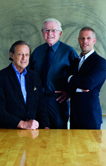
In 2008, designer Sagi Haviv became the third principal partner at the firm, and the youngest in its history. Some of their most recent projects include new logos for Armani Exchange and the Library of Congress.
The following video by Sagi Haviv, titled LogoMotion, features an animated showcase of various Chermayeff & Geismar logos.
Not a “crescent swish” or 3D reflection in sight.
Celebrating 50 years of working with partner Tom Geismar, Ivan Chermayeff (at the recent Design Indaba conference) noted that in the early days, when people would ask him what he did at parties he used to tell them he was a commercial artist, “They didn’t know what that was but they left you alone, which was good.” Now he says he’s a graphic designer, “and they say ‘Oh, my niece is studying graphic design.’ But they still don’t know what it means and they still leave you alone. Which is also good.”
Chermayeff & Geismar logos
Designed in 1986, the six-feathered peacock (representing NBC’s six divisions) has become one of the world’s best-known birds.
Designed in 1981, the type manages to be both contemporary and classic, emphasising the proud New York heritage by placing the ‘N’ and ‘Y’ in the centre.
Designed in 1961, when few American corporations were identified by abstract symbols, the Chase octagon has survived a series of mergers (quoted from Logo by Michael Evamy).
Designed in 1964, the Mobil logotype has become instantly recognisable across the globe. With this design reliant on colour, the black only version makes use of two concentric circles (for the letter ‘o’) suggesting motion and mobility.
Designed in 1997, this trade association for brokers and dealers uses a logo that appeals to those with an eye for upwardly-moving charts.
Steff Geissbuhler
Chermayeff & Geismar can’t be featured without mentioning renowned Swiss designer, Steff Geissbuhler, who was a key part of the design firm’s success.
In 2005, Chermayeff & Geismar Inc was dissolved following the departure of Geissbuhler and several senior colleagues, who established their own successful design firm, C&G Partners. Ivan and Tom, along with Sagi, now trade as Chermayeff & Geismar & Haviv.
More reading on Chermayeff & Geismar

Comments
Chermayeff and Geismar are icons. Great feature, thanks for the video!
You know, I’m glad you listed that Mobil logo. I’ve never actually seen it out of color – and understandably so, considering how heavily it relies on that red – but I hate to hear that it has two different logos. Is that a common thing?
Robert, you’re very welcome. I enjoyed watching the video and thought a few of you would too.
Erika, it’s uncommon for a logo to be primarily used in both colour and black and white. You’d be hard pressed to find a black-only version, because pretty much everything the company creates uses their corporate colours.
I did a quick search and oddly found a colour logo with the concentric circles. I don’t think it’s a proper version, but gives an idea how the black-only design appears.
Very Nice Article David.
Learned new things about logo design, I think we can break the rules to get new ideas like using different versions for complete black and a coloured one…!
Some superb modern logos, thanks for the knowledge. A couple of my favourites in there including NBC and National Geographic. Very iconic.
Great post, David. They really designed a lot of great logos.
Wow. Very impressive.
Ugliest: Downtown Alliance….or, at least that’s the ugliest of the 20 minutes I watched. I don’t have time to watch the other 4 hours. ;)
Chaitanya, one downside of different logos is recognition, although with the case of a logotype, as Mobil is, the black-only is a small departure from colour.
Valentino, Roberta, it’s amazing how many iconic designs came from these designers. You’re very welcome for the feature.
David,
Wow! What I knew of them before just skimmed the surface. I only knew 25% of the logos in the video, and only associated half or fewer with Chermayeff & Geismar. The more I watched, the more their beautiful, deceptively simple way with type had me entranced. (That I already knew, but I didn’t know the trance could last that long!)
Great post and thanks very much for linking to the video.
Regards,
Kelly
“Now he says he’s a graphic designer, “and they say ‘Oh, my niece is studying graphic design’. But they still don’t know what it means and they still leave you alone.
I will have to try this one…
Great post, David. I’ve learned quite a bit since you launched this blog. And thanks for clarifying that Chermayeff & Geismar are not responsible for the Xerox re-brand. :-P
Best regards,
Kevin
I worked with Tom Geismar when I was a student at Yale in the late seventies. I found him to be, unsurprisingly, a gentleman. Too, he was a serious and curious designer wanting to wring out all the relevant information before committing to any design work. The project I worked on with him and others, like Massimo Vignelli, and Rudy deHerak, was the DOT Symbol Sign Committee. My brief brush with this distinguished group of designers was both an inspiration and an unforgettable moment in time for me. I thank my department head, Alvin Eisenman for “hooking me up.”
I heard these two a couple of times.
They are still two creative people, huge in our profession.
May they live and work forever! P@
I got the book, matching the logo-video. Personally, I am more and more going to this extreme iconic and grapical way of logo design.
So.. how does a 34 year old designer, 5 years out of school, 5 years at the same firm, become a partner at said powerhouse identity shop, joining only 2 other partners, who happen to be the founders themselves, ahead of any other employees, who’ve been with the firm for ages!?
Honestly curious—I know there’s a rational explanation here somewhere. Is it to branch out to younger clients? Is he their “internets” guy? I’m all for young go-getters, but on paper and in press, this reads rather bizarrely.
Ok, no more coffee for me.
Two points about some of the comments I have just read can be made. Great designers are called so when important work is accomplished by intelligent minds. Every great designer has to be a great thinker as well. You can also include the success some of our best designers – and our most famous – is a result of their ability to communicate well in person and on paper. Don’t underestimate the value of being able to learn about the client’s needs. Tom Geismar is an incredible communicator in person. He is a great student as well. Paul Rand had a unique way of managing egocentric clients by becoming egocentric himself – when it was necessary to get the project done. Over the years I have seen some really sumptuous graphic work but have been able to remark only about its standalone beauty. I have no idea about whether a symbol satisfied the design requirement or pleased the end client. Successful designers have to be more than good mark-makers.
The other comment – There are many logos that have more than one version. Burlington’s logo showed fabric lines in their mark and used varying numbers of threads based on the final size and implied viewing distance. Another mark that I worked on with Alvin Eisenman while a student at Yale was the World Check symbol fro the World Bank. It was essentially a circle with a checkmark inside. The circle had to be modified into a non-circle because when the checkmark was inserted an optical illusion distorted it. It had to be changed to LOOK like a circle.
Good question, Alan. It’d be great to have an insight into Sagi Haviv’s career path, and how he made it to the current partnership.
Hi Mark. I wasn’t aware of those facts about the Burlington logo and World Check logo. Thanks for sharing.
Can you tell me who designed the pegasus for mobil oil?
Anyone familiar with the Screen Gems S logo-some people call it the S from Hell.
Subliminal rainbow message of acceptance.