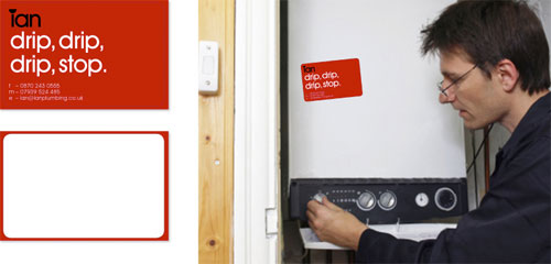
![]()
Cheshire-based designer Raphael Mahon helped Ian by creating this simple, relevant, and memorable plumbing logo with an accompanying stationery set.
“The look and feel makes Ian’s identity easy to remember as well as having a personality to help stand out from the others. Ian enjoyed the use of wit as it reflected his sense of humor.”
— Raphael Mahon


The fact that Raphael told me he has the Logo Design Love book on his shelf, that it’s a great resource, had absolutely nothing to do with my decision to feature this work. Honestly. I smiled at his design idea.
More from Raphael.


Comments
That is just pure awesomeness. What a wonderful, clean brand identity that really gets away from the stereotype.
Good to see that my first name isn’t as hard to use in a logo as I first thought.
I like this, simple, yet striking.
Love it. Simple, effective, and a nice mix of prefessional and light hearted.
Love it.
Definitely one of the better ideas showcased on your site David.
Absolutely perfect!
I kept waiting for: Ian, the plumber’s friend. Absolutely love the simple, brilliance. I can imagine lots of guys named Ian thinking of ways to adapt for themselves.
One word. Brilliant!
So perfect!
Simple elegance is my favourite kind of design aesthetic.
Perfect, is just the perfect word for such a perfect design. Simple, neat & clean, stands out and so much of fun to have one with you. I would love to take one for my collection and also try their service. Hat’s off to the designer Raphael Mahon and thanks David for introducing/sharing such a perfect design for us. This is again my first comment in your ‘that’ site as mentioned in your ‘this’ site (davidairey.com). God bless all.
brilliant, simplicity is sometimes overlooked as too easy but here is used to perfection to achieve amazing results.
one of the best ive seen for a long time, very refreshing!
haha i love it!
Absolutely brilliant! Very clever Raphael, such a memorable branding device.
Love the simplicity. My only gripe was with the single colour application on the sticker it could look like Tan instead of Ian.
Illustrates why so many people wish they were designers and so few really are. Terrific, memorable, simple. I can imagine Raphael or any designer wanting to get up and do a little dance of pleasure after coming up with this.
Wonderful! Raphael did an amazing job on this identity. It’s completely memorable and definitely stands out from the “clip-art inspired” competition!
Thanks for sharing!
So, so smart. The simplicity and cleverness is beyond amazing! A fine example of less is more.
The Van’s livery is lovely apart from one aspect – no mention of what Ian does?
This is a brilliant little gem. But I wonder how this brand will work for him? Will more housewives call him, who appreciate the large open type and playfullness and femininity of the logo? Or will less people call because they figure the plumber with the fancy logo has a fancy rate to go along with it?
I designed a logo and site (a mini brand) for a very high quality cabinet maker who works mainly as a subcontractor for general contractors. He needed to show competency in his custom work, but also come across as not expensive. You can see the result here:
http://watkinscabinet.com/
The logo and website are designed to come across as sensible, no frills, but exacting with a focus on craftsmanship and design. I wonder how well I did :).
Woops. Here is the business card too, for good measure. The branding carried through the logo, website, cards, and stationery.
Wow. Forgot to paste the link 2 times in a row. It must be Friday…yes, just checked.
http://www.bonfx.com/graphic-design-portfolio/watkins-cabinet-logo.jpg
Strange – the link to the image of the collateral didn’t paste. Let me try once more:
http://www.bonfx.com/graphic-design-portfolio/watkins-cabinet-logo.jpg
Wow. Such a fantastic concept.
It’s surely a good day when someone invents a new, creative way to dot
an “i”.
Kudos on the great, great work, Raphael.
Great!
Although I was expecting something like “Drip, Drip, Drop, Stop” on the sticker.
The logo is reminiscent of the Logo Design Love nameplate.
amazing yet simple work!
love it!
I love it!
But I wonder how he convinced the client… I mean, its an incredible design, but it is very non-plumberish in a way. do I make sense?
I’m not sure what was going on with your comments there, Doug, but thanks all the same (and thanks to everyone else, too).
I realise the vehicle design is a mock-up, but I’d like to see “plumber” mentioned somewhere.
The stationery is memorable and clever.
Not sure about the logo. On it’s own it feels Japanese, especially on the white background. But in context it’s great. They should work on the van a bit more, at the moment it’s just a logo on a van.
Hmm…works great in 2 colors…but when monochrome, it seems to read “Tan”…
Brilliant, simple idea. But how did Raphael convince the plumber to go for something so ‘simple’. Usually this type of client wants dodgy photoshop filters they think is good design, and not something so neat and plain.
Love it~ :D
I do love the design, very clever.
At first I didn’t get it as I thought the top of the dot was chopped off by top of the door of the van then when I saw it on the business card I thought “aaaaaaah…cool!”. Not sure about the colours, I agree with Lee, it’s too Japanese in feel. Maybe some cool colours or “plum” purples (groan!) would have been better? Great concept though! Love the tone of voice of the brand. Drip drip drip stop is great, was watching Junior apprentice last night and the girls came up with a bottle of water called “Drip drop” with the tagline “Never stop” so when I read this one for Ian I get a mental tongue twister as I confuse the two. Just me sharing my stupidity.
Anyway, very good!
Great solution, simple clean and memorable, nice to see the world of plumbing being given this treatment, great stuff.
I had a similar thought when Junior Apprentice was on TV, Victoria, so you’re not alone.
Oh dear, I think I’m going to come across as another cynical internet killjoy over-analyst, but from a bit of googling and istockphotoing, I’m strongly drawn to the following conclusion:
The client doesn’t exist. It’s just a designer’s project.
That would take a bit of the shine off it – especially if there was carte blanche to come up with the conveniently-vowelled nom-de-plumb [heh, sorry].
To be fair to Raphael, though, it’s never been presented otherwise; the idea of it being a proper design job has been inferred by spectators from the get-go.
I hope I’m wrong; as a designer myself it’d be nice to know that there are small-business clients out there with such faith in a designer. It would be a distinct rarity, however, judging from my experiences.
I can assure you Simisker that the client is real as is the work.
Above is final presentation material.
The reason why the client liked the idea was due to presentation. This is a ongoing project but the above designs are final (apart from the van).
Also I would like to add there will be a website for Ian The Plumber and it will be up and running in a couple of months time I will post the link here when its completed.
I am glad everyone liked the identity and I hope to be featured again on this great website.
Thank you everyone for your comments.
Please feel free to visit my website for any updates and more work:
http://www.ralphmahon.co.uk
I would also like to add that Ian Lightfoot is from and works in Liverpool.
In that case, Raphael, kudos is due to you not only for the design, but for having the skill to convince Ian with your presentation and persuasive arguments. Well done!
As I was keen to point out, I didn’t think there was any intent to deceive, but if any implication can be taken from my post, I apologize.
I’m very happy to have been proven wrong and eat a bit of humble pie, as it gives designers everywhere hope and inspiration.
Good luck with the website :)
haha so sweet
Just when you think you’ve seen it all in this game, a little gem like this comes along.
Very, very well done (but, as commented above, the van does need the word “plumber” on it somewhere or some other kind of clue).