
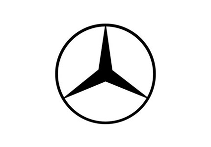
The Mercedes logo (Mercedes-Benz) consists of a simple depiction of a three-pointed star that represents the company’s intended domination of the land, air, and sea. But it didn’t always have the same familiar appearance.
In 1901, when Mercedes Jellinek was just 11 years old, her demanding father Emil Jellinek insisted that her name be given to an order of 36 cars he intended to buy from Daimler-Motoren-Gesellschaft.
Daimler-Motoren-Gesellschaft used the Mercedes name for most of its cars and registered it as a trademark in 1902. The three-pointed star came later, in 1909. Jellinek had his own name legally changed to Emil Jellinek-Mercedes.
On 28 June 1926, when Benz and Cie formally merged with Daimler Motoren Gesellschaft — becoming Daimler-Benz AG (Aktiengesellschaft) — it was agreed that thereafter, all of the individual factories would use the Mercedes-Benz logo and brand name on their automobiles.
The Mercedes-Benz logo design consists of a simple depiction of a three-pointed star that represents its domination of the land, sea, and air.
Silver is typical of the brand, and dates back to its involvement in the first Grand Prix at the Nürburgring in 1934.

When one of the cars exceeded the eligible weight of 750 kilograms in the pre-race checks, officials spent the night polishing off the white paint so the car was back to its raw silver colour. (So the legend goes.) The car was named the “silver arrow.”
![]()
For other car logos from the archives, here’s the BMW logo evolution, the history of the Ferrari logo, and the origins of the Skoda logo.


Comments
It’s great when a logo gets to the point that you don’t need the name of the company anymore, like Nike.
When it comes to car logos I also love the Mitsubishi one.
Wow, I’m impressed by how little it’s changed since 1909 – that’s consistency. Very reminiscent of the evolution of the Coca Cola logo.
Cool post mate. The most recent logo was just launched about a year ago…it is now flattened and a single silver color. It no longer has the dimensional element to it. This change applies to the logo in print and online. The emblem on the cars still has the hard bevels. I do some graphic design work for them and really liked the update they did to the latest version
It’s like the Chanel logo.
That’s it, there isn’t anything better, the logo enforces that belief to me anyway.
I love the 1926 logo, especially the enamel badge, it’s quality, just like the vehicles they make.
Ah car logos! The Mercedes logo evolution seems like heritage. I remember an advertisement where they had the entire history with a couple more.
Wonder how the Punto logo came about. Love the playful P form but there is something missing. What do you think?
Arguably the most well known car logo around and most probably due to its consistency and simpleness. A great identity that will never need to re-brand itself.
The Mercedes logo certainly is an impressive one, especially considering how little it has changed over the years, this goes to show how well the evolution has perfected its design. He fact that you can instantly recognise what it is without the name underneath, much like the Nike tick, proved how well embedded this design has become in the public consciousness.
It’s interesting to note that the latest logo design has been flattened to make it two dimensional, so that it is consistent in print and web publications. This simplifying of the design seems to be a common occurrence at the moment, as simplicity becomes ever more fashionable.
Looking forward to reading similar posts in the near future, thanks for a great tour through their logo design history!
When it comes to the Punto logo, I’ve read somewhere that some people say it was inspired by the air con dials from the latest Volvos. I remember seing it and there were some similarities.
I think car branding has always been way ahead of any other. It’s the logo or Symbol (the mercedes badge above is a symbol, it’s NOT a logo).
There are lots of visual signiatures that cars have that mean you can tell one from a distance, even in the dark just by the headlights. It took many years for other non automotive brands to catch on to this.
This also demonstrates exactly what a logo/Symbol is. Firstly it’s a badge, and identifier. The emotive connections people attach to that are mostly to do with their experience with the brand itself. Making the brand more visible/distinctive and re-enforcing those connections is the essence of great branding.
The current one is missing: http://2.bp.blogspot.com/_UYUyHACXkrA/SLlwUvpUO-I/AAAAAAAAIJQ/h21FRWlEpWE/s400/Mercedes-Benz%2Bnew%2Blogo.bmp.jpg
Thanks for mentioning the recent update. I’ve added new images showing the flattened symbol.
Will your Mercedes work be in the new portfolio, Brian? It’d be great to see.
Lee, a terminology post would be useful. Give me a shout if that’s of interest. If not, I’ll put some thought into it. Cheers.
I will email you David.
Cheers
Lee
It’s so exciting to see the 1 color version of the logo in effect. :-)
i like the stories behind cars logos, there is the BMW logo is also very interesting.
the flattened version of the silver arrows is very simple when you compare it to the 3D one, but it seems ok when it’s used in their web site, and i guess the print.
it’s tremendous decision of Mercedes owners, because see the great beauty in simplicity & richness, and easy to print on each and every promotional materials with even similarity….
Mercedes-Benz certainly employs one of the most recognizable and timeless logos out there. Thank you for sharing the progression of this logo from it’s inception to what we see and know today as the Mercedes-Benz brand.
Tessa Carroll
great post, helps to keep things in perspective when designing my own logos.
“Mercédès is the name of Maybach’s elder daughter, while the Benz came as a result of a merger with Benz and Cie in 1926.”
Wrong – Mercédès is the name of the Emil Jellinek’s daughter.
http://en.wikipedia.org/wiki/Emil_Jellinek
great post, i really love to collect pictures of mercedez benz cars.
awesome.
Thanks a lot for the daughter update.
Wow, nice piece of history in Mercedes logos. Thanks for sharing.
The logo/symbol is serendipitously, or perhaps intentionally, evocative of a steering wheel.
The three point star is for land, sea and air. the circle is for around the world. Mercedes Benz Land, Sea and Air, Around The World.
Hi, nice post. I had been told that Mercedes logo was a star because the company has manufactured aircraft engines and the logo was the shape of blades. Does anyone know if it’s true? And what about BMW logo?
There are three points to the star because of the three firsts the company achieved.
1) The first powered air-ship MB engine
2) The first i.c. engine in a screw-propellor boat (the Marie which is still in the MB museum, Stuttgart, and which we ran on the Thames under Tower Bridge)
3) The first “car” of course
For those interested.
Each point of the star has a meaning. It goes something like this:
botton-left: LAND
bottom-right: SEA
top: AIR
Mercedses-Benz manufactures automobiles, parts and accessories for use on Land, Sea and Air.
My dream car! I learned a lot reading the history and representation. My grandparents, Mercedes Benz owners, Howard R. Grimes (deceased) would be very proud if I ever own a Mercedes Benz. Thank you all for the imformation. Cheers! William R. Funk IV
How very interesting!
There’s a town in Austria, Bad Ausee (Steiermark/Styria), in which there’s a circular bridge over the river that is identical to the Mercedes logo – including the silver colouring. Don’t suppose you know of any connection between the company and the town? I haven’t been able to find one.
The Mercedes logo is as timeless and beautiful as its brand and machines. You can tell I’m a fan, haha. Mercedes and Aston Martin take the top of the list for my favourite car brands.
Love that “STAR”
I’m researching the Mercedes-Benz logo for one of my class projects and read on the Mercedes-Benz official website that the name Mercedes isn’t the name of Maybach’s daughter but of Jellinek who was a race car driver and wrote “Mercedes” on his cars.
I was watching The Remains of the Day (1993) with Anthony Hopkins and Emma Thompson recently. It’s set in the WWII era and at one point Stevens (Hopkins) takes a drive in his master’s ’37 Daimler ES24. If you look closely at the headlamps, you’ll notice the Mercedes logo inside them. Strangely, this was the English Diamler, which later became Jaguar–not the German Mercedes we know today. There’s your fun, albeit useless, fact for the day.
Hi all, I’m hoping someone is able to help me shed some light on the origin/age of a Mercedes star & laurel car badge that I have.
I’m not sure where on the car this would’ve been from but it’s the same size as a bonnet, boot or grill badge (9.5cm diameter from outside to outside of laurel circle, the outside diameter of star & inside of laurel measures 6.5cm).
I can’t upload a pic to this but am happy to email one to anyone who can help!
The badge is two parts – the star in the middle being one part and a perfect fit around the star is a flat, circular piece with raised laurel design the whole way around.
There is no paint or enamel present and both parts are made of a metal which, due to age has turned a brownish green colour.
The star is fairly thin in design and the laurel measures 1.5cm wide.
Thanks in advance. ;)
What years do they have the 7 1/4 ” logo on the grille? Found a couple, kinda trying to date them.
There have been plenty of additional iterations of the logo with Mercedes Benz in a number of fonts, forming what is known as a ‘logo lock up’.
Eg: during the 1960s the logo included an expanded font in caps — very reminiscent of the era — this being just one of a number variations of lock ups. So whilst the basic star hasn’t changed much it has been adapted to current design styles over the decades.
The USA has yet to fully picked up the new image, but if you look globally or towards Canada where it has completed, you will see the branding of dealerships has focused on the star, and historical colours have been introduced (black and silver).
It is correctly stated that MB has recognized that the star can be used without any letters and be recognized. That is very powerful to have logo recognition globally in that manner.
The stars on the signs are to be brighter than any of the words on the building. The new sign design is to be ‘silver by day and night’ so if it was properly manufactured the star is 3D chrome during the day and when illuminated a interior graphic lights through producing a 3D effect on the star.
Do we know which points of the star represent the land, sea, and air?
Left for land, right for sea, and the top for air.