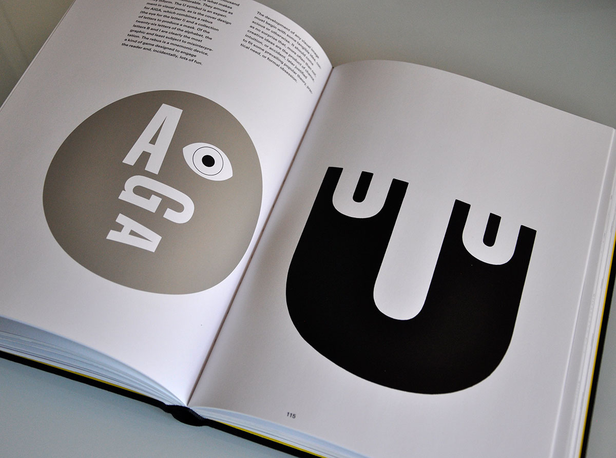
“The U symbol is an experiment in visual puns, as is the cover design for AIGA, which combines a rebus (the eye for the letter I) and a collection of letters to produce a mask.”
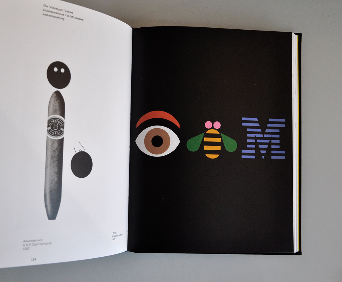
“Of the twenty-six letters of the alphabet, the letters B and I are clearly the most graphic and least subject to misinterpretation. The rebus is a mnemonic device, a kind of game designed to engage the reader and, incidentally, lots of fun.
“The development of any visual image must begin with some tangible idea, conscious or otherwise. It should come as no surprise that, more often than not, creative ideas are the product of chance, intuition, or accident, later justified to fit some prevailing popular theory, practical need, or formal obsession.”
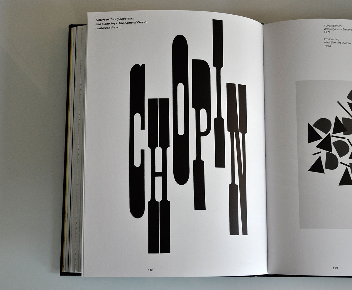
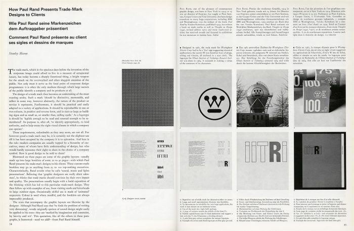
Excerpted from the 2016 reprint of Paul Rand: A Designer’s Art, published by Princeton Architectural Press and available on Amazon.com / Amazon.co.uk.
Highly recommended, A Designer’s Art was originally written in 1985, and includes updated essays from Rand’s 1947 text, Thoughts on Design.
Posted . Updated .
More on how marks like this are made in Logo Design Love, third edition.




Lee Newham,
I’ve always been a fan of Paul Rands IBM rebus. My tutor at college, Malcolm Swatridge, showed it to us as part of his quest to get us into ideas.