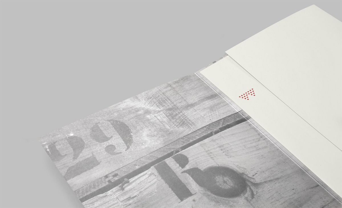
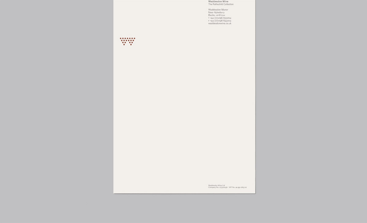
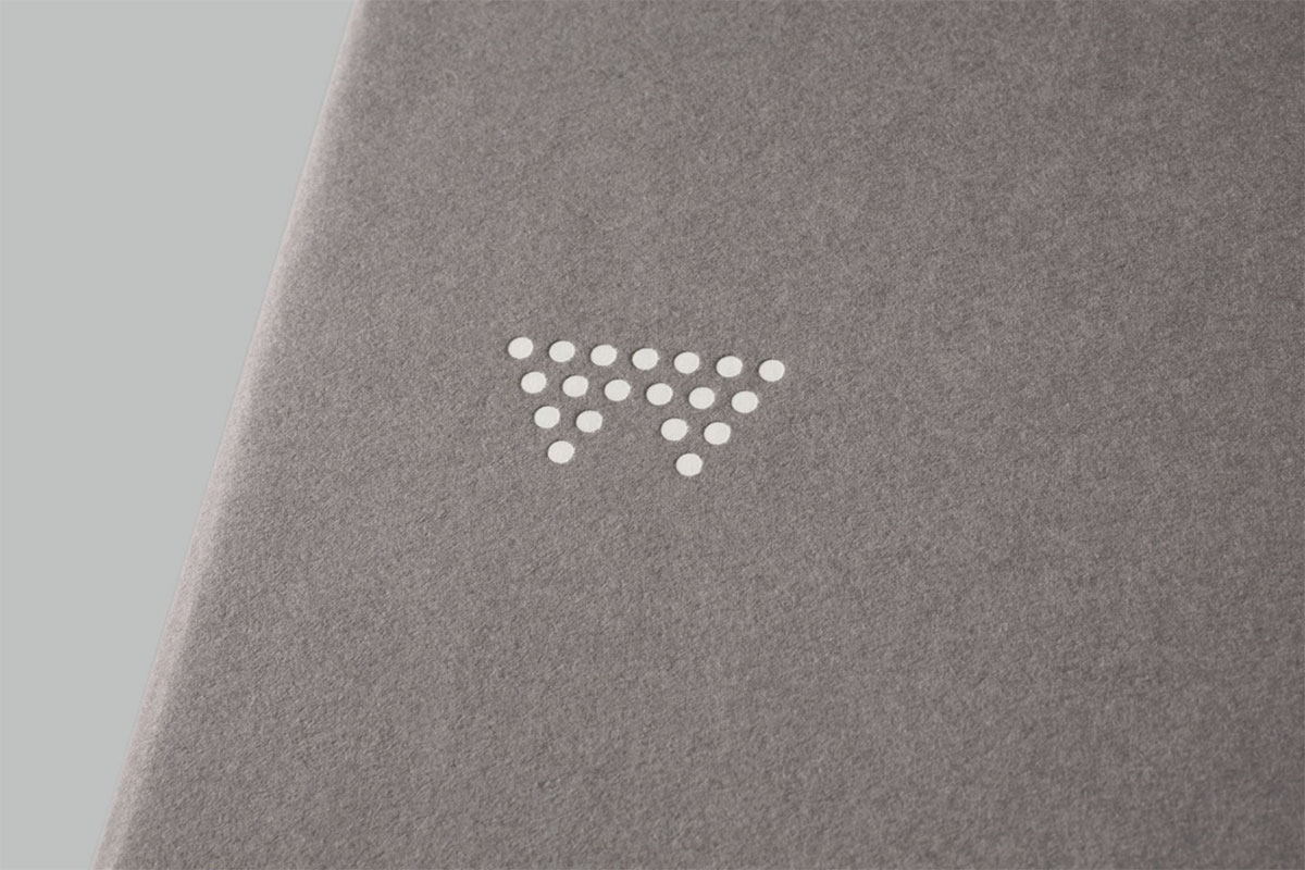
Circles that form a stylised bunch of grapes isn’t new, but when the name of the brand begins with a ‘w’, and when the aim is to balance the tradition associated with Rothschild wines with a more modern approach to the wine business, the grape-like monogram is an ideal fit.
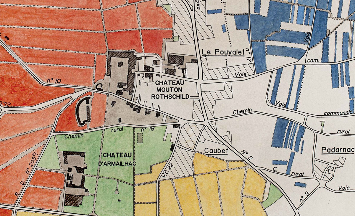
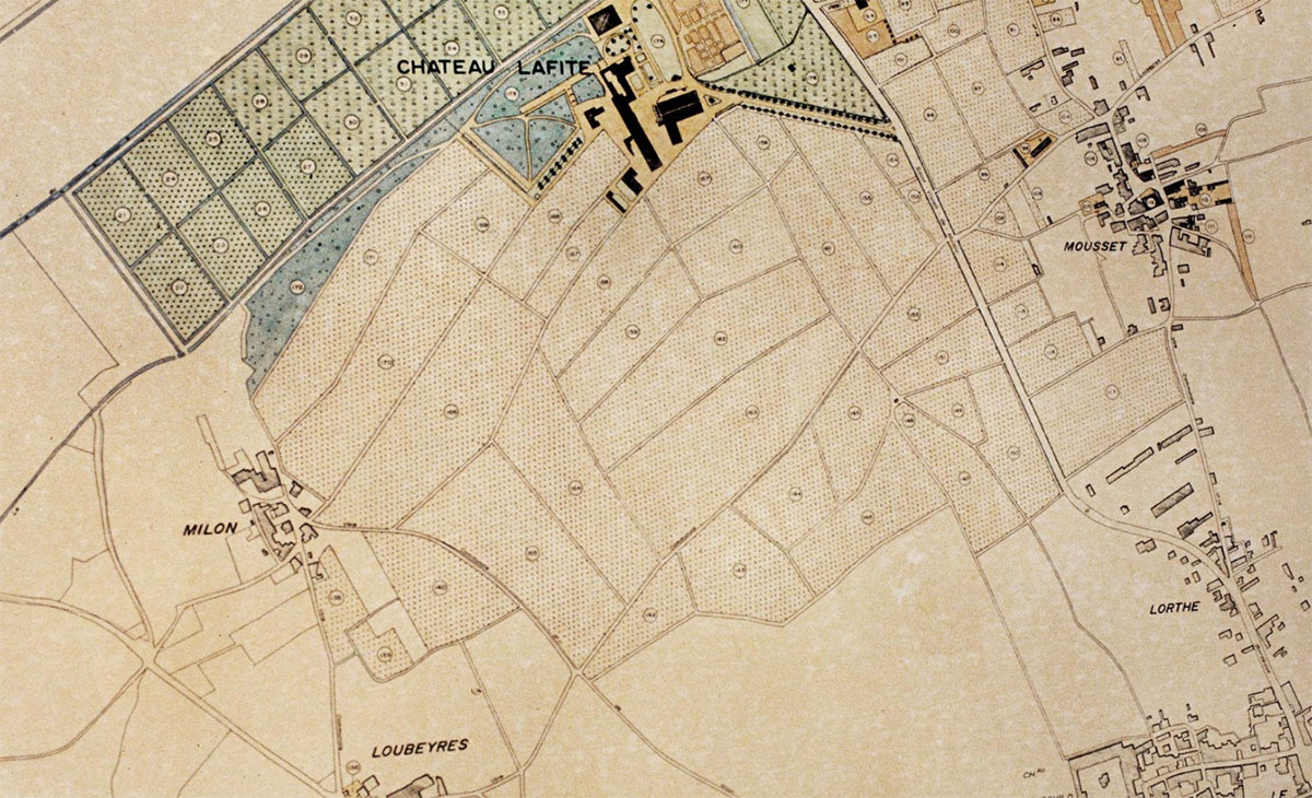
Packaging was created for Château Lafite and Château Mouton Rothschild, with each bottle wrapped in distinctive vintage maps of the respective vineyards.


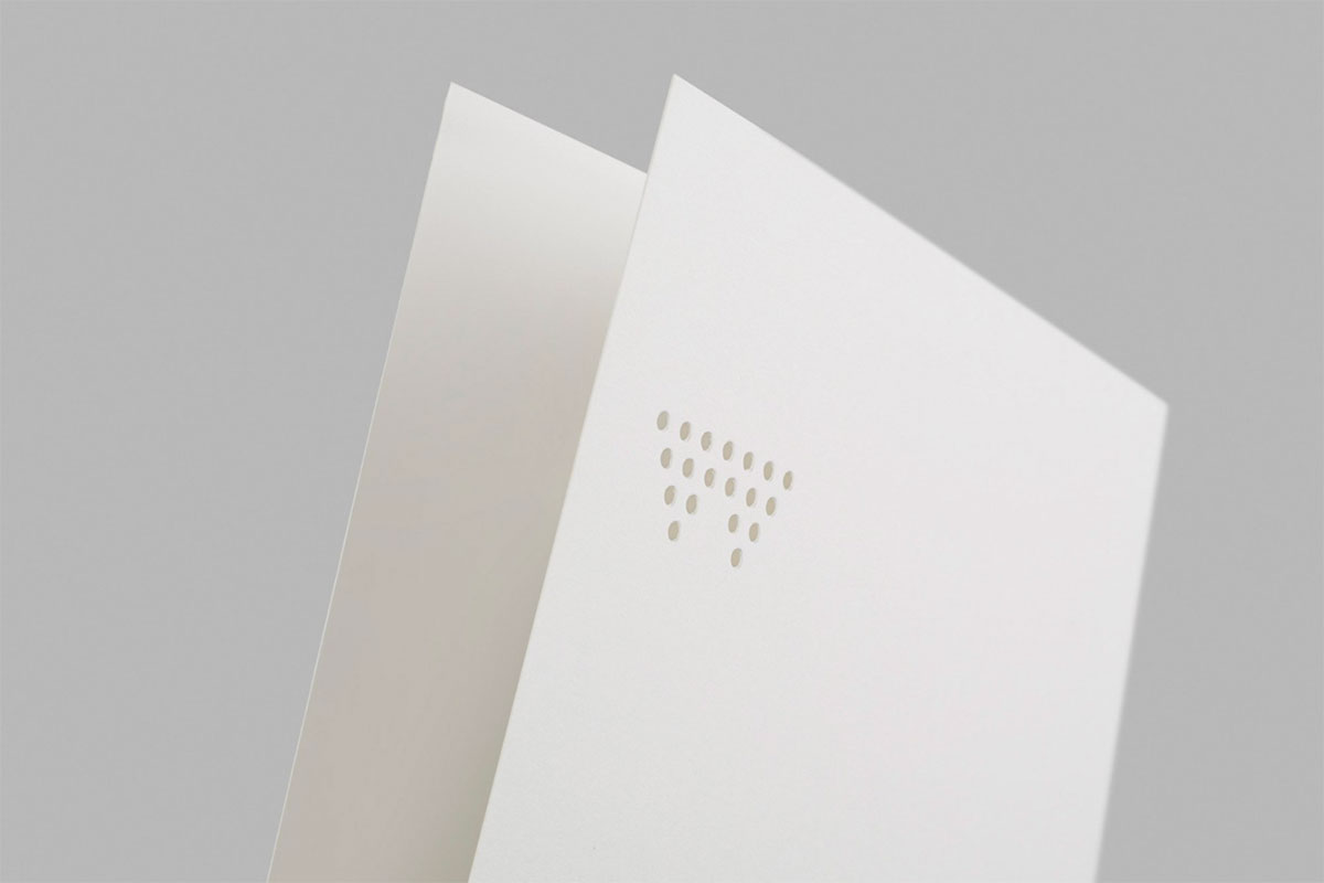
A set of A5 cards was also designed, for printing on thick cotton stock with the logo punched out so it can be read on both sides.

View more from the Paul Belford team.
Posted . Updated .
More on how marks like this are made in Logo Design Love, third edition.



Michał,
Neat.
I really like the wrapping paper for the bottles.
Octavia,
How elegant and discrete.
Steven Skaggs,
Less enthralled about the packaging, but the identity program and stationery are simply exquisite. Kudos to the design team. By the way, where one might see grapes, I see racked wine!
Alun,
The logo is very reminiscent of Vale brewing’s – valebrewing.com.au