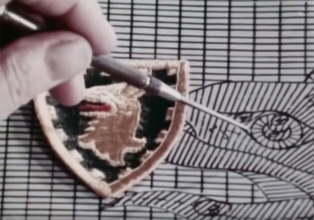
Alfa Romeo
Originally designed by Romano Cattaneo and Giuseppe Merosi, in 1910
![]()
The Alfa Romeo company was founded in 1910, and the logo has changed many times since then, but its main items have remained — the red on white cross of Milan, and the serpent from the Visconti family coat of arms. I’ve never been convinced. Mainly because there’s too much detail in the serpent and it becomes lost at small sizes.
Audi
Designed in 1932
![]()
Audi’s four ring design was created to symbolise the merger of four individual companies. One of my favourites for it’s simplicity and meaning.
BMW
Designed in 1917
![]()
The blue and white panels of the Bavarian flag were placed at the centre of the design. During the late 1920s, the BMW logo was given a new interpretation, that of a rotating propellor. Simple and iconic.
Fiat
Designed by Robilant Associati and the Fiat Style Centre, in 2006
![]()
Between 1931 and 1968, a shield emblem decorated Fiats. This logo design recalls the older icon, and the revised version has been made 3D. There’s something about the type that just doesn’t inspire a good feeling. Is that just me?
Ford
Designed by CH Wills, in 1909
![]()
The designer, CH Wills, was actually an engineer and draughtsman, working for Henry Ford in the early days. Extremely recognisable through the sheer scale of Ford production. The logo has certainly stood the test of time, but I’m curious as to what other logo designers think of it. Maybe it’s just that I’m not so keen on ovals.
Honda
![]()
Here’s a question, who designed the Honda logo?
Jaguar
Designed by The Partners, in 2002
![]()
In updating the older Jaguar logo, The Partners altered the logotype and digitally remodelled the leaping Jaguar. I’ve often wondered why the Jaguar is shown leaping from right to left, countering how the eye reads the text from left to right. Perhaps it’s to create a more streamlined end?
Lexus
Designed by Siegel & Gale, in 2002
![]()
The name ‘Lexus’ has been attributed to the words ‘luxury’ and ‘elegance’, and this is one that I quite like.
Mercedes-Benz
Designed in 1909
![]()
One of the most recognisable logos around. A three-pointed star had been designed by Gottlieb Daimler, to show the ability of his motors for land, air, and sea use. This star first appeared on a DMG model in 1909, so it was chosen for the new logo. The traditional laurel wreath symbol used by Karl Benz was added along with his name to complete the new logo. The logo with a plain ring, as seen today, was not used until 1937. More on Wikipedia.
Mitsubishi
Designed by Yataro Iwasaki, in 1870
![]()
I featured the Mitsubishi logo in an earlier post, 15 wonderfully simple logo designs, and it’s a design I greatly admire. ‘Mitsubishi’ is a combination of the words ‘mitsu’ and ‘hishi’. ‘Mitsu’ means three, and ‘hishi’ means water chestnut. Japanese have used the word ‘hishi’ for a long time to denote a rhombus or diamond shape. In speech, Japanese often bend the ‘h’ to sound like a ‘b’ when it occurs in the middle of a word. So they pronounce the combination of ‘mitsu’ and ‘hishi’ as ‘mitsubishi’.
Nissan
Designed by FutureBrand, in 2000
![]()
This metallic roundel is part of a successful Nissan revival, and in my opinion, is an improvement on those older designs that can be viewed by scrolling down on this page: Cartype Nissan Logo.
Renault
Designed by Éric de Berranger, in 2004
![]()
Interesting typeface info: both the Renault logo and its documentation (technical as well as commercial) had used a specially designed typeface called Renault, developed by British firm Wolff Olins. This type family is said to have been designed not for prestige reasons, but mainly to save costs at a time where the use of typefaces was more costly than it is now. In 2004, French typeface designer Jean-François Porchez was commissioned to design a replacement. This was shown in October of that year and is called Renault Identité. Found on Wikipedia. I have featured Wolff Olins on my other blog: London 2012 olympic logo disaster.
Seat
Designed by Enterprise IG, in 1950
![]()
The striped ‘S’ came about from the first letter of the previous logotype.
Volkswagon
Designed by Franz Xaver Reimspiess, in 1938
![]()
No official designer has been recorded for this one. The latest variation of the VW logo includes a 3D highlight from MetaDesign, added in 2000.
Check out Cartype for more car logos.

Comments
Was it Miles Newlyn who designed the Honda identity (and the new Unilever logo also)?
Good collection.
I think the car manufacturing industry is not that much dynamic in their logo designs. They will be much more interested in car designs. That is why we see some not much inspiring logos above.
Interesting to see Ford using oval while most others use a circle.
The Mitsubishi, Jaguar and Mercedes-Benz logos are the ones I like.
David, where is the Ferrari logo?
Woah!
I didn’t know that about Mistubishi’s logo!
That’s cool!
:-)
What about Infinity?
I’ve liked their logo.
Very fitting.
Yaili, possibly. According to Brands Of The World, he created the logotype for the most recent Honda logo, but I’m unsure of the symbol.
Niyaz, there are so many out there that I thought I’d hold some for a future post, Ferrari included.
Brian, you learn something new every day, eh? I’ll look at the Infinity logo down the line, cheers.
I found the Mitsubishi story quite interesting :) I am not a fan of that Fiat logo at all. My favourite would be the Mercedes. There is so many more car logos out there, maybe do a luxery car post next time :)
Yeah, the Fiat typeface and logo as a whole reminds me of a tractor manufacturer or something you would see on a semi truck. It’s not very “sleek” or “classy” compared to other car company logos.
I always liked the script Ford logotype. I don’t think there are many car company logos like it. Most are your normal serif/sans serif typeface.
My favourite logo is Jaguar – just because I love wild cats, and always fancied this race car. I’ve heard stories that people steal those metallic jaguars from cars, so some owners take them down themselves ;-)
In terms of simplicity I liked Mercedes and Audi as well.
Did you notice that so many car logos use circles or ovals in their designs? I realized that when I was putting my post together: 8 Bits Of Perfect Geometry In Classic Logos
I’ve never seen SEAT car, is it British?
PG, there’s no mistaking Ford.
Jacob, I’ll keep that in mind, thanks for the suggestion.
Vivien, SEAT is a Spanish manufacturer owned by the Volkswagon Group. They’re mainly sold in Europe, but some are rebadged as VWs and sold elsewhere. There’s definitely a liking for circles amongst car firms. I think I missed that classic logo post of yours. Nice.
Re: the leaping jaguar. I think the reason for the direction is not streamlining, but exactly what you mentioned. The direction of normal reading. I think what they were going for was contrast. As you read left to right, the leap of the jag is more pronounced. More bang for the buck.
AUDI’s “almost Olympic rings” and LEXUS’ elegantly shaped “L” are my favourite – simple, yet catchy :) I also admire OPEL’s logo a lot. Would be interesting to read about that one.
Will be looking forward to it, David ;)
Not that is so important, but Volkswagen is my all time favorite logo. And when it comes to cars… always Ford. :)
Great post!!, thanks.
About the Jaguar logo, i think the white space draws a car silhouette. The chest is the roof, the knee is the hood and the foot is the front. And that car is going right :P.
VW gets an A from me, an all-time favourite!
Lexus – well, though I love the cars, I don’t share the enthusiasm over the logo.
The fun part of Alfa-Romeo is in the details. Check that: “The right half is the crest of Ottone Visconti, founder of the noble Visconti family of Milan. He is credited with the killing of an infidel in a duel during the First Crusade. His victims shield was inscribed with the image of a snake devouring a man. Ottone used this emblem in his family crest which was later adopted by the city of Milan onto its coat of arms. It is a symbol of power and success of Milans enemies being devoured by the snake.”
Also love the elegant red typo (not on the logo featured above)
For Renault, it would have been better if the latest logo is shown (not the 1992 version above).
Mig,
My first car was a Ford. A Ford Fiesta (I don’t think they’re sold across the water – too small).
Plamen,
Thanks for the extra info, and also for pointing out the old Renault logo I was showing. I’ve updated it now, and enjoyed viewing the evolution timeline.
With reference to the Jaguar logo… could it be that the reason the jaguar is leaping from right to left is that British built cars are right side drive? It would seem natural to me if I were driving a Jag built in Great Britain with right had drive that when I looked down at the steering wheel and saw the jaguar it would be leaping across the car and not out the window. Just a thought…..
By the way….this blog looks like it is going to be a good one.
Eric
I thought Paul Rand was commissioned to redesign the Ford logo. He did it in a sans serif and kept it in the blue oval. I think the execs at Ford decided they liked the original better and kept it.
Where’s the GM or Chevy logo? Where’s the love?
David,
Where’s the “Hyundai” logo!? You have “Renault” and “Seat” but no “Hyundai”?!
http://hyundai-accent.5go.ru/hyundai-logo.jpg
Eric,
Interesting thinking about the Jaguar leap direction. The company sell about as many cars outside Britain as they do within (most on mainland Europe but also in the US), so I’m not sure how much of a factor that would be.
Thanks for the compliment on my blog.
Michael,
I didn’t know that about Paul Rand. Nice mention.
There are many many car manufacturer logos that aren’t shown in this post, and I wrote in the article how I’ll be featuring more in the future, so the love’s on its way. Don’t worry.
Hello Brian,
I guess you missed that part too, where I said I’ll be featuring more manufacturers soon. Do you drive a Hyundai by any chance? ;)
I love the Audi logo, so simple.
Don’t forget the Toyota logo ;) Quite like that design too.
Hi David,
Sorry I missed that mention…
Yeah, I am a hyundai fan…they have a great service team in our area…and take care of the cars so well…
I’ve got a tiburon gt that just 3 days got a little banged up. A guy slammed on his breaks (for no apparent reason) in front of me, and I slammed into him….not fun. I think the European version of the car is the Hyundai Coupe…
I like how Hyundai are marketing themselves as more of a high end brand now…they are about to realease the Hyundai Genesis, and they are pitching it up against a bmw 3 series and one of the lexus models.
It’s interesting to see the logo presented in this higher end imagery on their advertising…and they do pull it off pretty well. I dont think some of the other logos could ever really do that….like if “Seat” ever went for it!
cheers
Mike,
The Toyota logo is a nice one, and there’s an interesting article about it on the Cartype website I link to above. It seems a lot of people want to copy it in some shape or form.
Brian,
No problem about missing the mention. I’m familiar with the Hyundai Coupé, and it’s a nice car. Sorry to learn of your crash, but I guess you should read up on braking distances? ;)
Hi David
Just discovered this blog in the last couple of days, looks like it has a lot of great potential :)
Just to add to Michael Holdren’s comment about the Ford logo, in a recent issue of Grafik magazine there was an article in which a few prominent designers’ wrote about their favourite logos. One of them (I forget who) featured Paul Rand’s Ford logo. It was a very interesting adaptation of the original, maybe too forward-thinking for the Ford execs at the time.
(Just decided to do a google on it, here it is: http://www.paul-rand.com/assets/gallery/identity/logo_ford_large.jpg)
Hi Jonno, that Ford logo was interesting. I’ve featured it in a more recent post all about Paul Rand
I worked on a pitch for the seat logo years ago (we didn’t win unfortunately). If I find it I will send it to you if you want David.
Regarding the comments about the logo’s being uninspiring, I disagree. Most have evolved. Most are iconic and most you can describe. The fords Blue Oval, Rolls Royce’s RR, Vauxhaul’s Griffin, MG’s Octagon, Ferrari’s prancing horses, jaguars leaping Jaguar.
Lee,
I’d love to see your pitch for the Seat logo. I’m sure it would make an interesting feature.
I love the Mercedes logo. The 3D effect is pure black and white. No shading nor gradientmesh. Even in a very small size it doesn’t lose any detail.
Thanks for interesting facts.
I was amazed to learn about how old Mitsubishi logo was. Still so modern.
I think Ford’s design purpose was to trump the name “Ford” and the logo does exactly that as clearly as possible. The message is “Ford is what you are getting for your money, no doubt.”
Moritz, I agree, it’s good that the 3D Mercedes logo doesn’t rely on gradients or effects.
Daniel, certainly testament to the Mitsubishi designer. Timeless.
Have you notice that the serpent in the Alfa Romeo logo is eating a child?
If you look for their logo in the 30’s this detail is more noticeble.
Being that the question “Who designed the Honda logo” was mentioned aboved, why stop there? Anything on who designed the Acura logo, and what is the story behind that one is?
Most of the logos are dealing with the planet saturn and or black magic.
Nissan logo for instance, it’s actually the Planet Saturn. Other logos deal with illumination through symbols such as the pyramid, triangle, or hexagon.
I am trying to learn all the car logos an tail light shapes. . Is there a book I can purchase on them or on their tail lights? I need the name and the Author.
I’ve often thought that about what the next level will be after the car industry’s current 3D, ultra polished OTT logo styling collapses in on itself.
I once had lunch with the chap who designed the Landrover Logo, we were working on a project for a large car body panel manufacturer, he was redesigning their logo and the answer was simple… just make it 3D, like a car badge.
But how can car manufacturers look more like the front of a car?.. Holograms? Or maybe they will just be wiped with the scent of petrol.
Fun post! Looking forward to more of these in the future. Please, please don’t overlook the “Raging Bull”- would love to hear peoples commentary. I know it is a bit detailed and not as simple and iconic as Audi or Mitsubishi, but it communicates the power and attitude of Lambos so well.
Thanks for the article, very interesting.
The main reason I believe the jaguar is leaping in the opposite direction is because if he went in the same direction as the text, your eye would be led right off the logo. You want to create a circular pattern to keep focus on the logo, so after you read it, your eye follows him back around to the beginning, and your eyes are kept following it.
I am curious what are your thoughts on the Subaru logo?
Hi, is there any info on who was the Mitsubishi logo designer?
Hi, I like your logo analysis. A personal note: I was QC Mgr for a divison of Mitsubishi for many years. The Japanese Presidents I worked for all told the same story that the Mitsui = 3 and the Bishi = Diamond. Who knows, perhaps it was too difficult to explain to the Gai Jin. Thanks.
Would like to see the iconic Mustang logo here.