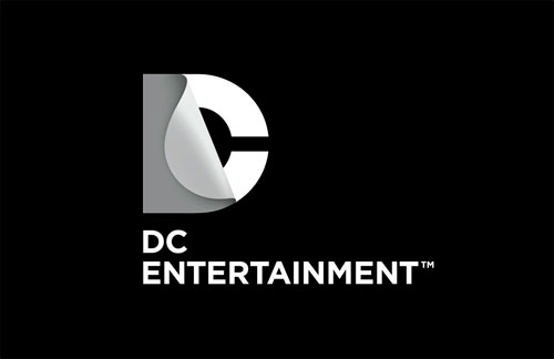
Some of you mentioned this on the LDL Facebook page, so for those who don’t use Facebook, here are a few images showing Landor’s redesign (also reported on Brand New).

“DC Entertainment, a Warner Bros. Entertainment company and home to iconic brands DC Comics, Vertigo and MAD, revealed today a new brand identity. The new identity is reflective of the company’s mission to fully realize the value of a rich portfolio of brands, stories and characters, distinguished by incredible breadth and depth across publishing, media and merchandise. A new logo for DC Comics was also introduced, closely aligning with DC Entertainment’s new mark.”

“The design of the new DC Entertainment identity uses a “peel” effect – the D is strategically placed over the C with the upper right-hand portion of the D peeling back to unveil the hidden C – symbolizing the duality of the iconic characters that are present within DC Entertainment’s portfolio.”

More info and images on the DC Comics blog.
The initials “DC” came from the company’s popular series Detective Comics, leaving the title suffering from RAS syndrome. As Daniel pointed out, it should be Detective Comics, or DC, but DC Comics just looks stupid.

Designs by Milton Glaser, 1976 (left) & Brainchild Studios, 2005 (right)
Thanks to Paul Stretch and Derek Graham for the tip.
Reported elsewhere:
Silas Amos of jkr offers his thoughts: DC comics quick costume change


Comments
I had no idea DC comics meant Detective comics. And I don’t care either. There is Marvel and DC. I never knew which was which as a kid.
That’s the problem the designers had to solve and I’d say it works. I’t may actually help cement the relationship between the characters and DC. I like the fact that it’s a recognizable window through which the brand can be viewed. Good job I’d say from the elements I’ve seen, and it works on the magazine.
As for the old ID by Milton Glazer, well, being honest, it’s not great is it?
I don’t think it works. I get that there’s a D, and yes it’s clever, but I don’t SEE a D when I look at it. It reads “C Comics” to me.
I actually love this logo. I think it is distinct, extremely clever and versatile. From the glow, to the image underlay potentials – it is continually exciting.
Great logo but I prefer the previous.
As one of my friends pointed out, DC new logo looks a bit like:
http://stocklogos.com/topic/discovery-historys-brand-new-look
I kind of agree that is a bit like that.
Cheers!
The previous one was much more dynamic…
I’d no recollection of the brand before this refresh, so I wasn’t attached to the previous design. The only comic I read as a kid was The Dandy. Either that or The Beano around these parts.
Very smart, very clever. Feels like DC might be moving away slightly from the comic world and incorporating a more adaptive and grown up feel.
Probably due to their increasing amount of film work and merchandising.
Like it.
As a comics fan I think this is a terrible logo.
As a designer i think this is a terrible logo.
When the logo first appeared I thought it looked kind of postmodern and pretentious for comic books. But it works great when printed on the left edge of the books like the example photo.
I have to agree with the majority on his one.
I believe the pervious logo is a lot more suited to what DC represents. I’ve been a comic fan for as long as I can remember and I can’t help but feel that this was a bad decision. The ‘peel’ effect is a very clever concept but it just doesn’t compete with the pervious logo unfortunately.
I have to admit, I really don’t think it works well as a standalone mark – the previous one was much better. I understand the concept of their comics being ‘page-turners’ and also the hidden personas of the characters but I just don’t think it looks that great on it’s own and when it’s in b/w, it doesn’t work well.
However when you partner it up with the lighting effects and the characters, then add the textures and colours to it – man it does look really really good. Really love the look of the ‘Watchmen’ and ‘Green Lantern’ marks – subtle and great.
Nope. Doesn’t do it for me.
It’s a nice logo and all, but it doesn’t say ‘comics’ or superheroes to me. The old logo had schwoong and excitement. It was something that stands out in the crowd. This logo is bland and perhaps adaquate for a neat and decent company involving packaging materials or carpets. An entertainment company involving stories about superheroes should breath playfulness, puckishness even, and have a boyish charm. This one doesn’t do that.
If, and only if the logo serves its communication purpose and follows the strategic plan that DC has, then and only then Landor can justify the graphic approach and the compromise of designing a logo like Discovery History already got one.
Otherwise almost any skilled designer could have done the work and we would have the same kind of do or don’t like discussions.
That is my humble opinion.
I think this is a fantastic piece of work! Very nice indeed.
There are many similar logos. Our possibilities are limited so there have been and there will be many similar logos, songs, movies, paintings… get over it. The only valid criteria to me is do I like it or not. And I definitively like this. It’s not timeless, original and so on but it’s here, now and it looks good. That’s all we ever need cause today is all we ever have.
I think the adaptations of the identity work very well, but the core-barebone design – I do not like. It has been one of the issues with modern branding, in my perspective of course – companies find very creative ways to extend the brand (which does add a lot of value to it) but I’m not feeling the base of it.
I dont know about the future plans of DC, but this logo is very media, almost tv oriented to me. Maybe that’s the hint, behind “entertainment” – a broader, more modern, entrepreneurial mark. Nice concept, but looks too corporate and unexciting for the kind of brand I know them for.
Thank you for this wonderful blog by the way, truly inspiring! :)
This is not clever or original. It is a rip off of the Discovery History logo. Only in Discovery’s case the peeling of the D makes perfect sense.
Not sold on this look. I can see how it can be adapted to the comic. But it’s not speaking to me.
So long as you don’t mess with the Superman logo, ever again…. that’s all I have to say.
@Duarte
Agreed. It’s more like a logo for HBO than for a comic book company. Curious if that has something to do with the path CD sees for itself.
(That said, I LOVED the old logo leader they had on their movies..
http://www.youtube.com/watch?v=4XTtHFOvkIQ )
I really like it. The potential for illustrating other heroes and villains through the window adds great potential.
I really like the glowing green version a lot. It may be difficult for some people to initially see that it is in fact “DC” without the aid of the full name being spelled out but those familiar with the brand are going to get it instantly I am sure.
I still think it’s great work though.
I’m on the fence on this one. As a long time comics fan, my heart is with the classic DC logo, as are most other fans I’m sure. Completely changing a brand that has decades of equity is never a good idea in my opinion, but there are some things this new logo does address. The biggest one in my mind is that the new logo is very masculine and mature. The vast majority of comic book readers are young male adults, so over time this might resonate well.
I would say as an overall identity for such as diverse company, it does not work as well as it could, it seems very static for a dynamic company.
The “D” is not very apparent, the “C” is dominant, and if the words “DC Entertainment” and “DC Comics didn’t accompany the mark, I don’t think anyone would read it as “DC”.
Also it does have almost the exact proportions as the “Discovery History” logo which deflates the value for me.
http://stocklogos.com/topic/discovery-historys-brand-new-look
I like it as an identity, especially because it can be applied in different colours and refer to specific heroes. I would associate it with a different type of product though.
Looking at this, it’s not really a bad logo, but definitely not what I would envision as a comic book brand/icon. The “DC” doesn’t really pop out immediately, and if I didn’t look close enough at the new logo by itself, I wouldn’t get that it was for DC Comics…maybe for some other type of company or product, but it doesn’t scream comics at me by itself.
Maybe I’m just an old school comics fan and resistant to change, but it doesn’t blow my hair back.
Hmmm, it’s ok as a marque. I like the flexibility of using different colours for the D and fill effects on the C but I just don’t ‘feel’ it’s audience has been catered for for a comic producer. It seems too sophisticated and corporate. Nice logo but maybe too corporate in it’s standard form? One for the shareholders rather than the fans maybe?
I hated how it looked when it was first presented.
I’ve been a comic book fan for years.
However, it has grown on me. As a design, it communicates the unveiling of an adventure. i like how it can keep the brand identity and morph into a supportive design element based on the comic book character. Simple but can be complex, clean yet fun.
I love it!
I love it it’s so good, I love how the D folds like a comic book page and reveals the C.
I got it straight away – it’s fantastic!
Well done!
If you can’t see the D you must need glasses.
No matter how great a concept is — a designer must never proceed with the design idea until they have made it work as a MONOTONE.
A lot of people confuse GRAYSCALE for Black & White.
I looked online, and I did not come across a single BLACK & WHITE version of this new logo.
As a corollary of the above; FAIL!
— Mafu