“Seventeen years ago [in 1995], eBay created a new way for people to buy and sell. Since that time, we’ve enabled millions of people to launch their own businesses, and helped change the way the world shops for things they need and love. We’re pleased to introduce our refreshed logo. It reflects who we are today — a global online marketplace that offers a cleaner, more contemporary and consistent experience.”
Quoted from eBay’s announcement page from 2012 (no longer online).
Designed by Lippincott, the new eBay logo (below) will appear in advertising campaigns from the middle of October.

The previous design (below) was by Elissa Davis and was her first job as a designer for CKS Partners in California.

“I loved the colours of the Apple logo and the fun movement of the Twister game and somehow that gave me the idea of eBay. The overlapping colours were designed to convey the sense of community on eBay.”
Quoted from Creative Review.

eBay president Devin Wenig said, “the eBay logo is known the world over, so changing it was not a decision made lightly. The time felt right.”
The old wordmark had much more character, so it’s a shame to see that distinction lost, even if the website placement always seemed like an afterthought, squashed into the corner with no room to breath. But as a company with such a unique name and palette I can’t see this having any negative impact. The logo update is more representative of an established tech brand rather than a quirky startup. That should please the shareholders.



Comments
Ho hum. Once again, the energy embodied in the original logo has been lost. C’est la vie. C’est domage.
The way that the E and B touch almost make it look like they over lap. Red and Blue touching like that is so much more powerful than the other colours touching. My eye gets sucked right to that connection.
It feels like is going to be the biggest rebranding of the year, for some reason the recent Microsoft update didn’t felt so great to me, but I really loved the new design. I’m surprised you were such a fan of the current version.
I think anyone who says this new ebay Logo is exciting, colorful or ground breaking is talking rubbish or works at ebay. This plasticky one dimensional logo looks jaded and tired and cheap. Ebays stocks and shares aren’t going to rise on the strength of this tacky effort.
I love eBay and the eBay logo.
Ray, if your surprise was at my comment, please let me clarify: I never liked the ebay logo. But it said something about variety (of items, sellers, and buyers). It had a certain character, and a personality that seemed fun. I agree with Gale’s characterization of the new one.
I think similarly, John. The distinction and relevance of the original appeals more than the execution. There was something about it that reminded me of the PriceWaterhouseCoopers car crash.
Um, this doesn’t look so great. I feel like the need for updating “old-fashioned” but unique logos makes them all look alike. Contemporary is fine but does that now also equal streamlined?
I agree that the old logo was really dated looking and needed a new design but the new logo looks like it was designed in 5 minutes.
Yes John, it was about your comment, and I see what you mean now. The original logo has a remarkably appropriate “variety” personality, but I never liked the solution they found to get there. While that is lost in the new version, the simplicity of the design does strongly appeals to my minimalist taste. On the other hand, I can see how looking to preserve the “variety” character would eventually benefit a possible alternative solution.
I’m a big fan of minimalism in page design (as Lou Dorfsman practiced it, anyway), but I don’t believe that logo design is where minimalism belongs. Whatever else a logo should do, it should attract attention, convey something of the ‘personality’ of the entity it represents (I hear that corporations are people!), and be memorable. If a person has a minimalist personality, it will not attract attention, or be particularly memorable. So many well known and perhaps even beloved logos over the past ten years, let’s say, have abandoned their personality, and become part of the parade of character-less monoweight sans serif wordmarks. This one is not Helvetica (while the majority that I’m talking about are), but it’s a definite wallflower nonetheless.
Wow. I wasn’t in love with their logo, but it was definitely recognizable. This feels like a mandatory move forward into the mainstream, but the end product is a little… blasé. I’m reluctant to accept “it was just time” as an actual reason for an identity change.
Should have updated with a more contemporary font and kept the jumbled characters.
Shawn, “It was just time” does seem to match the enthusiasm and energy of the logo, doesn’t it? And regarding your descriptor “Blasé,” I think you could drop the second syllable.
KERNING, PLEASE.
I love minimalism and supposedly that is modern. There is a way to be clean, simple and minimal but recognizable. Recently I’ve noticed all the logos are becoming less recognizable from one other save for the fact that the company is spelled out. The old one had character and showed much better exploration in terms of typography. It looked like a mess but a mess with appeal. This one is minimal but lacks any exploration. I don’t understand why this is considered a logo, frankly. It’s basically the company name spelled out in a font. To me it’s not even a type-based logo since there is barely any typographic exploration here. Besides the spacing this “logo” is basically just the company name typed out. It’s about as good as the new Microsoft logo is. It’s unmemorable and easily forgettable.
Old logo, playful. New logo, boring.
I’m not a graphic designer, just an appreciator.
This rebrand made me think of eBay joining the Google stable.
The only thing I like about the logo is the new color choice. Subtle, I know, but still a better color palette.
Enrique: Check.
The first was never really a logo was it? Much like Google’s, it always looked like it was designed in two seconds by the programmers who built the site. Whereas the new one. It looks like it was created in two seconds by designers.
Didn’t like the old logo but it definitely had presence and a fun aspect to it. This new logo looks bland and is another step towards eBay’s pursuit to become more like Amazon whilst shedding its flea market image of old.
I feel like someone opened the logo in InDesign and didn’t have the appropriate font, so the generic font appeared.
So blah, so boring, so uncomfortable in the way the letters touch – they even look uncomfortable.
This reminds me of both the Tropicana and Gap flops.
I don’t like that they are considering this a logo. It’s basically just text typed out. There isn’t much typographical exploration. With the old logo you could recognize it without colors, here you would only know it’s ebay because of the company being spelled out. This looks like Microsoft’s logo. It’s bland and boring. This is minimalistic but removes all the personality from the original. Aside from spacing there isn’t much exploration.
I think its yet another homogenized logo in a sea of homogenized logos and a missed opportunity to create something really memorable and unique. Snore.
I’d kill to see the design sketches. I bet they were really innovative. I laughed when I saw it – I recognized it as the designer’s “safety design”. lol.
There are thousands of companies who are conceptually homogenous – eBay is not one of them. But their logo sure is.
eBay didn’t lead, they followed.
It’s so depressing I want to make Amazon my sole marketplace from now on!
“You could say the update is more “grown up,” and that will probably please shareholders.”
I think in all honesty that’s the kindest thing that can be said about it. I personally was more excited about the website that was made to announce the new logo more than the logo itself.
Once again work is done to please the good ole’ safe shareholders. Oh my haven’t they created a new inspiring logo. Seriously, the old one summed up ebay, it had grown on everybody. Why on earth does the world need yet another none descript sans-serif logo. rubbish.
Meh…
Everybody copies Apple.
Couple of things – indecisive on it all, looks all a bit rushed personally. And the kerning bugs me a bit. I guess it’ll work but it’s still pretty ‘safe’
What is with the shopping bag mockups?
As soon as I saw the new logo I analyzed it, broke it apart and improved it (in my mind at least): I would make the letters all caps and keep the colors the the same as the original logo except for the dark blue I would take out a bit of red to blue it up. The colors on the new logo feel a little flat to me. I would keep the staggering up down and overlapping of the letters, but would not stretch them as in the original logo.
I apologize if I am opening some kind of “this is how I would have designed the logo” discussion, but this is how my brain works.
I think the logo solution for this particular logo is somewhere between the old and new logo.
Is that a logo? Sorry, but all I see is some regular font and some color. I see no story, I see no history. Why do people have to “repair” things when they already work?
“Work is done to please the good ole’ safe shareholders”. Well, that’s corporations for you! Who else should work be done to please? Armchair design critics?
Ouch!
It’s not exactly about ‘pleasing’ anybody. Work should be done in a trusting symbiotic relationship between the designer and the client. Ultimately the marketplace will decide on the effectiveness of the design.
Like everyone I think it is completely uninspired and generic looking. A way to really not set yourself apart. I guess since there is no real competition for eBay it doesn’t really matter if the logo is appealing or not.
While I don’t much care for the old logo either (though I do more than the new) I think the key component of the overlapping letters at least should have been integrated somewhere continuing the symbolization of community. Maybe that would have at least made it look like someone thought for a fraction of a second about the actual design’s meaning or feeling it would convey.
This is a: googlebaycrosoft logo… they paid for that?
Every company has got some sort of personality ( I believe eBay has got a really strong one ), and a logo should reflect it, if it doesn’t ( the new one certainly doesn’t ) what is the point of having one? You might as well just type the name of the company in a random typeface so it looks like every other brand and doesn’t stand out at all.
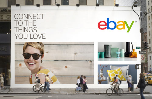
Great comments everyone. I’m finding these days that many companies are gravitating toward the sans serif/minimalist logos when it may not be appropriate. These companies are almost blending all together. While ebay’s new position is to “offer a “cleaner” and “more consistent” experience, I find it also says, “but you won’t have as much fun as you did before”. I would have perhaps tweaked the old one (which in my opinion had more character) than use a totally different font. Sometimes you just don’t need to fix what ain’t broke. HOWEVER… after I saw the logo in context (thank you David) I liked it more than my first impression when it was simply on its own.
Those who are fans of this logo strike me as people who never used (or “got”) eBay to begin with. It is anything but minimalist and it’s visual identity should reflect that.
It would seem Apple has taught the masses just enough about design to be dangerous. Sans-serif? Lowercase? Light and airy? THATS GOOD CLEAN MINIMAL DESIGN!
I worry we are heading into an era like 60’s architecture where a lot of bad glass boxes were built trying to emulate the masters.
Seeing it before reading any of the backstory, I assumed it was done inhouse and was cutting it some slack, but as an former employee and eBay shareholder I’m appalled a branding firm could turn this in!
Minimalism/modernism is very difficult to get right and this logo proves it.
People need to appreciate what Ebay have accomplished with their new logo. It looks sophisticated and clean (The way a global sensation should). The old one is very outdated and gives the impression that ebay is “behind the times” when in actual fact they are still and will be for a long time – The best place to buy and sell goods online. When looking at this new logo it makes Ebay look like the mature giant of the marketplace that they are. Not very creative but still very neat and professional.
I don’t agree with Kieran’s opinions and conclusions. If the logo represented something sophisticated and clean, it might look sophisticated and clean, I suppose… but extended proportion light weight lollipop colored lower case letters = giant of the marketplace? Not in my book.
Work doesn’t need to please shareholders (although we all hope it would). It’s there to please the client’s customers. Even the client doesn’t need to personally like the design. Sure, it can be much more difficult to complete a project if it doesn’t suit the client’s personal taste, but even the Nike logo was first deemed by the client to be the best of a bad bunch.
John, it’s the “lolipop colours” that represents ebay’s brand. It’s the same as the olympic logo in a sense that those exact colours in that order are now enough to carry the companies image alone.
You may be right Kieran. Much as logo designers (who operate a bit south of the big, big time, anyway) may hate to admit it, color is what consumers remember best. I don’t know how much ebay’s future success depends on the personality and impact of its logo, but I feel sure that the new ebay logo is a far more ignorable logo than their old one.
I’m all for simplistic logos, for example the new USA today rebrand, but this… the old logo captured the various items for sale, from a shoe lace to a roller skate and the naivety of the layout gave a feeling of new wannabe sellers that have made eBay what it is today. I feel the new logo is a copy of Apple’s approach to design. Just another me-too unfortuantly.
typical example of modernising a logo without knowing, what the brand is all about. of course it looks cleaner, it’s 2012 after all. but that’s it. I personally lost my interest in ebay many years ago and with such a ‘new’ identity, i don’t really feel like going back as it tastes like the common daily meal.
The old ebay logo could have used a bit of an overhaul, but the result looks like very little time was spent doing so. This falls into the same category of “refresh” as The Gap and Microsoft.
Although colors help the logo the problem is visually it doesn’t do anything without color and the more successful logos(to me personally) will be able to pop even when there isn’t much color. With the old logo it wasn’t the most well designed but at least the look was distinct enough to recognize. I don’t feel the same way about the new logo where without the color will lose most of the impact. Frankly, even with the color the logo doesn’t feel as if it fits the personality. I used ebay as a kid and even now. The old logo fit in with how ebay has a mix of things to buy or bid on. The new one looks clean but doesn’t not relate to the brand at all. I’m sure there was a lot of thought put into it but I don’t really like that this is even considered a logo. It’s basically the company typed out with limited space between the letters. I wish companies would actually explore their typography in their type logos instead of just typing their names out as a logo. This is minimalism in the worse sense.
I dont like it at all. the original logos had the unique character it was fun and overlapping semi-transparency was really important to convey core concept that ebay is driven by and for by individuals.
this one is simply lost its character and somehow in the lines of Google. uniqueness is lost.
if you want to refresh identity do it with a plan to communicate major change in overall organization.
Both Microsoft & Ebay have been rebranded along the same lines: ‘communication’ is being favored over ‘storytelling’. And that’s kind of sad, because great brands are about great brand stories.
While I prefer the new one, over the old one, I can’t help thinking “Google” when I look at it…
Hmm…
EBAY — if it isn’t broke don’t fix it. I LOVE the old familiar eBay logo and the letters together gve a sense of ‘community’. IMO there was NO need to change it at all.
The new logo is “ok’ but I like the old one much better. The new one is plain.
How fantastically underwhelming…..although I must say, Carol who stated “KERNING PLEASE” obviously knows the word, but has no understanding of what Kerning is!
I loved the old logo shape and overlapping look. It gave it such character. It was recognizable from out of the corner of your eye. I have it on a mug. I have it on a bear that sits above my desk. It was fun and playful.
NOW, they change it. I love the new colors, although the plain look of the logo itself I could do without. It doesn’t “do anything” for me. I used to really like the logo. I still like their product, despite the look of the logo.
Here’s my suggestion to eBay should they be listening…
Why not combine them and make a recognizable logo shape from the original and the updated color schemes from the new logo. My idea, but you can have it…
-nickguitarguy1
Nicholas thought that it should be “recognizable from out of the corner of your eye” is a great standard for logo design. Perfect.
ebay has gone corporate, which I guess reflects the fact that ebay is no longer somebody selling stuff out of their house but completely taken over by wholesalers. Their customer base has changed. It’s just unfortunate that they had to announce so obviously that their priority has changed and is de-emphasizing the individual, flea-market sensibility.
On first glance it appeared ebay had moved to a web and operating system friendly font for their new logo design. A shrewd move I thought, make the familiar name even more visible on html page code world wide (not that it needs promoting by content hungry search bots).
Unfortunately it has been introduced to reflect their cleaner, corporate and more consistent online brand. The new logo design has sadly lost it’s character, what a shame.
The designer part of me is appalled by this – ebay’s new logo. WTF?! I’m seeing a lot of this lately – this over-simplification of names/brands. As designers, our job is NOT to simplify something to the point that it loses all originality. I LOVED the fun, bouncy letters in the original design, and the way the letters intersected and created the middle-tones. Yes, they kept the colors – but they lost everything else. What do you think? :) J
Hmm, short and sweet: The old logo was never really looked at. But since the new one is up, the old is kinda missing. The difference: the old was hip, the new is boring. To come up with the old logo required creativity, the new is made in Word using colors. It’s just like Kinder chocolate with the new “kid”. Supposed marketing experts everywhere.
I can understand why eBay have changed their logo and its quite natural actually. Its more of a tweak than anything else, plenty of huge brands do this to keep current in trends.
Personally I think this looks more elegant and fresh compared to the previous logo ( despite being so iconic). This logo definitely looks like the next steps for eBay.
Steve, I’m guessing you’re not a designer. This logo change is revolutionary, not evolutionary. To non designers, or non-visual people, this may look like a tweak, but everything’s changed except the colors. The quantity implied by the word ‘tweak’ is the amount that’s left, not the amount that’s changed. You’re right that “plenty of huge brands do this to keep current in trends” — and therein lies the problem. An identity should brand the individual that’s being represented. In the past decade or so the trend has been towards neutering more unique identities, in favor of identifying with the flock. You say it looks elegant — is ebay elegant?
It’s amazing that the old jumble and shapes contained so much fun and vitality. It looks deflated and sad now, the colours aren’t enough on their own to convey the crazy range of things available on eBay.
I was wondering, what is the average lifespan (years) for a typical logo?
I would guess that the lifespan of a logo unveiled in 2005 is, on average, a good bit shorter than that of a logo introduced in 1965. Gut feeling. No research.
The first time I saw this new logo, I instantly thought “oops…the fonts aren’t installed,” taking me back to my print production days for a split-second.
It seems like all roads lead to Helvetica, or Helvetica-esque faces these days (Gap’s aborted effort, Arby’s and now this) when it comes to freshening up the brand.
This could eventually cause cost-conscious C-suiters to say to their assistants “here’s my credit card, go some site called ‘Fonts.com’ and buy a lettering called ‘Helvetica.’ I want a new logo on my desk by 6PM (do it after 5).”
I get it, Helvetica is the face of choice for mass communications these days. But that’s like only dating blondes…there is a whole, exciting world out there, my friend, and the redheads can be the most fun of ’em all!
The old logo was way better, IMHO. It had some motion, some personality to it. This feels…well…like the fonts aren’t installed.
M
I cannot believe the iconic logo has gone and been replaced with something so bland. The last logo reflected fun, passing parcel from door to door connecting people and places. Making a link which came in a variety if sizes to consumers selling and wanting different things. The new logo barely have any parts touching each other and I disagree with the streamlined, up to date global status it is trying to achieve. It does stand out. Like a sore thumb. We know a major drinks logo (white joined up writing on red background) plays on it’s lettering to promote it’s brand, and we can still recognise the logo. But this new eBay logo has stripped itself bare and lost it’s original identity. Hope it does not lose brand loyalty. Change is not good. Especially when my little logos on my app are still the old logo when receiving mail from eBay. If you are going to change something update it everywhere. But I rather the old logo come back and represent the core values of visual identity and stand out from the crowd.