Sol Sender of VSA Partners led a design team for the Obama 08 logo project. He was interviewed about the work, and here’s a look at the various logo options alongside some of Sol’s thoughts.
Option #1

Option #2
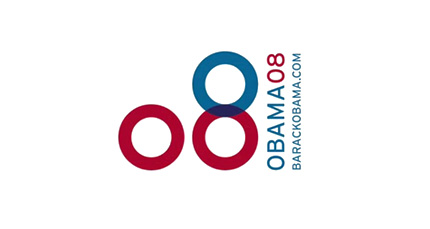
Option #3

“We did see the O as standing for something beyond just the first initial of the candidates name.”
Option #4
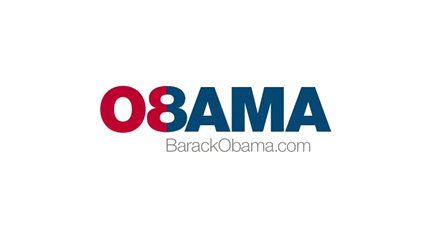
“There was an idea of unity that emerged, particularly when we began to look at the red and blue, and how they intersected.”
Option #5
“Before we even arrived at the final identity we were aware of developing a number of options that had an element that stood separate from the typography.”
Option #6

“We developed a lot of logos. Usually we only develop two to four, maybe five. There were fifteen, sixteen options, and we focused on three.”
Three finalist Obama logos
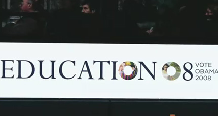
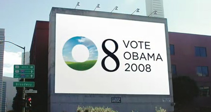
Obama logo finalist #1
“This masking of different photos with the O shape became an opportunity to say different things in different moments… The O could contain all these different ideas, possibilities and feelings.”
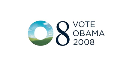


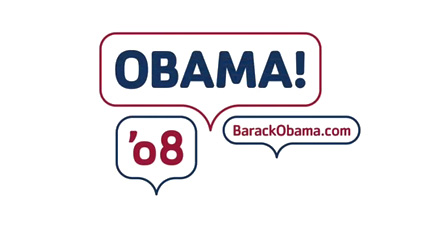
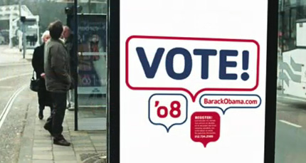
Finalist #2
“There was a lot of excitement about this. People felt this was really something new, something different. It was a kind of populist expression — everyone’s excited about Obama, people are talking… (but) it was a little too far out of the box. We felt that having a little more tradition in the mark was the smart way to go.”

Finalist #3
“For me personally, this was always the one.”

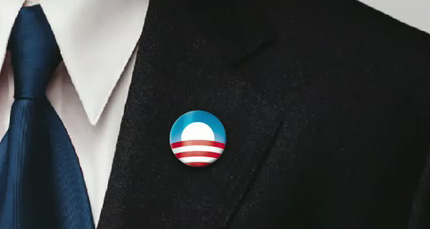

“Originally the stripes were kind of symmetrically expressed across the horizon, and as we went into final refinements we felt that giving it a little bit more dimension, a little bit more motion, ways to enter into it a little bit more for the viewer was a better way to go.”

It’s interesting to note that Sol had never worked on a political logo before. A nice reference for when that Russian nesting doll client asks you how many Russian nesting doll logos you’ve created — don’t worry about saying, “None.”
Amanda Gentry and Andy Keene are two of the designers at Sender LLC who worked on the project.
In the second part of Sol’s interview, he talks about the viral nature of the campaign, and the many places the Obama logo appeared.
One last quote from the interview:
“The strongest logos tell simple stories.”



Comments
Very enjoyable post, and seeing applications of the various logos was particularly interesting.
I can understand why “the one” was always “the one” for Sol. It conveys a great story and captures some patriotic imagery – not just the colors or the flag, but the flag as a fertile field. Pretty awesome.
I’ve loved the Obama logo since I first laid eyes on it — and it’s great to see the other logo optioned developed, although I cannot believe Option #1…was even an option at all. I found it quite dire to be honest, but I suppose it’s good to present a scope of ideas to work-up from in this case.
Overall, I recken Obamas’ logo had a lot to do with why his was elected. Even though voters approved his policies, I believe they were also swayed with a great design. Afterall, isn’t that what Logo design is all about? To win custom, loyalty…and in this case, votes.
Yes, you are right, that is what logo design is all about. I thought option 1 was a good logo, and I can see why it wasn’t used. I thought that option 4 was great, too. Creative and simple.
Very interesting to see the failures! haha :P
That was such an awesome perspective on the progression and options that the Obama logo went through.
The logo that was chosen was most certainly ‘the’ best of the batch and it completely encapsulates the story that needed to be told.
It’s so strange that subtle changes making such big differences, with reference to the symmetrical striping to the more dynamic movement of the stripes in the production logo.
Awesome!
Thanks for posting this, David. I’ve been wondering about the others, ever since I’d read that they’d come back to the client with so many. There was never a question of who I was voting for, but the final design really won my heart. So much spirit and poignancy, power and tenderness. I’ve begun studying design in the past two years, and I’ll always remember this one as the first logo that really moved and inspired me.
Really enjoyed that David!!
I agree with the others that the chosen one clearly works way better than all the others. I think the soft glow in the last version may be a little too much, but, I can totally understand why they did it, the whole new horizons thing and all that is a great story to sell.
Big fan of the speech idea, but that comes from a personal angle of loving the more personal touch with ideas, again they made the perfect decision to add a bit more tradition to it all.
When you like it them all you can see where some spawned others, then the final one just completely stands out as the only choice. The others seem to begin to lose themselves, almost over designed in some respects.
I think this logo is one of those that will crop up in a favourite logos topic sometime down the line, it certainly ticks all the ‘what should a logo do’ boxes.
Classic.
Great spot.
Very cool to see the process, great job!
Love the blog, keep up the great work.
Cb
Even though voters approved his policies, I believe they were also swayed with a great design.
I don’t see the voters as having recognized it outright as great design, but the way it was used and handled created a strong impression of a guy who was organized, clear and coherent and stayed on message. Considering he was up against politicians with many more years of experience (Hillary first, then McCain), it probably went a long way to establishing a bit of trust in what he was saying. Also contrast that to the infighting of the McCain/Palin campaign and the mixed messages he put out and you see how the design worked.
I’d like to see a study on how cognizant swing voters (and not marketers or designers) were of the logo and associated campaign graphics and whether that affected their choices.
A lot of great logos. They did a nice job with the final one though.
I’m stunned by this logo. I had a good time riffing on the final logo after the win.
http://www.70percent.org/blog/win/
I was going for ‘waves of change’ to fit with my surf blog. The image of bodysurfing hit waveriders hard. We think he’ll work to protect the oceans as well as pulling us out of the current financial mess.
I love version #1. I can however see that a small play with the letters it could be used for the Omaha tourism board. I still like it.
Well done.
Anyone else seeing ‘Osama’ a little too easily in 4 and 6?
The Obama logo really struck a chord for me because of the way it evokes the Midwest, the furrows of the farmer’s field and the horizon and the big sky. After remembering the farm crisis of the 1980s and the response to it, what this logo said to me was, “he remembers too.” The best part is that the angling of the stripes is effectively doing double duty — evoking the farmer’s field and giving an “all roads to the horizon” optimistic look into the future at the same time.
I have to say that I love finalist #2. It’s so fresh and modern and maybe the whole speech bubble thing is becoming cliche but it still screams out fresh, modern, inviting and communicative.
Although I do also see why it wasn’t chosen.
Great article, enjoyed it very much. Thanks.
“Obama logo finalist #1” letter O background looks very familiar to me… XP’s default background?
One way to tell at-a-glance the difference between the Obama and McCain campaigns:
The Obama logo was that brilliant, iconic “O” with the hints of flags, waving fields and a rising sun — “Morning in America” reduced to a single, eye-catching image.
McCain’s iconic logo (the half-shaded five-pointed star)…was a Wingding.
very cool to see all the process. Some of the proposed are very good!
I loved seeing the various ideas. It’s always amazing when the final choice bears little relation to anything that came before it. The Obama logo is one of the most effective political advertising graphics ever. That it was introduced the same year as the groundbreaking abstract slogan “McCain=Bush” is further reason to marvel.
The one chosen reminds me of the story of Benjamin Franklin at the Constitutional Convention.
http://www.phillyvrtour.org/risingsettingsun.htm
It is the one with the best imagery.
There is no comparison. The final logo is worlds apart from the others. I have worked in advertising and graphic design for the last 40 years, and the Obama logo is one of the best logo designs in history.
To me the change to the strips in the final logo did not imply motion, they implied a plowed field. A great way to brand Obama as a midwest heartland America candidate instead of a urban Chicago candidate. Every time I saw it, I thought of the line, we are not from red states or blues states, we are from the United States. Well done.
The chosen logo, with the motion and dimension, also gives it a bit of an “infinity” feel….like traveling somewhere positive into the design. There’s also a sunrise feature to it that always appealed to me….a brightness, new awakening thing. This logo was a GREAT feature of the campaign, itself new and different.
I’d still like to get the story behind the ‘seal’ used as a centerpiece for Obama’s conference on the economy during the campaign. I *think* the designer was trying to mimic the seal design on US currency, as would fit with the topic of the meeting. They even used a monochrome design that resembled an engraving.
If I’m correct, the subtleties went over the heads of the media, who assumed it was the presidential seal being referred to.
They are so predictable they stink
Finalist #2 is catchy but would’ve been a mistake. It immediately reminded me of that old show “Pop-Up Video.”
Finalist #3 was very good, but a little rigid. The winner, with the different motion of the stripes, conveys a sense of a path to the future, along with the iconic O. It says it all — and this is one logo that I actually love looking at. It’s a simple, beautiful image that carries precisely the right symbolism. Any graphic artist should be proud as can be to have designed something that full of win.
It was wonderful to see this behind-the-scenes progression. Thanks.
I find it hilarious that they referred to speech bubbles, one of the biggest Web 2.0 clichés, as “new” and “different” and “outside the box”.
[Full disclosure: I’m working with a speech bubble logo right now, but it has an extra dimension of cleverness, and “Voices” is in the name of the thing.]
I am one of the few republican graphic designers – but it should come as no surpise that I think the Obama logo is one of the best logos ever. There is a bit of borrowing from the bank of america logo ( the overhead crop rows) – he’s just lucky his last name starts with an O or it would never have been what it is. Hopefully this will set a new standard for political design on both sides.
A lot of good choices, but the truly transcendent one was the one that was chosen. After all this time, it still hasn’t gotten tired and still can give you shivers. Says all it needs to say without appearing to be trying to say anything.
I think 20 years from now, it will be looked upon with the same awe as the Nike swoop and the Apple apple.
Option #3 would have resulted in a copyright infringement suit from The Germs.
It’s a great logo, but I always felt it would have been better with the red stripes inverted, e.g., concave rather than convex, heading away towards the horizon rather that towards us from the horizon.
where is the icon with the hammer sickle?
How much would that logo have cost the campaign? for a corporate identity of that scale and importance, would it have been say USD $100,000 ??
This was very interesting and I believe Daniel Pink is correct when he talks about right brain directed thinkers running the world now. Design, Story, Symphony, etc. “A Whole New Mind” is his book. I make Rhinestone Obama Shirts and we were very successful with our designs because we didn’t take a “literal” version of the logo in our shirts. The end result is pretty cool.
Amazing article! Loved the different designs. “O” logo that was used is my favorite logo of all time. Thought the reflective Obama/08 was good too. Glad some of the above designs weren’t chosen b/c they look a little too much like Osama.
I agree with Jonsel. Many people have said America should be proud of this election, rather we shoud feeled dismayed because to the educated person the policy differences between barack and mccain were not very different at all. In fact, one could very well argue with the exception of health care they were the exact same. Obama proved one thing: race in politics still matters or else they wouldnt have voted for him in such a landslide. Honestly, as a member of the U. S. military im really fed up with the so called “people” of the United States. I can’t wait until they realize that we are in fact in a world at war and realize how dissapionted they are when they realize that this conflict is rooted as far as their democratic policies exist. Liberals! Take ownership of this nation and its interests! And realize its your interests to think less of it you would think less of yourself. Resources are scarce. Basic principles of economics can teach you that so just ask yourself who are we to share them with? Your family or others? I know my decision.
Wow. I love the Obama logo, but I have to say the other choices are pretty bad. They made quite the leap to something appealing and functional, but it saddens me the amount of work they did beforehand in trying to mix the ‘b’ and the 8. The majority of the early concepts look like they belonged in the 1988 election.
But thats what the design process is about, so I applaud them.
Seems that the influence of Bank of America’s logo was massive in this effart.
Its interesting to see the different designs and the ideas besides the logos that were selected.
When I first saw the chosen Logo, something hit me. When Tampa’s airport upgraded in the late 70’s and became Tampa International Airport, they used a very progressive and modern Logo which was very popular as a symbol of Tampa’s growth as a city. The Airport Logo was everywhere. I don’t have a picture of it, but in my mind the Logo is almost identical, at least in its general shape and form, to the selected Obama Logo. That was thirty years ago.
The accidental benefit of this logo was that it had even more powerful “viral” possibilities than even Finalist #1 because of the ease with which it can be replicated.
I still chuckle at #2 – it looks like a logo for some distant Olympic event.
I must say that the current logo is just superb. It just blows the other ppl away. It is just a brand icon now. The website also matches everything. The logo tells a lot of things in just a simple spaces. The whole vision of Obama is included in the logo. Other logo concepts are also good. But the chosen logo just outruns others.
It was a great logo to work with as we social networked. Check out our logo for Food Tasters for Obama at http://my.barackobama.com/page/image/0aab4bdb739384935f_ynm6bx86s.jpg
Option #1 looked great but not versatile. Screen printing (bumper stickers etc.) don’t handle 4 color process well and all brochures would have to be b&W or 4 color and it wouldn’t translate well in newspaper. #2 wouldn’t work well in small formats. #3 was just right. Process or RGB, big or small translates well into b&w. Screens could be dispensed with as needed.
Nice find! I find th chosen logo to be the best! Also find amusing the paying with the 08/OB
Did anyone happen to notice the similarities between Obama’s final logo and that of carbonfund.org Check it out for yourself. If they were not supporters of Obama there would probably be a lawsuit.
Again, Change We Can Believe In….looks a lot like Bank of America’s logo and Carbonfund.org logo as mentioned by others. No surprise, except for the person behind the teleprompter, this was a carbon copy of Axelrod’s previous campaigns. Not too much original thought going on here, just a lot of soundbites based on the polling numbers.
I am curious to see how fast the love goes away for so many of the Koolaid drinkers out there. You can’t blame George Bush for everything, although it will work for a while.
Still disappointed that McCain and Obama were the best this country could come up with. Looking forward to 2012!
logo# 2 makes me think of mobil oil.
And the final logo always made me think of Bank of America’s waves of grain logo–which I suppose is apropos because Obama is so money and he knows it.
Sunrise on a new day for this country. Great logo.
@Lanny Heidbreder “too far out of the box” would have been too modern for old voters and too cliched for young voters, I’d say?
What about the one that had Obama walking on the Sea of Galilee?
Funny – I didn’t see any logos that reflected 20 years of black liberation theology, socialist ideology, or contempt for those in Rural America.
I like the visual imagery on the 8/B combinations, but they do look rather soviet (cyrillic) to me.
Can you imagine how that would have played out? :)
I liked #1, very subtle, no wonder it wasn’t chosen. But the whole change thing was stolen directly from the Clinton campaign. And it was so stupid. Bush was termed out, of course change was coming, and he was so awful a party change was pretty much inevitable.
Great to see the various options.
The funny thing about the (superb) final logo is that it perfectly expresses “morning in America”, the old Reagan tag line.
The last logo is the best one. Notice when you refined the horizon somehow made it look like a running track? Just a childish thought but I think it’s apt.
I don’t think it was so much the logo that worked, but the other visual elements: the consistency of ‘Change’ set in Gotham Bold, for example, and the other collateral that followed that. If anything, this was one campaign where the logo was very secondary to the slogans and buzzwords. It’s hard for me to not be drawn, consequently, to the third option above that was rejected.
muchio is correct. I immediately identified finalist option #1 as a blatant rip-off of the default Microsoft Windows XP desktop wallpaper. It also looks like that’s the one that the winner was based off of. Sad, sad, sad. Microsoft should sue.
The logo is nice, but it’s also remarkably similar to this Pride of NY logo which has been in use since at least 2002:
Gee, what a surprise: nothing new under the sun. The election is over, the logos are a part of americana now. I was just commenting on which one I liked, not on its originality. Pretty lines, pretty words, let’s hope we end up with a restored country. That’s really all that matters anymore.
Starting to work with logos, been able to see the process it took is pretty cool.
Thank you for the posting.
I have seen that many people find these logos similar to previous works, (I seriously doubt Sender would have seen this one) but here is my contribution.
Do a search for Cutcsa, which is a public transportation company in my country, and tell me if you don’t find it similar to the final Obama logo. Cutcsa’s logo is over 6 years old or more…
I always associated the winning Obama ’08 logo design with the state flag of Kansas (“the sunshine state”) — homestate, of course, of Barack Obama’s mother. Both feature a setting (or rising?) sun within a round graphic design. To me, the stripes on the Obama design suggested the furrowed fields of the Great Plains. [I see commentator DBX shared this view.] So I guess I am still left to wonder how much of this association was intentional and how much of it was more or less accidental.
I was very interested and surprised to see the rejected alternatives. Thanks for letting us see them. Congratulations to the Obama team for picking such a winning design, clearly the most organic and powerful of the options presented.
Wow, this post got a huge following! Logo option #2 is quite clever but I still am a fan of the one in use! Very insightful, thanks David.
Thanks for posting these… I love seeing other designers’ complete process. It would be really cool if someone got their hands on (and posted) some of the initial linear pencil sketches (if any).
Fascinating! I find it really interesting that all of the logos that weren’t chosen seem extremely forgettable (to me at least).
Congrats on the massive amount of interest/links this post generated. I see the post is in the top 10 for “logo design” on Google already (on my pc anyway).
Thanks everyone. I was surprised at the post popularity, so apologies I don’t have the time to respond to each of you.
What also surprised me was the amount of trolls here to slag off Obama and his administration (moderating the comments has taken a significant amount of time).
Regardless, thanks for keeping your thoughts relevant to the topic.
a similarity, incidentally
http://kazcargo.kz/
I agree with Jonsel. Many people have said America should be proud of this election, rather we shoud feeled (sic) dismayed…
I’d quote Dominic’s entire statement if it wouldn’t take up too much room here. But I felt like his agreement with me is a separate statement from his following comments on the election, race, and the policies of the candidates, of which I don’t agree. I’d prefer my original post and his followup thoughts are not linked.
My comments had nothing to do with policy positions of the candidates nor really anything to do with whether one candidate was better than the other. I’ll admit to being an Obama supporter, but I’m a lifelong democrat and had no intention of voting for McCain, even if his campaign graphics were the best we’ve ever seen. I’m of the opinion that the graphics of Obama certainly helped him get across his message (about time politicians took a good lesson from consumer and corporate branding) but had his message not been a good one, he would not have won.
I look at Obama as a startup, and startups need strong visual branding to get their message across. It helped him establish himself in the field (the political marketplace, if you will) and build a bit of trust. Once established, his ideas had a better chance of being heard and judged on an equal footing with the rest of the candidates. If I’m allowed one more analogy, consider Obama as juice. He may have had the best looking juice package on the shelves, but bad juice won’t sell.
Very interesting read.
Loved the campaign and loved to read about some of the more inner workings.
They definitely chose the best of the logos. Even though the “Hope” was beautiful!
A group of us did a photo mosaic for the campaign as well. You can access it here.
wwww.thefacesofchange.com
I voted for the first black president too!!! I love I took part in history… in voting with the whole country, for one single reason. Skin color. He also makes me feel better about living impoverished, and I’m hoping he pays my mortgage soon too.
The chosen logo seems to reflect a rising sun or the light at the end of the tunnel.
Let’s just hope that given Obama’s lack of executive experience, that it’s not a setting sun or the light of an oncoming train!
Joe
Agreed – the logo has truly captured the imagination and the hope of an entire country.
But, how original/unique is it? Some thoughts:
http://www.brimdeforest.com/post/65428762/obamas-o-v-azimuts-azimuth-is-imitation
It looks a lot like the logo of the Elvis collectors record label,
Follow That Dream, see http://www.kki.pl/elvisal/ftd_label/ftd.gif
But I don’t think Elvis himself would mind.
I loved the last one!
It was a pitty it wasn’t chosen.
Great post. I’m impressed by the variety of options they explored. Back in March I listed the Obama logo as a “great logo” in a blog post on logo design: http://www.thisuser.com/2008/03/one-thing-about-logos.html — you’ll see I put it up there with some real classics.
BTW, this post and the post on ambigram logos have convinced me to add this blog to my reader. Nice job.
Jon,
The results would be intriguing.
Roy, thanks for subscribing.
My favorite is definitely finalist #2 with the talking boxes – it’s new, fresh and it works for me!
thankfully finalist #2 didn’t win because I am sick of speech bubbles and it would have looked too similar to the Charles Schwab ads everywhere.
I’m just glad y’all knew what an apostrophe looks like.
(The other folks had it wrong in three-foot-high signage at their National Convention. Google on “backwards rolled the apostrophes”.)
my first reaction to the O was Oprah, since she uses it on her magazine. And since they’re buddy buddy, that was just my first thought. It’s almost like “O” has already been taken. He’s Obama, she’s O. Neat to see the progression of thought, though.
The safe, boring and expected route was chosen. Does this really say change?
I think in the end, the O Obama logo that was chosen was the best choice because of the extensibility that it offers, including derivatives like “Obama Pride”.
The American flag has a field of stars on a dark blue background that represents the UNITED States of America. United we stand, divided we fall. Lincoln was adamant about keeping the country UNITED. It was intentionally omitted from the Obama logo, it shows only the stripes. Divide and conquer. No more states rights.The same stripes only were projected on screens at the Democratic conventions, no field of stars. Amazing that nobody noticed, or cared if they did. How arrogant of Axelrod and Sender, they constantly test to see how ignorant the people have become.
The logo treatments are interesting in the standpoint that from the first explorations to the near final and final logos there seems to be a quantum jump in improvement and being on the mark.
As we know that all design isn’t done within a vacuum, I’d love to hear more of Sol Sender’s process with the client.
I guess when your dealing with what must be considered God fearing patriots then the flag colours had to come into consideration. Not because it was so essntial more out of fear of being misinterpreted. Americans like their flag and its colours. The “O”, well it must have been a designers dream. There is so much, perhaps even too much one can do with it.
Tell me David, did you contribute a design?
Keep well always good to read your stuff.
Ps. we just got awarded the CNBC 2009 award for our work with Nikolsons and Naissance Villas & Marina. So we are feeling a little smug ( and hungover).
Take care and continue getting as much joy as you can everyday
Odinga, the reason that no one noticed is exactly why no one noticed. it didn’t matter.
United usually means no choice. I’m sure there is/was no intention to indicate divide and conquer.
Congratulations, Ray. Glad to know about your successes, and no, I didn’t contribute a design.
I see “OSAMA” a little too much in #4! lol. I really liked the speech bubble one too though!
Of course I love the ID system and logo that was picked, but I also think that a great identity system could’ve been created around logo option #2.
In the comp the colors are bit stale, but if they eventually got around to the brighter colors (like the ones eventually used), it could also have been an excellent identity.
No. 4 read like Osama, no wonder it wasn’t chosen.
i’m currently writing my final year dissertation with the title, ‘What role did graphic design have in the 2008 US presidential campaigns?’ Im studying graphic design at The Arts University College in Bournemouth, UK. This feed has proven very insightful and have taken a lot of your views on board in my conclusion. I was wondering if anyone could post a brief response to my dissertation title, ‘What role did graphic design have in the 2008 US presidential campaigns?’
Would be extremely helpful and appreciated.
Dan
What a great article and really interesting to see the initial designs and development. All of the work is excellent in its own way and coming from its own direction.
I disagreed with Andrews comments though that the logo won Obama the election, I think it was a combination of this the website his social media and web campaign and obviously his policies.
It was something really ground breaking it terms of how he and his election team communicated with its target audience, alomst in the way a product might be launched. Very interesting.
As a libertarian, I was heartbroken to see the Obama branding – it was near perfection. I am confident that the branding effectively won the election for Obama. I think the GOP leadership saw this as well, as there were numerous attempts late in the campaign and shortly afterwards to associate the imagery with Nazism where possible – see the “seal” that was used after the election.
It was also interesting to see the play on the “8” and “B” – that would normally have worked, but I think a previous poster hit it on the head when he said that it could also be read “Osama”. The names were close enough to be a disadvantage anyhow, and the play with typography made it worse.
Finalist #2 is too trendy and cliched. Look at the Charles Schwab “Ask Chuck” campaign – it already seemed outdated and old, the first time you saw it.
I actually liked option #5, but it was very vertically oriented, and would have been a real challenge to use on the web and for many strongly horizontal media.
The blue rising sun is like rising depression. Round – it is going in circles. Blue colors that moves into red – depression that ends with a communist reality, which gives even more depression and which is the blood and a bunch of problems, as we learned from other countries pasts. The logo is not very optimistic and not too inspiring.
About 2 weeks ago, I posted a comment in this forum that disputes Sol Sender created the winning 2008 Obama Campaign logo discussed in this forum topic.
I said then, as I continue to say now, that I am the original creator of the logo design that later became the 2008 and 2012. It angers me that Sol (whom I talked to over 10 years ago) continues to falsely say that he and/or his “Design Team” created the graphic logo that I actually made.
Instead of contacting me regarding the validity of my claim and proof I can show of my allegation about my rightful graphic creation, someone at your website removed my post without attempting to contact me.
Could you please call me to discuss this further?
Regards, Steve Neago
(513) 248-8830
Hi Steve, I don’t remember seeing your earlier comment, sorry about that. Feel free to send an email with more info and I’ll get back to you as soon as I can. hello@logodesignlove.com
My god these are terrible. Maybe that was the strategy. Show the client a bunch of disasters so they are forced to choose the one you want. Ugh.
The fact remains that #3 supposedly “won” the competition. Every picture tries to show a story to the viewer.
It seems that memorable and successful political campaign logos try to show the viewer a graphic with a positive message the viewer can relate to and see multiple stories in different ways.
Some artists attribute the Obama 2008 campaign logo to having a “modern look, but this was not my intent. I created the Obama 2008 campaign graphic logo to have a lot of curved surfaces for a flexible and soft look that did not appear rigid.” This “flexible story” graphic concept may be why the Obama campaign symbol appears to have been recognized, modified, adapted, and adopted by so many people in different ways over the years.
The Hillary Clinton campaign logo was disappointing because the solid Blue sans-serif typestyle looks too rigid, inflexible, and “corporate” – not the logo attributes that you want to represent any vibrant political campaign trying to attract voters. The Trump campaign logo also appears rigid and “traditional” with its large serif typestyle and heavy use of red.
I tried to send a pic that shows how I created the 2008 Obama campaign logo in both vector and bitmap formats when compared to the 2007 State Seal of Ohio logo. However, this Forum’s software apparently prevents me from posting the file used for comparison. How can I submit a graphic file that is linked to this post/comment?
I originally created this logo design in Jan/Feb 2007 as a proposed logo to uniquely identify the “Organizing For America” effort solely for use within the State of Ohio. I delivered the logo in person on Thursday, March 20, 2007 afternoon to the Ohio Democratic Party at their Columbus, Ohio location.
ODP staff liked the logo and later asked if they could forward it to the national graphics competition run by Sol Sender for the 2008 Obama campaign. I gave ODP staff permission to forward the logo graphic to the graphics competition and I asked my name not be used as the creator of the logo due to a close relative’s failing health. As a result of ODP forwarding the state-wide logo I created as a proposed national campaign logo for the Obama campaign, the logo graphic won the national graphics competition based upon its looks and appeal to voters.
As the JPG pic and Adobe Illustrator file show, the yellow overlay of the logo I created in Jan-Feb 2007 displays similarity to the Seal of Ohio logo that I found in 2007.
Regards, Steve Neago
It’s fascinating to see the thought process behind the iconic Obama logo! The design team explored so many ideas, considering how the “O” could symbolize unity, movement, and hope. The journey from experimental concepts to the final logo reflects a careful balance between innovation and tradition. Each finalist had a unique way of capturing the campaign’s energy, but the chosen logo told a simple, powerful story that resonated widely. A great reminder of how impactful design is rooted in simplicity and meaning!
Hello Brigade,
Thanks for the interesting commentary about the Obama Logo design. I am the one and only creator of the original 2008-12 Obama Campaign logo.
I asked in 2008 not to be publicly named as the graphics designer of the Obama Campaign Logo because of my extended family’s connection at that time, who worked as a Senior Member for the George W. Bush Presidential Administration. I also did not want my name publicized because of past death threats my family had received at that time for my past political volunteer efforts.
Sol Sender was only a Graphics Judge on the 2008 Graphics Competition, where my logo creation was the final and winning selection out of 225 entries from across the USA. Sender had no personal or professional involvement in the creation of the graphics logo I created. I allowed Sender to take public credit for the logo (with David Axelrod’s agreement) solely to divert unwanted public attention towards my family and me.
My winning design was originally submitted by the Ohio Democratic Party in March 2008. The logo design I created in Adobe Illustrator was selected by David Axelrod who was a Senior Campaign Advisor for the Obama Campaign.
If you would like, I can further go into detail in this forum about the interpreted meanings of the graphics elements of the logo design and why I chose to create the logo in the first place…
Regards, Steve Neago