Named after inventor and engineer Nikola Tesla (1856-1943), the company’s CEO Elon Musk has just published his “Master Plan, Part Deux,” where, among other things, the self-driving capabilities the car brand is working toward will allow owners to…
“…add your car to the Tesla shared fleet just by tapping a button on the Tesla phone app and have it generate income for you while you’re at work or on vacation, significantly offsetting and at times potentially exceeding the monthly loan or lease cost. This dramatically lowers the true cost of ownership to the point where almost anyone could own a Tesla. Since most cars are only in use by their owner for 5% to 10% of the day, the fundamental economic utility of a true self-driving car is likely to be several times that of a car which is not.”

According to TechCrunch, Elon Musk expects It’ll take a total of 6 billion miles of test-driving before fully autonomous cars are a reality. Fleet learning is currently happening at 3 million miles per day.
The portfolio of New Jersey-based RO Studio shows the following version of the Tesla logo where the symbol and wordmark are placed within a shield.
![]()

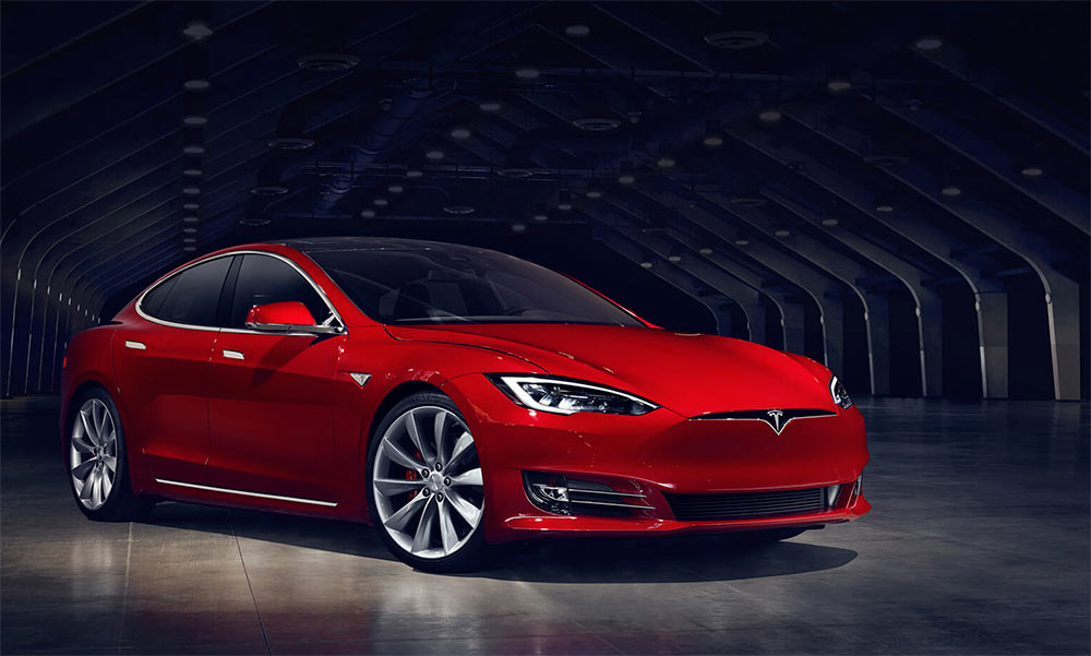
The design has since changed, with the shield all but disappearing for a simpler look (it’s still partially visible on the front of the car).
![]()


Maybe the T emblem hints at the Tesla Tower or coil. Perhaps it’s the design execution, but I just don’t think it portrays the clean energy powerhouse the brand aims to become.
Update:
Elon Musk tweeted after being asked about the Tesla logo, “Similar to SpaceX, the T is like a cross section of an electric motor, just as the X is like a rocket trajectory.”

Comments
The shape’s not simple enough to just draw out on a napkin at will, but also doesn’t really have any interesting complexity to it, which leaves it feeling sort of unintentionally unbalanced.
Nothing about the visual design of the Tesla aesthetic speaks to the revolutionary nature of what the brand’s after.
Maybe this sort of works for them though, letting the car blend seamlessly into the existing sea of bland vehicles, rather than seem unattainable etc.
The Tesla logo is meant to look like a part of an electric motor. The top part is a stator (non moving part), the lower part is a rotor (rotates around the tip). I think it’s pretty clever!
Also the nose of the car has been redesigned, the current version looks different than the one shown in the last picture. They got rid of the fake grille.
I get that imbalance, Haik, between the weight and spacing of the lockup.
Marian, that idea makes more sense. And I’ve updated the Model S pic, thanks (an improvement).
Fully agree David. The mark says ‘sports car’, albeit inelegantly. It doesn’t have the personality of a kindler, gentler approach to mobility. Always refreshing to see smart criticism of beloved brands.
I love the cars but I can’t help thinking the logo looks like a skinny T-shirt. Maybe the logo should have focused on the element of electricity? The wheel reference isn’t obvious to me I’m afraid.
I think it works well and the nod to Thor’s hammer does indeed evoke the electric nature of the product.
I cringe every time I look at the design of that TESLA “T”.
My guess has always been that it partly represented the opened gull-wing doors on the Model X, but still, sadly, it looks like the first attempt by a junior high school art student unclear on the message as none of the elements of the logo work together. There are arcs, and curves, and lines, and varying angles, and wedges, that all seem to be going in different directions, conflicting with each other, all trying to say something different.
I can’t help but think that the design is a reflection of the compulsive, spontaneous, erratic, lofty, multidirectional, and often conflicting viewpoints of Tesla’s current Techno King/CEO, and it evokes in me the same conflicting opinions about him.
The “T” is a perfect logo for a failed startup, but Tesla is seemingly and hopefully now well beyond that stage.
I wish they had thought more ahead at the beginning, by creating a more professional, elegant, timeless design.
The “T” design also reminds me aesthetically of the Tesla auto-line with it’s soft lackluster, “used bar of soap” curved designs, and the sharp angular cartoonish look of the Cybertruck – two vastly contrasting, aesthetically questionable product lines that just don’t seem to share a brand, with the latter being sadly reminiscent of the DeLorean.
The TESLA logotype is cool however. It thoughtfully matches the SpaceX logo, and luckily the Adidas lawsuit hasn’t influenced either logo’s existence.
Though I wish the “T” Logo itself were a better design, it may be here to stay, unless of course Tesla’s current Techno King continues picking fights to make enemies out of practically every potential customer on Earth, then the logo and the company itself may also go the way of the DeLorean.
The logo is not supposed to bring ecology to mind, but to make Tesla seem like an elegant sports car.
Not mentioning the fact that if you even scratch the surface of Tesla’s history, you’d learn the fact that Elon wanted to create a powerful sports car driven by clean energy.
And if you think about it this makes a lot of sense. Musk invested a sum of money into Tesla as a single entrepreneur. He knew that there needs to be a lot of work and further studies to at some point create a car that would be easy affordable. They needed to sell high in order to have money for further development.
That’s why he started off from creating a “luxury” very expensive car – the insides were still expensive, they needed to add something that millionaires (that could afford it) would desire. That’s why the logo itself brings more of an elegance and velocity (at least I think so) to mind rather than an eco, family friendly ugly car.
There is something as a 3 step plan or vision or sth like that for Tesla development if you want to read about it.
tl;dr: Tesla cars are supposed to be bought because they are great, good looking machines, not only because they are eco.
In my mind the logo represents Nicola Tesla humbly bowing before humanity, arms outstretched.
‘Perhaps it’s the design execution, but I just don’t think it portrays the clean energy powerhouse the brand aims to become.’ – I think so to. It feels rugged and portrays conventional needles to me. IMHO.
As an average consumer, I think the logo is unique in its ability to be freely interpreted. It somehow reminds me of the new Batman mark and the silhouette of Batman, who owns one of the most, if not THE most, recognizable future-centric vehicles.
Purely in basic design terms, the T symbol for Tesla Motors is neither great nor memorable – looks like a T shirt with a hanger!
But the lettering of T E S L A with curved edges and eliminated verticals from the letters E and A is much more satisfying, though the letter S needs some more fine tuning.
To me it looks like a sports shirt with a V-neck.
Just wanna know if the logo is designed by RO or Prado studio? Who is in charge of the design?
I don’t see the ruggedness or the imbalance that everyone is talking about. It is sleek, just like the cars. It looks fast, the cars are fast as hell (if you know anything about them they perform like sports cars). They aren’t supposed to be desired just because they are eco friendly, but because they are rad vehicles. That’s why they don’t have a stupid leaf or some other eco cliche. I do agree though that the wordmark is much better than the icon.
Hey, check this article about the Tesla, SpaceX and Boring Company logos on medium.
Tesla logo looks just like an IUD birth control. I don’t think there were any women at the table, or one of them would have pointed it out. Every woman I talk to finds this design hilarious. :)
I came here just to find this comment. My partner agrees with you 100%.
I’ve always thought that the Tesla Logo was an IUD not some electric part. And I agree that there wasn’t a woman on that design team.
Ditto! Absolutely looks like my birth control!
Literally came here to say that.
Tell me you don’t hire women without telling me ☠️ RO studio is owned by a man so totally possible.
I just heard that Tesla is getting a new logo. Apparently the Adidas law suite also involves the three stripes in the T ≡ S L A name so they have to ditch that too. Is the same company involved in the new branding/logo?
It looks EXACTLY like an IUD folks.