
In 1898, when looking at an advertising sketch for a brasserie drawn by O’Galop, André Michelin had an idea: why not replace the bearded giant raising his beer mug with a man made of a pile of tyres and holding a cup filled with nails and broken glass. The latin quotation from Horace, “Nunc est Bibendum” (now it is time to drink) declared by the character was also reused by Michelin.
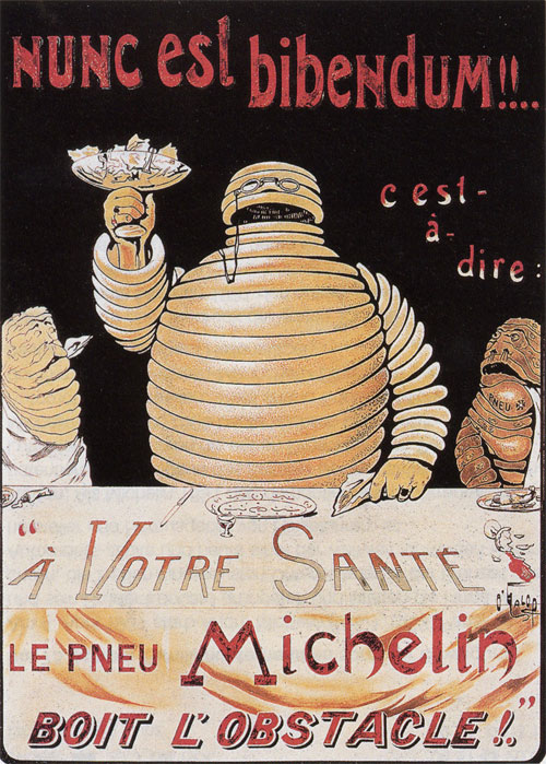
“Cheers, the Michelin tyre drinks up obstacles!” This slogan had been launched by André Michelin a few years previously to convince engineers of the benefits of tyres.
An animated cartoon was made in the 1930s to show the Birth of Bibendum (embedded below).
No sooner was the Michelin Man born when he began to play a major role for the company: it was he who presented the products and advised and assisted motorists, becoming the brand’s worldwide ambassador.
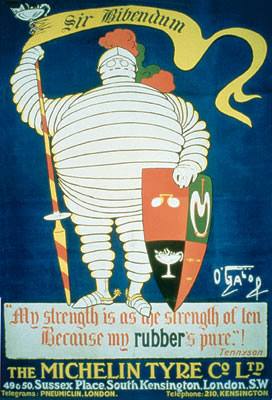
In 1905, Michelin opened a sales office in London. The Michelin Man changed into a knight to conquer this new territory, wearing a helmet and carrying a shield. For his coat of arms, O’Galop drew his accoutrements: the spectacles, the cup, a cigar, and the cross-section of a tyre with a nail incapable of puncturing it. In the caption, a line from Tennyson is adapted to promote his tyres, “My strength is as the strength of ten, because my rubber is pure.”
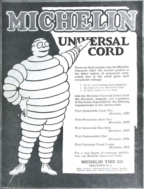
As early as 1907 the Michelin Man crossed the Atlantic and set up a factory in Milltown, New Jersey. The advertising became more educational: the Michelin Man was depicted as a giant accompanying and advising travellers by explaining the advantages of his products.

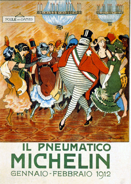
From 1907 to 1915, the Agenzia dei Italia Pneumatici Michelin published a monthly review sent to its customers by post. It copied the fun but educational format of the “Michelin Mondays” in France. Particular care was taken with the cover illustrations, which naturally involved the Michelin Man. The Italians turned the character into even more of a hero than he was in France. On this cover the Michelin Man is a sort of diplomat idolised by women.
Michelin used a large number of artists who each brought their own interpretation to the character. His shape was guided by the narrow silhouette of the tyres, while his appearance and attitude reflected the customer of the time, smoking a cigar and wearing spectacles, here in 1914.

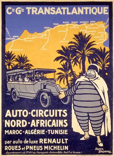
In North Africa in 1922, Roger Broders showed the company’s mascot dressed as a Bedouin. Adopting local costume, the Michelin Man slipped on babouches and a djellaba.
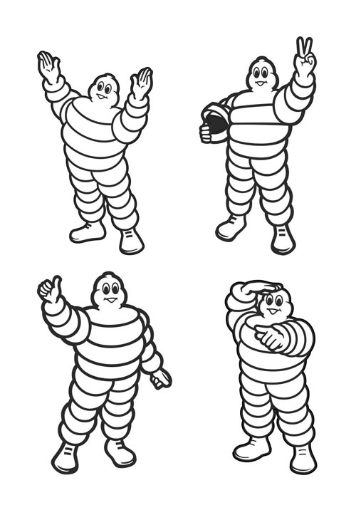
From the 1930s onwards, Michelin made increasingly less use of outside artists. As a result, images of the Michelin Man became more standardised, although there were country-specific variants. Adapting to the evolution of tyres, his rings became thicker and the character dropped his wealthy image to move closer to a broader customer base.
The character’s sportive nature is often symbolised through this famous attitude of the racing Michelin Man.

In Germany, as in the Nordic countries, the Michelin Man dons a hat, boots and a scarf when the weather gets cold in winter.
In Japan, he was seen as a ladies’ man with his sumo-like proportions.
In 1998 his centenary was an opportunity for the company to give him a new look: he appeared slimmer and more dynamic in the company’s brand block.
Today, more than 120 years after his birth, Bibendum stills appears all over the world.
Information from Meet the Michelin man, on the Michelin website. Original design by O’Galop, 1898. Also featured on pages 210-211 of Per Mollerup’s Marks of Excellence.
A notable Bibendum appearance was in the incredible 2009 film Logorama, and you might be interested in designs from other tyre manufacturers Pirelli and Goodyear.

Comments
Fantastic to see this evolution and comparison of promotional videos 80 years apart.
This is my favourite identity of all time. It’s emotive, adaptable, relevant and distinctive. Above all it’s fun and beautiful. Even though it’s so old, it still works.
Wasn’t the refresh done by The Partners?
Great read and good to see some old ads as well. Love these evolution-of-brand history articles!
A fascinating article. I’m french, and your article helped me rediscover this major brand identity. Thanks for that ! :)
I’ve always thought the Michelin Man made the company seem racist. Tires are black, yet the Michelin Man who is presumably made of tires is white. They obviously did not want a black mascot, but could not come up with a better solution than to make him white. Especially one of the more recent commercials where the white Michelin Man pulls black tires from inside his body and throws them on cartoon cars as they are driving by. Even if that was not their original intent, not a fan.
In the late part of the 19th century and early part of the 20th century many auto tires were white. And that’s probably why the Michelin Man is white. Personally, I’m not a fan of people looking for ridiculous opportunities to use the label of racist!
They started adding carbon to the tires to make them stronger, thus turning them black.
Dear Anthony,
If you really want to look deep into this matter think of this: Tires, when purchased, are placed in white bags, so the Michelin man would represent a tire bag. Also, if you look on pages like this to be offended you should really look at your own life. I hope the five years have made you less of a sensitive sally, more like a man.
Sincerely,
Daquan N. Smith
There have long been white tires in the industry.
Today’s white tires are typically, but not limited to, non-marking industrial (forklift) tires. A funny trait of these is that they also tend to clean up a concrete floor where traditional black rubber tires have left dark rubber marks. Common in the food industry. Others are grey and even ruby colored polyurethane for load wheels.
Whitewalls and white letters are a totally different subject as the coloring of rubber has long been a trend for different cosmetic needs. They come in blue, gold, red, etc., and are made from a different composition for sidewalls — usually underlying the black rubber and then buffed to show. When you see these colored stripes in the tread of modern tires it denotes information — such as compounding and/or identification of a specific “green” tire to be built.
Tire Buddy
Man, I never thought I’d see the Michelin Man on an art nouveau poster.
The natural color of rubber is white, and so up until the early 1900’s tires were a pale, light color. Carbon started to be added around 1912 to add strength and durability, which is why all tires are now black. At the time of his invention, Mr. Bib was representing the product as a stack of white tires, because that’s the color the tires were.
I grew up in a family tire business, so always a big fan of ‘Bibs’ as we called him. He’s iconic, non-threatening and consistently relevant to the Michelin brand. And he makes a fun vintage collectible – I bought a few 19th century reproduction ad posters for my father.
I just love that the character was used in the William Gibson novel, Pattern Recognition. The primary character, a marketing analyst, had an extreme phobia of Bibendum, likening it to an allergy. I hadn’t thought of him in years before that.
As a kid in Africa the Bibs was one of my fave characters and it still is. I collected key chains and loved watching it on tyres. The symbol is hardly racist because as we know rubber is white so the addition of carbon makes it stronger hence black. Therefore it can be taken as black power too.
The reason that Bibendum is’ white’ is becuase rubber in its natural form is ‘white’. The tire is black after all the other raw materials are added to the in the mfg. process. Michelin has integrated its coorporate culture in over 70 countries, there is no place for racism.
It is very sad that some (like Anthony Louis Kelly) have to find racism in everything. Michelin makes tires: period. There is nothing racist about tires. Michelin makes excellent tires, and my 3 cars have Michelin tires all around. Never has racism been anywhere in the formula when buying tires. Only an idiot would see racism in anything about tires and/or about Bibendum as the logo for Michelin.
Bravo to Michelin and their success with the logo and excellent products!
Bibendum is all over North West Africa. It is not racist at all. It’s loved and wanted by anyone involved in the tyre industry. It’s exhibited in its very African versions in many tyre repairing workshops. Two basque travellers have collected many pictures of African Bibendums and, yes, some originals. If you are interested you can contact them at beiegu@hotmail.com.