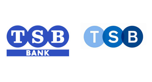
 Old monogram (left), new (right), designed by Rufus Leonard, interim (below).

The BBC asked me to comment on the new monogram.
Where a logo already exists, you rarely need a completely new design. More often than not, a subtle refinement will bring the logo up-to-date while keeping the equity that’s already there.
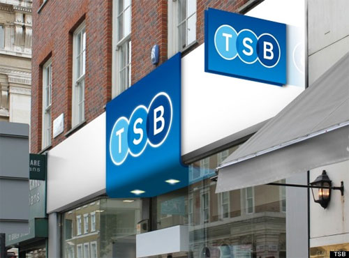
 TSB branch mockup.
This charming 2-minute animation accompanies the relaunch.
Read the short piece over on the BBC website: What’s behind the new TSB logo?


Comments
Wow David, you are turning into the go to guy for comment on design in the press!
It’s a clean update, but very safe and the signage could be so much more exciting.
I think the symbol of the horse for Lloyds is great, it relates to the ads, but it’s in desperate need of an update. I look forward to the new Lloyds ID. And it’s nice to see an old name back on the high street. We need more banks, definitely more building societies, more competition, simpler products…and more ethics.
I lot of people know a lot more than I do, Lee, but if someone asks…
You might’ve pointed me toward this guide to ethical banking, with UK banks scored out of 20:
http://www.ethicalconsumer.org/buyersguides/money/banksavingsaccounts.aspx
If it wasn’t you, I’m pretty sure you told me about your bank, chosen for its ethics. Can’t remember the name, though.
It’s an improvement for sure, but why not a dimensional sign – with the circles overlapping? Lee has a point.
Nice one David. As well as your comments on safety and sterility, blue is associated with regality and general classiness. Hey, I should keep my money with these guys, they’re obviously doing well for themselves.
Changing from serif to sans obviously makes the brand more contemporary and the brand is now strong enough to discard the ‘bank’.
The Venn element is an interesting addition to the original logo, to me it represents how the logo caters to all 3 classes of society and everyone in between. Light blue the working class, dark blue the higher class, but all equally integral to the bank as a whole.
I like it a lot. I used to bank with TSB when I was a kid so this presses the nostalgia button for me.
The first thing that struck me was ‘transparency’ – which I think is very clever and subtle. Something needed more than ever in banking these days.
I’m not sure what the final signage looks like, Don. The image above is a mockup — all I can seem to find online.
The original inclusion of “bank” beneath the TSB monogram was a strange one, Rich. TSB stands for “Trustee Savings Bank.”
I agree about the transparency, Mark, and more ethics, as Lee pointed out.
Something about the signs doesn’t seem right to me. They look cheap and remind me of Iceland or Dealz.
I’d make the logo smaller on the sign and maybe get rid of the blue background.
I really like the new logo, but for me, the rest of their launch branding, especially the website really lacks any identity or personality.
I am sure the designer had to work within very strict guidelines, however, my interpretation of the logo is: “A variation on a theme” which doesn’t augur well considering the banking industry’s poor reputation! There’s no sign of growth, just more of the same.
Personally, the new TSB identity has started to grow on me. Banks are unfortunately in the position, and will be for some time, where they need to be cautious on how any rebrand or visual identity change will be perceived by their customers, and by the public in general. Banks are still going through a hard time of rebuilding trust, so it’s good to see TSB trying to bring back some familiarity to the high street with their refreshed identity that isn’t too dissimilar from the original.