


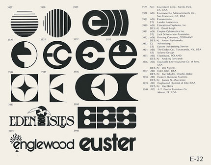
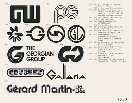


View the full set of scans on Flickr, lifted from a mid-70s edition of the book World of Logotypes. Via ISO50.
There’s an enduring nature to vintage logos crafted with simplicity and a focus on one idea.
View the full set of scans on Flickr, lifted from a mid-70s edition of the book World of Logotypes. Via ISO50.

Comments
nice collection!
You can get the PDF I made with the whole set here. There’s also a similar book, published in 1973, I’ve made a PDF with it as well.
Cheers!
Nice collection.
I particularly like the PG one on page G-20. The connection between the two letters is kinda clever, although the right side of the G doesn’t seem quite right.
Nice find! More proof that good design stands the test of time. Of course people will always want their updates.. but lots of these are still lookin’ good.
There are many delicious designs here! I love seeing logos from past decades – partcularly the 60s and 70s.
One of my above favorites is the Englewood logo.
Nice find!
These logos still live their legacy. The forefathers of logo design.
wow that second a…. fat! is that ‘candice’ i wonder
These vintage love logo designs are very good. Artistically done.
Good work! Keep it up!
I refer to these all the time. Absolutely timeless.
It’s always interesting to see logos from decades ago, you can see how design has progressed since and what factors have stood the test of time. Looking at these it’s clear the are all from the 60’s and 70’s, their usage of bold curved designs indicate this era well.
Looking at the PG design this has a few characteristics of logo design from this era, most notably the three lines effect. The same can be seen again in ‘The Georgian Group’ and ‘Gerard Martin’ logos. Obviously this was one of the design styles of the time that certainly hasn’t passed the test of time.
Having sheets of old logos such as this is always useful, if we can see what design factors can still be current decades on then we can learn how to create logos that will last for generations.
Thanks David. This is a nice resource!
Print-outs of these look great in my sketchbook and I always find myself using them as inspiration for new ideas and drawings!
I wish I had the book.
Bring back classical logo design everyone. PLEASE!
Some very inspiring stuff in there actually.
We can all I’m sure spot some shapes in there we’ve seen in some modern logos. Designers are often inspired by the past/other designers.
I love vintage and would look to see more vintage samples at Logo Design Love :)
Notice the one thing all these logos have in common that logo designers need to do more
THEY ALL LOOK GOOD IN BLACK AND WHITE!
Awesome article. Just timeless.