
The decision to start producing Volvo cars was made in August 1926. Financial backer Svenska Kullagerfabriken (SKF) reactivated a company that had been idle since 1920 for the purpose. The name of that company was Volvo — formed in 1915 for the manufacture and marketing of bearings for the automotive industry. Here’s a little background on the firm, and how the Volvo logo has evolved over the years.
SKF management came up with the Volvo name because it was simple, easy to pronounce in most places around the world, and it had a small risk of being misspelt. It also held a strong symbolic connection to the company’s entire operations.
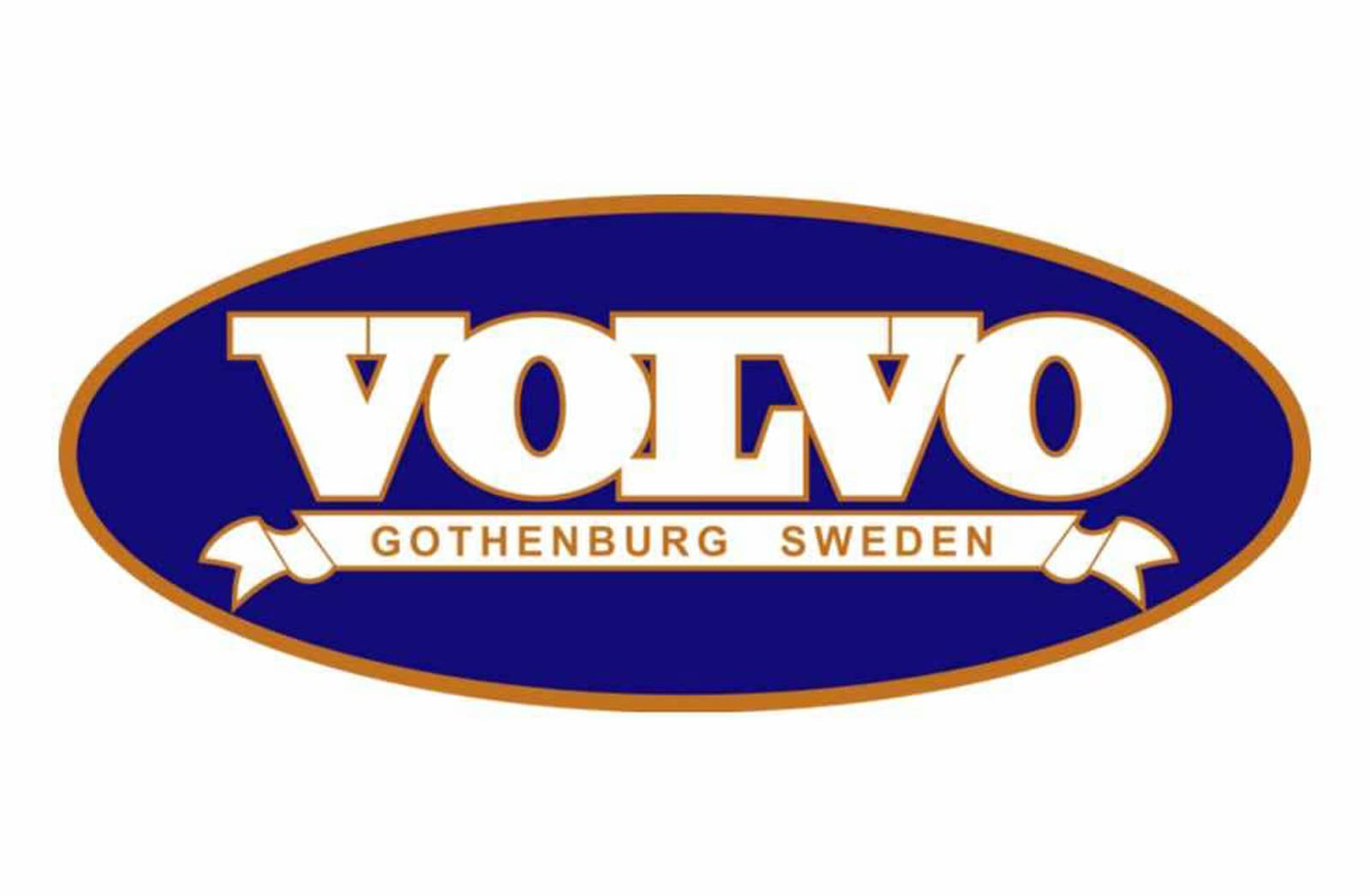
“Volvere” is the infinitive form of the verb “roll” in Latin. In its first person singular form, the verb “volvere” becomes “volvo,” i.e. “I roll.” Its Latin form gives rise to several derivations of the word that in one way or another, and in many languages too, describe a rotating movement, for instance, revolver.


Just a few years after the first cars were manufactured, the company logo incorporated the ancient chemical symbol for iron — a circle with an arrow pointing diagonally upwards to the right.
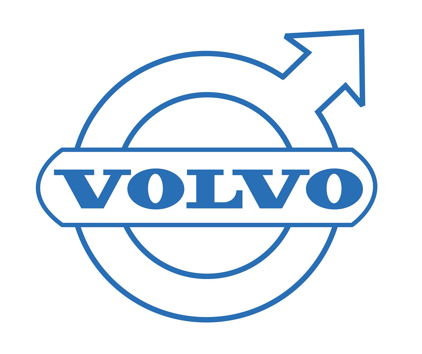
This is one of the oldest and most common ideograms in Western culture and originally stood for the planet Mars in the Roman Empire. Because it also symbolised the Roman god of warfare, Mars, and the masculine gender, an early relationship was established between the Mars symbol and the metal from which most weapons were made at the time — iron.
As such, the ideogram has long been the symbol of the iron industry, not least in Sweden. The iron badge on the car was supposed to take up this symbolism and create associations with the honoured traditions of the Swedish iron industry: steel and strength with properties such as safety, quality, and durability.


In 2021 Volvo quietly released a new logo, flattened and without the metallic gloss — a trend amongst other car manufacturers. The rationale is based on an “electrified” and digital future. More on Design Week.

Details via The Volvo Owners Club, and this 2006 Volvo press release: Volvo’s iron logo back in the centre.
On the car logo theme, you might like the history of the Ferrari logo, and the evolution of the Mercedes design.
Posted . Updated .
More on how marks like this are made in Logo Design Love, third edition.





Jami Pillow,
Hate the Volvo logo! I would never buy a Volvo because of that logo. Say what you want, justify it anyway you need to, but it exemplifies a male dominated world. The kind that elects Trump.
kb,
Buy a Volvo and become a man!
Rufus T. Firefly,
Volvo doesn’t like you either.
Heather Sprenger,
I completely agree – I think more people associate this symbol with the male sex versus an iron symbol.
Tio Caiman,
It was a surprise for me to find this change in the logo all of a sudden.
The logo just used to be a circle, but now that arrow makes it look ridiculous, like the new piggy tail on the F of Ford, or the lack of sunglasses in Tom Cruise’s Risky Business dance.
#MandelaEffect
Extraneous,
“The logo just used to be a circle”
It was never just a circle…?
Gayle,
Ladies, do not buy a Volvo unless they change the symbol to the woman’s sign, the vulva, with a cross.
Amelia,
That’s not a nice thing to say. Why would Volvo change it to a female sign?
Maddy Lahmar,
I bought a 2020 Volvo and I’m 23 yr old female. I bet you are just jealous cause I have a Volvo and you probably got a cheap Kia or Nissan.
Mark Damon Cervantes,
Well stated!
Andres Beltran,
👍🏼
Amelia,
Here we go again. It’s not sexist for Volvo’s symbol to look like the sign for men. And what’s wrong with Trump?
John,
What’s not wrong with Trump? EVERYTHING is wrong with Trump.
Kylan Wallus,
You wouldn’t buy a great car because of a logo? Ok, whose child got on their parents computer?
Jeremy,
Wow. You really should worry about bigger issues.
DB,
The Volvo logo is a circle with an arrow pointing northeast. The symbol’s origins are in iron, which was a key export for Sweden during the industrial age. The logo also represents the brand’s strength, durability, safety, and resiliency. The blue color and chrome accents in the logo symbolize stability and class.
AL,
I love the symbol. I’m a woman and a Volvo owner. Seems to me too many folks look are just dying to be offended these days.
Jonathan Newman,
I agree wholeheartedly, Al.
Vicki,
I’m a woman and a Volvo owner. I love the symbol and the car. If people would just educate themselves and find out the truth and reason behind them choosing that symbol — it’s a chemical symbol for iron. Nothing more, nothing less.
Kevin,
Can you show me the source of the ancient periodic table? I never found vol, or something similar, just fe for iron.
DaJaniel Lawrence,
Kevin, Volvo was a part of SKF, they produced ball bearings before they produced their first car. Their ball bearings were made from… iron. Use of the iron symbol was to pay homage to the traditions of the Swedish iron industry: steel and strength with properties such as safety, quality and durability.
Antwan,
Well said Vicki! My wife loves her XC90 and the logo.
Kim,
Hear Hear… emancipated woman here and feel the same way. Just because you’re ignorant doesn’t mean you have to buy the car.
Paul Henson,
In light of the recent advertising showing that crash test dummies are based on males, not females – add the female cross to the male arrow. Simple: + and -> on the O.
John,
The slash usually means “no” as in “no entry”. The slash is unpleasant.
Charlie,
I love my Volvo and I am a woman.
Kellie Allen,
I love my Volvo and I love the logo. I am a female. It is okay with me. I love to drive my big boy. Love the design of it. Going to hand it down to my daughter, and she can’t wait. There is nothing wrong with logo. It is always how you view something. I love it. Ladies you need to be more open minded. It was not an anti so and so symbol.
G,
I’ve read a lot of comments, but no one will address this one point… Regardless of history, the logo just looks cheap. I feel this way about most automotive logos (and I don’t know why). I’m a male, and just think Volvo should start over.
I’ll be driving and think, “Oh that’s a nice car, I wonder what it is…?” then I see that it’s Volvo, and am no longer interested. But the XC90 has piqued my interest to reconsider it instead of the Lexus I’ve always preferred. That’s how I found this webpage… LOL.
Just trying to find a reason to accept the vehicle, despite the logo. After reading all comments (including the negative ones), I’m leaning more towards “yes” to get one more than I am towards “no.”
Peter,
Alternative thoughts about the logo are pathetic. It is bold and strong.
Mother and Daughter,
I’m a woman and I love the fact that Volvo protects me like a man.
Suze Sinclair,
I’m a woman and love the idea that I can drive a Volvo like I drive a man. To be of service to me!
miguel,
Disappointed, perhaps it is not the word… After 6 years from brand new station wagon V50, all the chromes fade away and burst with 25C sun! It looks like an old car already.
Thanks Volvo.
Lennox Brown,
Couldn’t give a monkeys about the logo, it’s one of the safest cars on the road. I’d prefer to put my family in a box of iron rather than an ideology.
Carlo,
Ah ah ah!
Human race is incredible! It’s able to argue on everything on this Mother Earth.
What fun!
Then, human race, don’t be surprised or sorry or worried for all the wars on the planet.
Argue on Volvo logo!
Can’t believe. Really, can’t believe.