
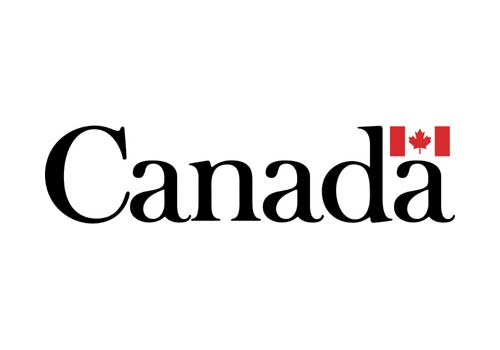
“I designed the Canada logo while working at MacLaren Advertising on a campaign for the Canadian Government Travel Bureau. Other government departments began to use the logo and, eventually, the Government adopted it as their official logo.”
— Jim Donoahue
Designed by Jim Donoahue in 1965, the wordmark seems to be a customisation of Baskerville.
—
Update: Jim kindly replied, “The logo typeface is a modified Baskerville. I always found parts of each letter too thin, so, in this case, I thickened the thin strokes.”
—
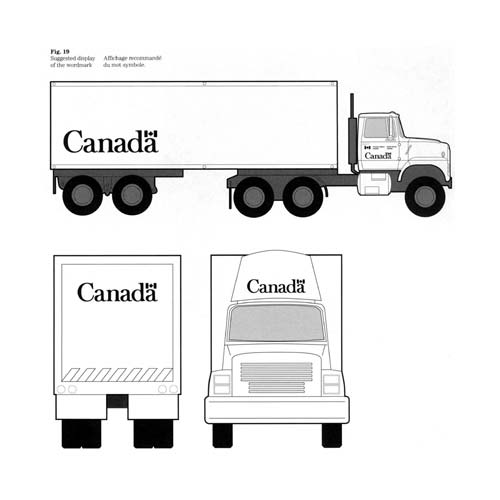
 Signage by artsigns.

Via @BlairThomson.
Comments
David, you should come visit Toronto. I would be happy to show you around.
I’m sure it’d be a pleasure, Sean. Thanks.
It’s funny. I’ve been looking at the Bruce Mau Design – Know Canada campaign since the Sonos logo has had so much attention. I really love it and it could easily act as an extension of this existing mark. The flag has the same negative space down the middle.
I like the Baskerville so much and I love the modified version of it! <3
The kerning on the logo is perfect.
People are hounding Canada over using Baskerville?
Since when?
I love the way this logo looks on the Space Shuttle’s Canadarm. The combination of the classy logo and the robotic arm symbolizes the country’s technological abilities. Additionally, because of the logo’s consistent use, it quietly extends the Canadian identity into outer space for the whole world to see.
How can I fit in the wonderful Canada Logo in between other words?
For instance: Upper Canada (here) Chapter for our chapter in an International Historical group? Will be happy to send you a pic of our stationery logo.
We’re a Canadian chapter (Ontario) in the National Society Daughters of the American Revolution! So named to let those south of us KNOW where we are! Thanks!