Arlington was founded in 1875 on the Texas and Pacific Railway as a market town for surrounding farms. In 1972 the Washington Senators baseball team relocated to Arlington and began playing as the Texas Rangers, establishing Arlington in the Dallas-Fort Worth area as a major sports hub for the region.

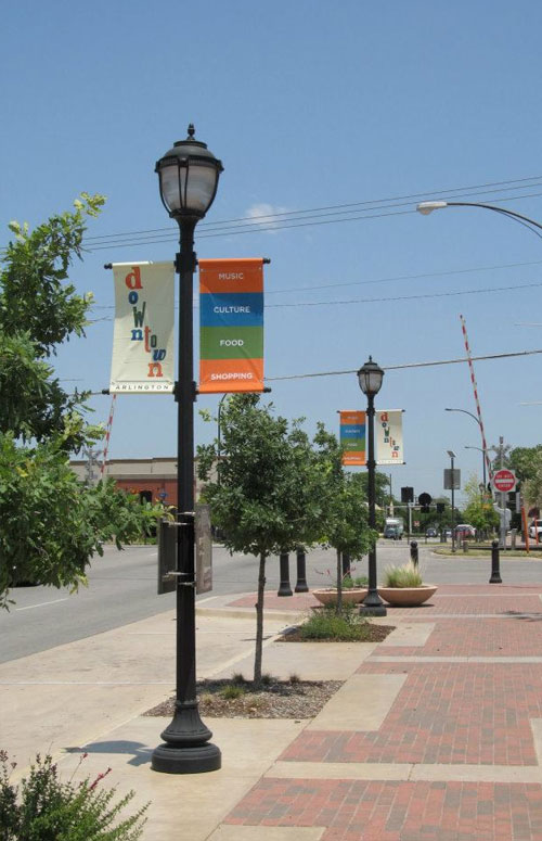
The logo spells out the word downtown in multi-colored letters in alternating typefaces, hovering over the word Arlington. The corporation reportedly spent about $30,000 on the new branding campaign.
“We are trying to create an image in people’s mind that you can have fun downtown. There are a lot of cool things going on.”
— Tony Rutigliano
 A flag with the new Downtown Arlington logo flies at Levitt Pavilion. Photo by Rodger Mallison.
“It’s something the business owners downtown are paying for. They see the value. The see the importance of branding downtown,” said Rutigliano, who was hired late last year to head the nonprofit agency.


The comments on the following two reports seem to sum-up the general feeling.
Downtown Arlington’s signature logo arrives, on Arlington Citizen-Journal.
Does this new logo have you dying to visit Downtown Arlington? on FrontBurner
Via @majomo.


Comments
As someone who grew-up in the DFW area and spent many days going to theme parks and Rangers games in Arlington, I’m quite disappointed with how this turned out.
$30K for that?!
It seems awfully dated.
I might have to change my claim to hometown now. This is just a terrible logo, and I suspect a victim of Design by Committee.
DFW is trying to brand itself as an artistic landscape with museums, and modern design trends. This sends Arlington back to the 90’s.
I bet they had Kinkos or a Banner company with “graphic design” skills create this.
I actually like the bright colours and alternating typography of the main word “downtown”, but to pair it with some dull uppercase Gotham seems a major cop-out. I can see where they’re going with it on the light posts and on that flyer. But I don’t think they’re there yet.
Also, for the photo of the sign on the light post, you’d think they could find a better shot of swinging downtown Arlington. Makes it seems like some dusty old west town built around a railroad crossing, almost as if the moniker “downtown” is ironic.
Looks like a $200 logo and nothing memorable about it
Multiple typefaces! Gradients! Outline! Vertical Tracking!
I don’t think they even need a logo for the project. They should’ve spent the money on creating a more effective ad campaign. Their goal for the project was to “raise awareness about recent developments in the heart of the city”. A logo is used to create an identity, whereas marketing raises awareness.
Personally, I really appreciate this logo (and the other marketing collateral shown). Throughout my decade long career as a professional designer I have encountered numerous times of self-doubt, and feelings that I’m just not as good or creative as others. Well, I just want to give a big thank you to whoever created all this – today I feel like the best designer in the world! Perhaps I’ll shoot for $100,000 for my next branding campaign design. Good grief…
“Music, culture, food shopping”, sounds like the opening of Tom Goes To The Mayor. Jefferton alive!
2nd on the logo looking 90s, but I’m already nostalgic enough for the 90s where the logo isn’t terrible for what it’s for but they definitely overpaid.
I’m in the wrong game if you can ask and get $30,000 for that.
Is this designed for a 90s era child-care facility? /sarcasm/ I agree with the other commentaters, terrible, and how they charge 30K for it is quite remarkable.
I am, well, shocked at this design. Arlington is the home of the Texas Rangers, the Dallas Cowboys, Six Flags, UTA. The proximity of the downtown Arlington area to all these features deserves a much more professional treatment. And as a graphic design student, I am even more shocked that such a design could be worth such a paycheck. Was someone in a hurry to get something out, and they just settled? I am going to cringe the next time I drive through and have to see it.
A lot of folks are complaining about the price, but they don’t consider that the $30,000 likely includes a comprehensive strategic consultation, brand audit, management of all graphic assets, deployment in stages across various media, and perhaps even the print/sign production and media budgets. When real businesses engage one another, $30,000 is reasonable.
As for the actual design, yea, it probably “evolved” slightly from the designers original vision. This happens sometime. Let’s watch it and see what develops — in practice it’s often better than a single look at the logo alone.
I agree that the mark looks like it was created to appeal to my grandmother… in 1986. But the cost shouldn’t be all that shocking for a project of this type and size. A municipality, with its hierarchy of committees and sub-committees requesting endless changes and “hey-I-got-an-idea” requests? I guarantee you the size of the project fit the size of the bill…regardless of the results.
Did not expect to see my hometown appear in design news under these circumstances.
@EricMichaelSay > Multiple typefaces! Gradients! Outline! Vertical Tracking!
You forgot Dropshadow! (behind the logo when it ^headlines^ the poster)
They must have asked a high school student to design half the logo using WORD and then asked a signwriter from the 1950’s to design the bottom half. If the brief asked for 2 ugly logos to be joined as 1, then design nailed!
Q. What’s wrong with this brandmark/identity?
A. Design by committee and nepotism.
I would bet any money this is an outcome derived by wealthy individuals making decisions based on what they feel is right. It smacks of client designed outcome – probably little Johnny or Jenny who have just finished their highschool design course.
As for the 30k, it was probably chewed up in media/production costs. I doubt there would have been a reasonable budget for the conceptual development and refinement of this brandmark. It would be interesting to see the figures for actual design time spent on brandmark development.
No wonder the streets are empty — No one wants to come out and see these banners.
Look, Arlington wants to be a big boy town. Hey Arlington, why not focus on the real meat of the problem, your disinterest in the resident. Arlington is one of the most sterile communities in the area. No worthwhile public transport, no community engagement, no heart, no soul. Arlington will forever be a commuter, tourism town without a significant change in government group think there.