

Feed is a seasonal food magazine with an interesting typographic approach for the Feed logo and magazine cover.
“Compared to other food magazines it’s very rich in content. It is a magazine that is made to Feeeeeeed you to the fullest.”


![]()


![]()
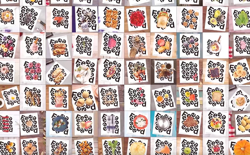
Tasty work from TBWA\Istanbul, that most definitely stands out, and is somewhat reminiscent of watching words move.

Comments
I absolutely love this. So organic!
Somehow reminiscent of Edau’s graphic work FEELS.
In fact it’s a complete rip off of his book! Agencies should be ashamed of stealing other people’s work and claiming it their own! Respect independent creatives.
Tiffany, I agree. What a shame.
Also, I’d like to add that there is nothing glamorous about displaying a dead animal.
Sensation of touching the food, that’s excellent!
@tiffany: yes and no. The cover was clearly a big inspiration for them.
But they also made a coherent concept in the interior pages.
It’s really difficult to be precise on the frontier between copying and inspiration.
But honestly, when one of my works is copied or used as inspiration I have bizarre combination of feelings.