
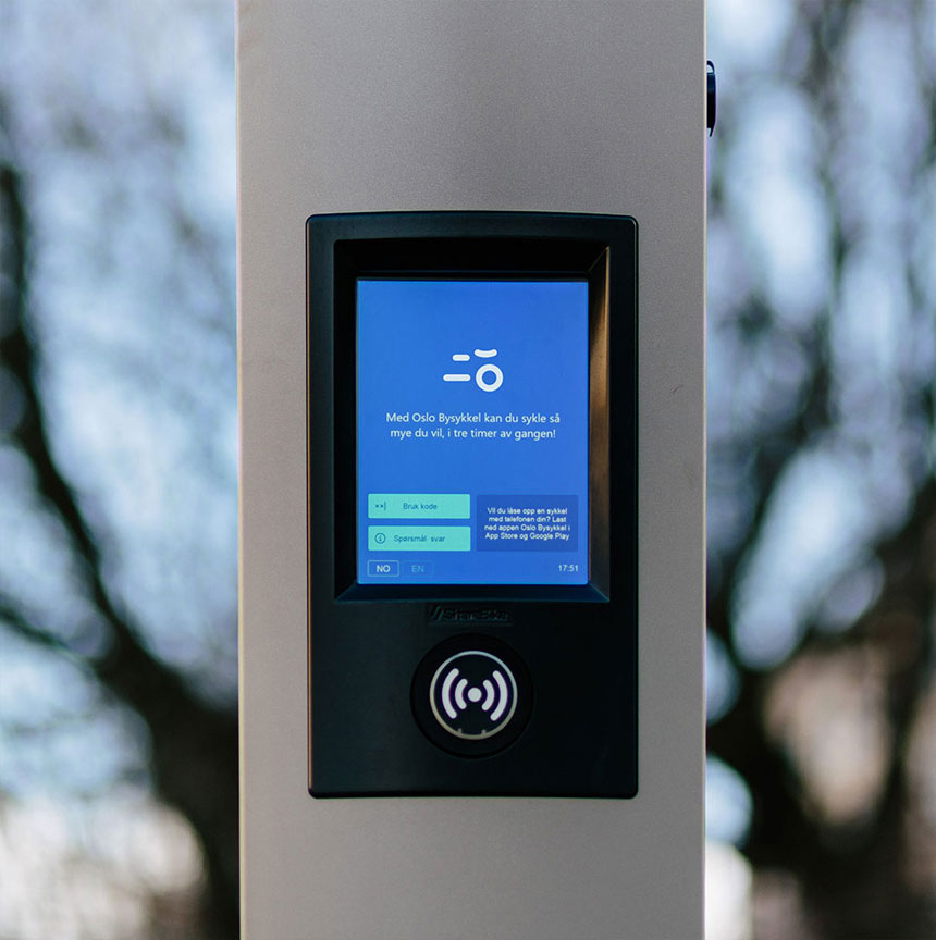
“The identity is centered around a simple abstraction of a bike, whose main function is to present itself in an attentive but subdued manner. In channels where you interact with the service, the identity opens up. The logo comes to life in a lively character guiding you through the service; It’ll tell you if something is wrong, inform you of slippery roads and give you a high five after an ended ride. Product and brand are one and the same, designed to create a user-friendly experience.”
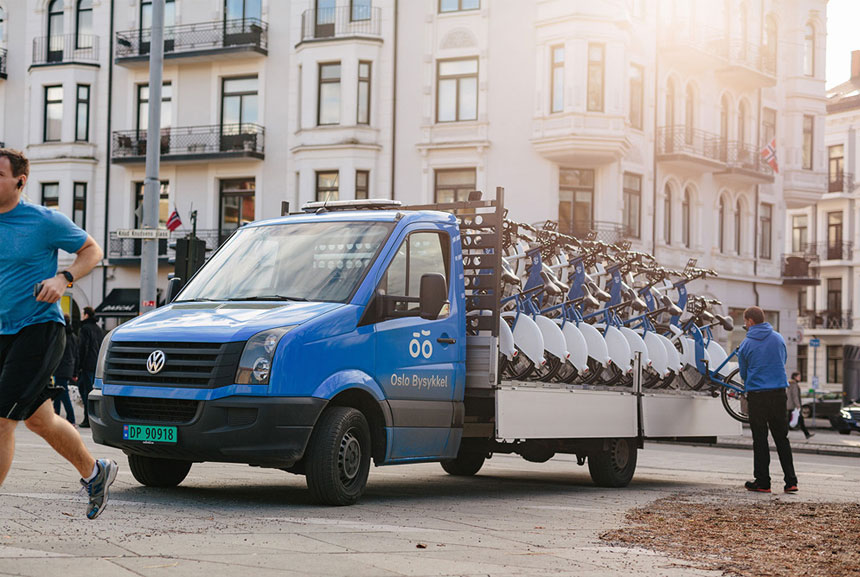
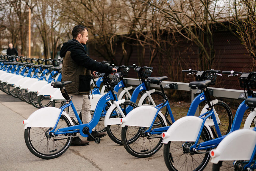
Designed by Heydays for Oslo City Bike.

See all winners from D&AD’s branding category, including two previously featured marks that’d also get my vote — Heart & Stroke and Eero Aarnio Originals.


Comments
Love it! Playful, clever and simple but then I’m a bit of a sucker for logos that hint at faces and facial expressions. The scope of the identity just from a few simple shapes is really impressive. Personally I think it’s a really clever piece of work.
Although I love the simplicity. In not convinced my the master logo. To me the face it creates (although main focus is on the representation of a bike) looks concerned or unsure.
I really wanted to love this.