
“It took eight months to create the 5448 characters that carry the brand essence of the Rio 2016 Games.”
Quoted from the Rio 2016 website.
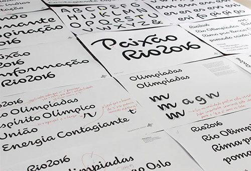


There’s a nice interview where FontFeed talks to type designer Fabio Haag from the Brazilian Dalton Maag office.
“Around 2005 I had my own graphic design studio which paid the bills, but my heart was set on doing type at nights and weekends. I started ByType in the hope to create a business. I kept in touch with Bruno who was kind enough to offer honest feedback on my type developments. Soon I started reselling Dalton Maag’s fonts in Brazil, approaching studios preaching about type and doing talks. In early 2008 Bruno invited me to join his design team, but insisted I should stay in Brazil as he was convinced this was fertile ground for a self-sustaining business.
“We were only 3 designers back then and have now grown to a full team of more than 40 people spread around London, Brazil, Austria, USA and most recently Hong Kong. There’s no magic as to how we got so big: it’s a mix of passion for quality type, business vision and hard work.”


 Producing ligatures for the Rio 2016 typeface.


 ‘M’, and the Copacabana pavement
 ‘R’ and Rock of Gávea
I’m sure this’ll look beautiful throughout the Games. Stellar work.
View more custom typography on the Dalton Maag website.
Related:
Rio 2016 Olympic Games logo
Rio 2016 Paralympic Games logo

Comments
I really like how they took elements from Rio by actually using shapes and etc from the world around them. I’m really interested to see how the signage is going to turn out and various other things.