
“Pirelli [tyres] breaks a lot of typographic rules with its overly stretched P; the longer the word, the more horizontal it becomes and the less functional it is. It breaks all conventions. It’s kind of ugly in its weirdness, which probably would have never got through a boardroom now. It’s part of its charm and distinctiveness.”
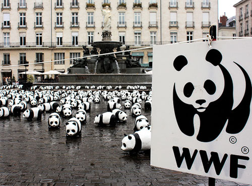
“My very favourite mark is the World Wildlife Fund. I’d love to have done that. That’s the one. The giant panda is the perfect choice; the way it’s drawn is charming and very enduring.”
Pentagram partner Angus Hyland talks logos in Adweek.
Related:
Sketches of the World Wildlife Fund logo.
A look inside his book co-effort (with Steven Bateman), Symbol.
Posted . Updated .
More on how marks like this are made in Logo Design Love, third edition.



Kevin Burr,
Great read. “Are there any designs you’ve done that you’re embarrassed by now? Everybody has a drawer of shame. But I won’t open it for you.” Haha, loved that part. It’s so true…usually, those are the client driven logos. The projects in which the client just couldn’t let go.
Ralston Vaz,
I’m enjoying Angus’ Design Matters interview with Debbie Millman. I dig this cat.
Steve,
You’re very kind to the Pirelli logo. I googled “Pirelli logo ugly” and it got me to your page – just seeing if anyone else felt as I did. That logo’s bugged me since childhood and I agree with you – it probably wouldn’t cut it today.