The redesign of a sports club logo or crest generates more contention than most projects, because club supporters feel a much greater sense of ownership than they would with, for example, a multinational bank or a restaurant chain.
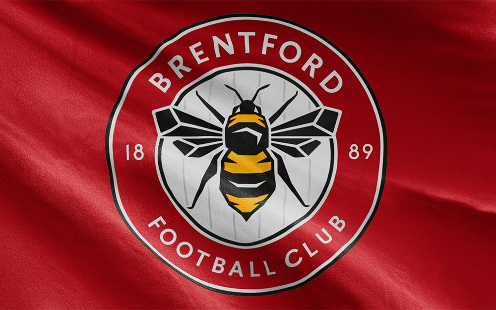
The latest update to cross my inbox is for English Championship side Brentford FC (The Bees), developed over 18 months by London-based Article.
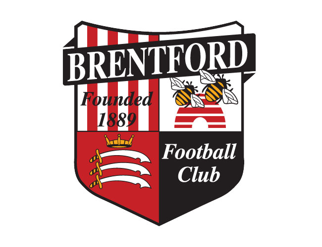
Flaws in the previous design (above) are obvious, but I’m sure that by addressing them in the club crest mini-site it helped bring supporters on board with the update.
- ‘Founded 1889’ is not clearly legible over the red and white stripes. Having words on top of stripes also makes it very difficult to create an accurate single colour version of the crest.
- While Middlesex is an important part of the club’s history, the swords from the county’s coat of arms are not of primary importance today.
- The bees and hive illustration is cartoon-like and too detailed for the small section of the crest in which it sits.
- The ‘Football Club’ font feels dated and is a different size to the ‘Founded 1889’ text.
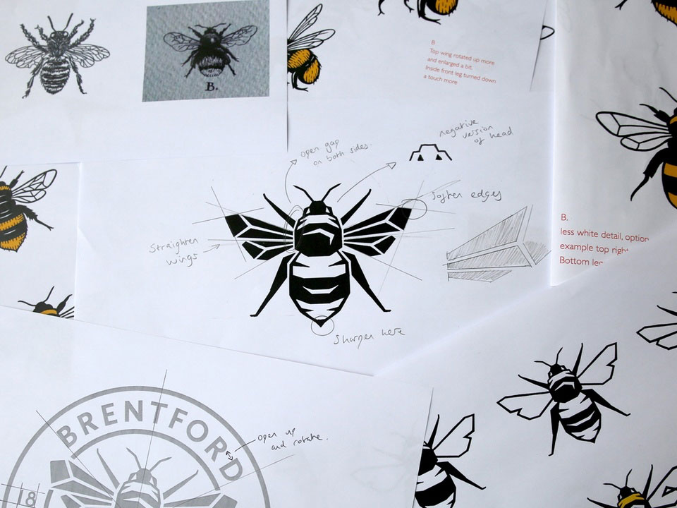
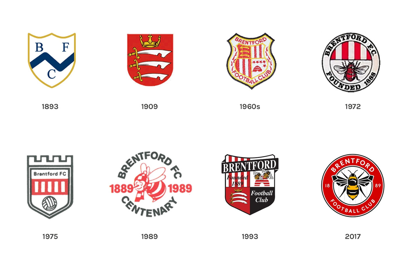
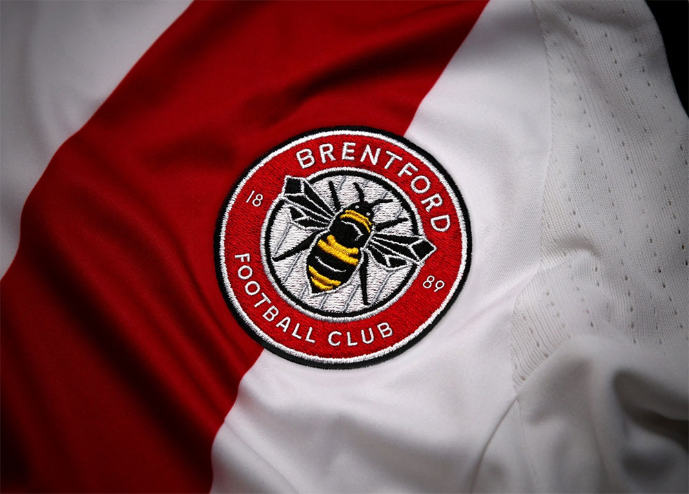
The mini-site also lists the advantages of the redesign.
- Solves the practical issues with the current crest.
- Draws most inspiration from the 1972-75 crest and the 1960s Brentford Supporters Club badge.
- The bee at the centre of the roundel is more angular and aggressive looking than any bee illustrations used down the years, adding to the strength and character of the overall design.
- The typeface is clean and legible and the numbers in 1889 draw inspiration from historic football typography.
- The colours mimic the red, black and yellow of the current design.
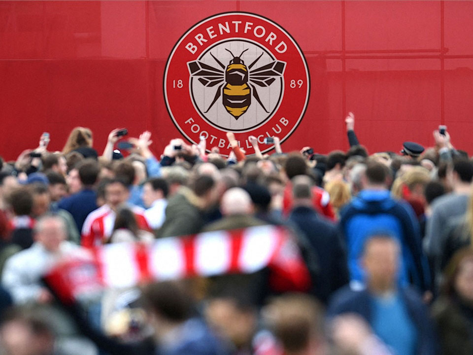
A great overall improvement by Article, who commissioned Peter Horridge to illustrate the bee. Article were previously featured on Identity Designed with their Escape the City project.
Posted . Updated .
More on how marks like this are made in Logo Design Love, third edition.




Sean Jamshidi,
The font weakness still continues into 2017.
Kyle@Brandcouver,
Huge improvement. Honing in on one idea does wonders for creating strong logos. The ’93 version is just confusing. I have to say that I find ’89 quite hilarious though. Wrong for so many reasons but that cartoon bee is really kind of fun to look at.
David Airey,
The 1989 bee would’ve struck immeasurable fear into the opposition.
Sean Miller,
I love the bee design. It does look more aggressive.
Russ, Bees fan,
Definitely less confusing, but missed a trick by not having red/white stripes below the bee incorporated in a black circle.
Simon Chase,
I love that it lacks stripes. Who wants stripes!?