
The origins of the BMW logo are discussed in this four-minute video (embedded below), dispelling the myth that the emblem was based upon rotating aircraft propellers.
“Aircraft engines are the origin of the myth. People think that the BMW logo is based on a rotating airscrew. The origin of this interpretation is the cover of a BMW aircraft magazine. This picture (shown below) was taken in 1929, years after the logo first came into existence. Respect for the publicity department back then for the fact that the airscrew myth continues today.”

So what’s really behind the logo’s origin?
Kai Jacobson, automobile historian with the BMW Group said, “As Rapp grew into BMW, BMW assumed all the business segments, and the company wanted the logo to be oriented on Rapp’s logo. As you can see here on this example, Rapp has a black horse as a symbol on its logo. BMW chose the Bavarian national colours as a symbol, but arranged the letters exactly like Rapp. So you can see very clearly how the [design] was developed.”


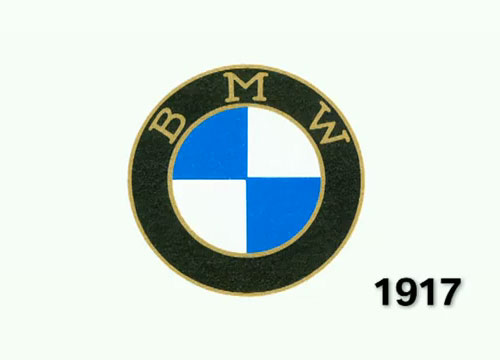


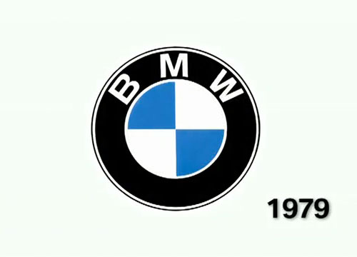
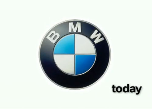
More logo evolution: Starbucks, Shell, Mercedes-Benz, Pepsi, BBC, Braun, Batman.
Posted . Updated .
More on how marks like this are made in Logo Design Love, third edition.



Sergiu,
really like your logo evolution series. it’s nice to see how details make the difference.
Michael Sansagraw,
This is a very cool post. It’s always great to see the story behind an emblem like this. I like the fact that there’s a myth revolving around the origins of the BMW emblem. I wonder if it has a positive, negative, or neutral effect on BMW for the myth to be spread around. I also like how close to the original they’ve stayed over the years. That’s very smart on their part and the consistency sends the message that they know exacly who they are, and that hasn’t changed.
Alex,
So in essence, the BMW logo is just a simplified Bavarian flag? I can see why people would gravitate towards the airscrew myth; it’s much more exciting.
Luke Jones,
Pretty mad, I wonder if they’ll ever get rid of the 3 letters.
Christine,
I’m still convinced that, while using the old Rapp logo + Bavarian flag colors, it’s still also based on what some engineers refer to as a working point, http://www.construction-dictionary.com/definition/working-point-1.html.
Here’s an example picture from some of my own steel drawings:
http://i50.photobucket.com/albums/f332/mobius8band/WorkingPoint.png
As a structural engineer, I use a working point if I’m specifying steel shop drawings or even steel connections. It denotes the intersection of the centroid lines of two steel beams. It’s also used to show elevation points on sections and elevations in both structural engineering and architectural drawings.
Not sure how or if mechanical engineers use this symbol, but I always found the similarities rather interesting.
Simon,
Oh great!.. I drive a BMW and I think I preferred the propeller story. Next thing you’ll be telling us Santa Claus doesn’t exist :-)
Josh,
I’ll never watch ‘Finding Forrester’ the same way, now.
Kelly,
That was quite interesting, I hadn’t known about the propeller story to begin with but it makes good sense. It’s always interesting to know where things began. But like Simon said, I think I prefer the propeller story as it has more meaning than just copying someone else’s idea then putting colours from a flag inside it. Nevertheless, I do really like the BMW logo for it’s simplicity.
Kev,
It’s always interesting to have a classic demystified, especially when the logo is both abstract and etched deep enough into your mind past the point of question.
I have written a, trying to be funny, article about how you can design your own logo and would appreciate any feedback.
http://theshrewsburyfinger.com/12/07/2011/how-to-design-your-own-logo/
clare,
Interesting, but I kind of wish it was the propeller story… still it is great to really understand why a brand/logo has developed.
Shaun Hensher,
When I was in school, one of my professors told me the logo was actually based on a bomb viewed from the business end. I always thought it an odd story, but you can see the resemblance… sort of.
jez cook,
What a shame the current version uses the same trick as UPS etc, etc and attempts to make the logo appear ‘3D’.
The 1979 version has so much more presence.
Shaun Hensher,
jez: Normally I would agree with you, but in this case I don’t think the way they’ve gone is a mistake. It mimics what the badge looks like on the cars. By doing so, they evoke the sex appeal that a BMW badge embedded in the hood of one of their gorgeous cars has. Personally I get a much stronger sort of primal reaction to the modern logo.
jez cook,
I see what you mean Shaun, but I don’t know how well it would translate to other applications such as print.
Actually, maybe that doesn’t matter too much these days.
Jarek Kowalczyk,
Very nice post. Currently I am working on a book about car logo design history. Bmw is a very nice example of consistency (like all german motor brands) and this show us that great, simple idea can last many years.
Juliette,
I think it would be nice if BMW came out with an ad or something to end the feud of where the logo actually came from. Maybe they always planned for their logo to be controversial. I mean, this way they always have people talking about it. I had never heard any suggestions of where the logo originally came from, but it looks like a lot of people have. This makes me wonder if they came up with all of these stories just to keep people interested in the products.
Glenn Dieffenbach,
I’m here searching for a logo hat pin I once had which had multiple colours in the perimeter circles. I’ve been riding BMW motorcycles since 1984. In the BMW motorcycle community that could be considered a “new guy”. It is always simpler for me to explain to my American motorcycling kin the myth about the propeller. I once had the damaged motor of my 1977 R100/7 sitting in my living room on a German child’s sled. Visitors would always ask “what’s that?” I would always reply that it was an airplane engine. Fun for a motorcycle rider is to ask a car driver, “when did they start making cars?” We do this for the frequently asked “I didn’t know BMW made motorcycles, when did they start doing that?”
Jer,
The article fleshes out the origins of the logo, but doesn’t disprove the propeller “myth.”
Klaus,
I don’t buy it!
You explained why the BMW logo is round, why it has the three letters arranged in a similar way and why it is blue and white. That’s acceptable, but why did the Rapp horse change into the four quarters? That’s the most important point but there’s no explanation for that in the article. You can’t debunk a myth without offering the real reasons, the truth.
To me it’s a rotating propeller because BMW made air-plane engines first. That makes sense to me!
Peter,
I agree. Because the Rapp logo is round, that means the BMW logo is derived from it? Huh?
joe ciechanowski,
Give this some thought – the colors may be from the Bavarian flag, and the pattern may be close, but the segmented circle is clearly the engineering symbol for “center of gravity (CG).” I may be out in left fields here, but I can see how this could work its way into the BMW logo.
Carol Mooring,
I am making a Kleenex box cover with the BMW logo on it for a guy. What shade of blue can I use? The pattern says light blue but there are so many shades of blue. I have light blue, blue, royal blue, turquoise. Which one would best represent it? Thanks, will wait for a reply by email.
Peter,
Did you get an answer to what shade of blue?
Doug Pratt,
There’s another origin story. I’m curious if anyone else is familiar with this, as it’s propagated in Baden Wurttemberg.
The decorated ceramic heaters in the main rooms of Schloss Heidelberg have a family crest on them, the blue and white quadrants in a circle. Tour guides claim this is the model for the BMW crest.
Gregory Meili,
I believe I have an original 1917 glass window hanging emblem and would like to find its worth.
David Airey,
I can’t help with that unfortunately, Gregory. Good luck.