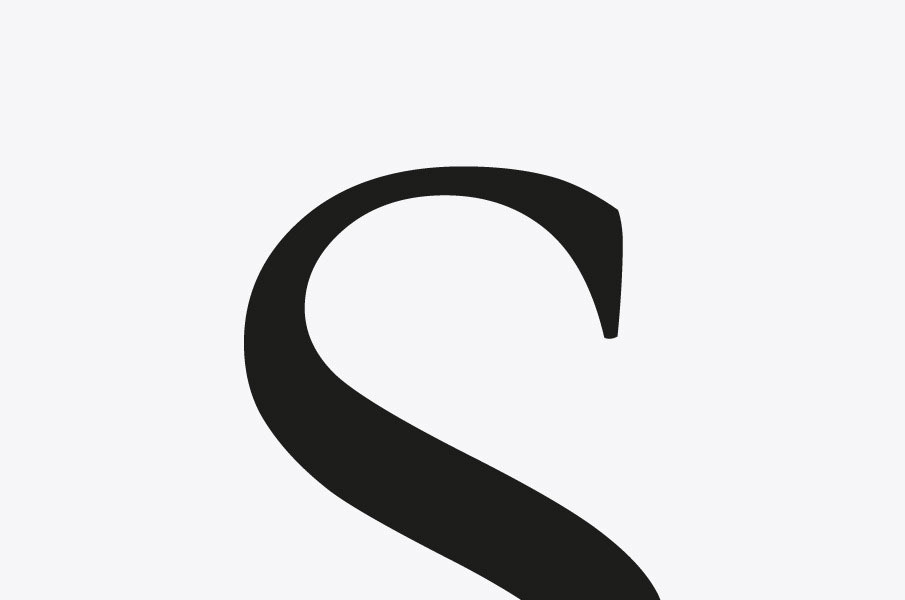
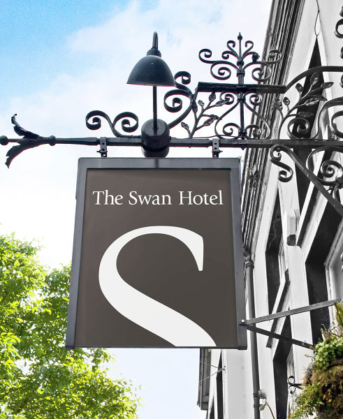
The Swan Hotel logo is lovely, designed for the public house and hotel in rural Essex, England. “Under new management after years of neglect it was decided that the old bird needed a new lease of life. I created a simple new identity from a monogram that doubles as a swan, coupling it with a neutral palette and a friendly tone of voice to create a startlingly simple yet elegant solution.”

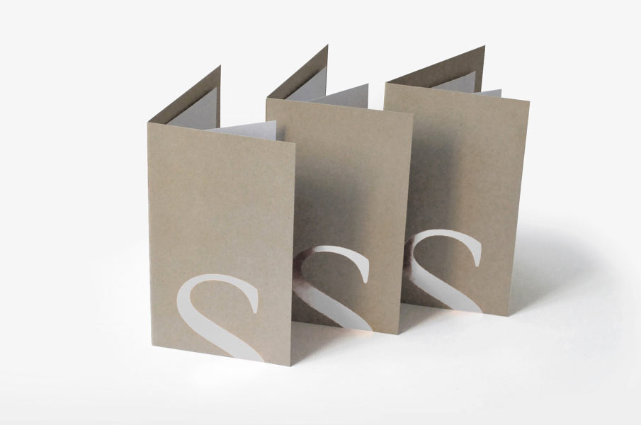
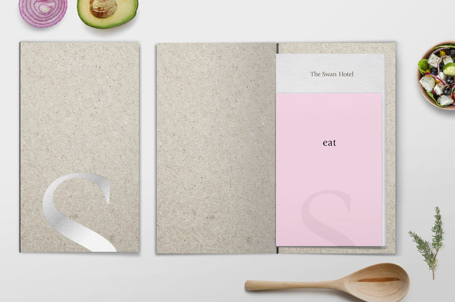
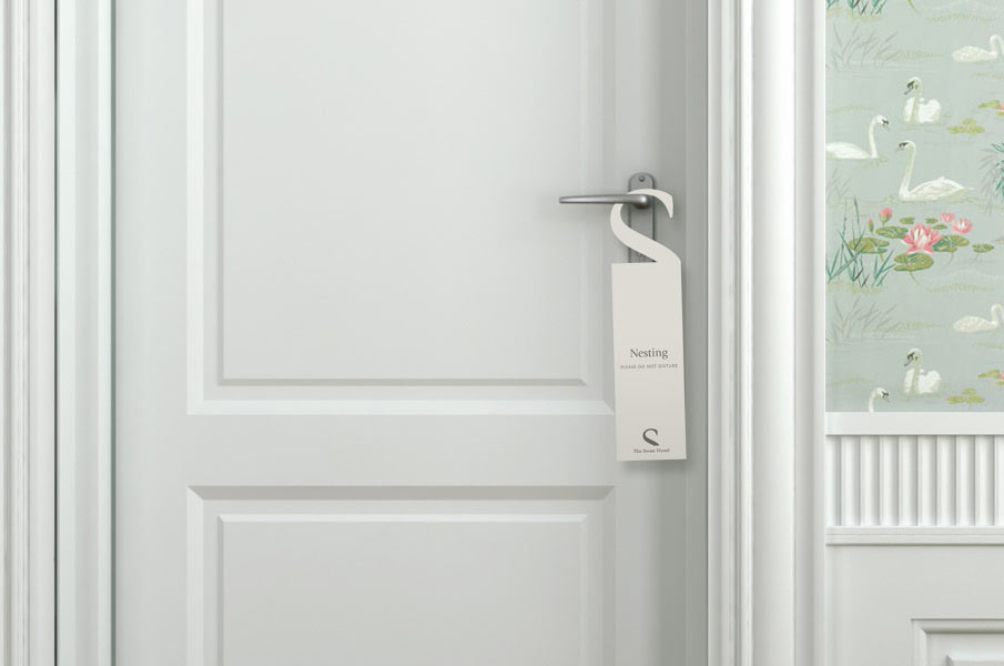 “Nesting.”
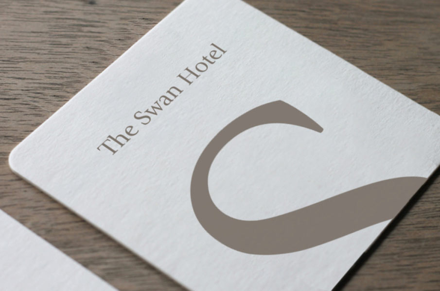

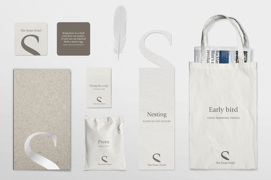

The Swan Hotel logo was designed in 2012 by Gareth Proctor of Sonnet, Sydney.
Somewhat related in the archives (well, regarding bird and wildlife), are the Penguin logo evolution, and the background of the WWF logo.


Comments
Brilliant idea. Simple, yet effective!
Beautifully simple design David, love it.
Took me two takes to see it – suppose that is the idea. Wonderful design.
Wow. I love this. Well done. Very simple, yet impactful!
Brilliant.
Best feature is the restraint to not make it into a swan – with an eye, etc – so that it takes just a tick before you see it: then it is forever. Courageous and memorable.
Some great applications of the logo here, simple always wins in my book.
In top 10 logos I have seen. Effortless elegance.